Before & After: A Vinings Atlanta Estate Transformed
Houses are so sad when you first move in. Realtors recommend you paint everything neutral and walls are often bare for a while until you have a plan, which was the case in this Vinings home. In Atlanta, where homes are celebrated for their Southern charm and architectural beauty, it's crucial to infuse each space with the right mix of elegance and comfort.
The architecture of this home is gorgeous! It’s got a grand scale, beautiful marble in the entryway, brass hardware on the doors, plush wall to wall carpet in the bedrooms, lovely crown molding and a spacious layout… but…it was missing personality, texture and richness. Oh…and furniture!
In a city like Atlanta, where each neighborhood has its unique vibe, getting the interior design right from the start is essential. You know you need furniture so why not skip the uncertainty and hire an interior designer to help you select the right size, function and finish for your space. Do it right the first time as soon as possible so you can enjoy your home.
In Atlanta, the entryway is more than just a passage; it sets the tone for the entire home, welcoming guests with that signature Southern hospitality. Our first task was adding texture with a creamy ivory colored silk grass cloth, switching the light fixture to add some sparkle and adding a few key furniture pieces. Over the console table we added two wall sconces to add dimension and illumination and a gorgeous gilded antique mirror. Opposite this will be upholstered bench with custom pillows. It will add richness in texture and dampen the sound and soften the space with function for guests to remove and put on their shoes.
It went from drab and boxy to warm and inviting. Dead to alive.
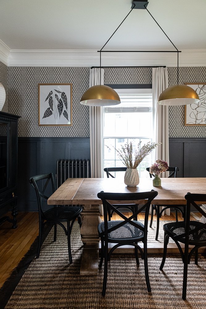
The dining room is located by the front door and again, the room has great bones. The clients already purchased furniture for this room which fills the space nicely. They bought a beautiful rug in muted greens and even added silk taffeta drapery which add softness and drama. But, don’t you think the walls are crying out for wallpaper and a dressier light fixture?
Yes, of course you do! Look at this perfectly gorgeous wallpaper we found. It has muted greens and golds with just a touch of brown and cream. It adds so much richness and energy to the space and ties in all of their existing furnishings so perfectly. It adds so much depth to the room while still be subdued.
On the ceiling (which we call the 5th wall) we added gold wallpaper which is warm, reflects the light, and adds a little shimmer. The clients found this chandelier at RH and it adds more volume and dimension to the space than the original flat wooden one ever could.
Could we have softened the crown molding and baseboard with a dimmer creamy paint? Yes of course but then we get into painting all of the doors. This room has three doors so it was too much of a commitment. I found the gold mirror below at an antique store and added a few decorative accessories on the dressy server to make it shine.
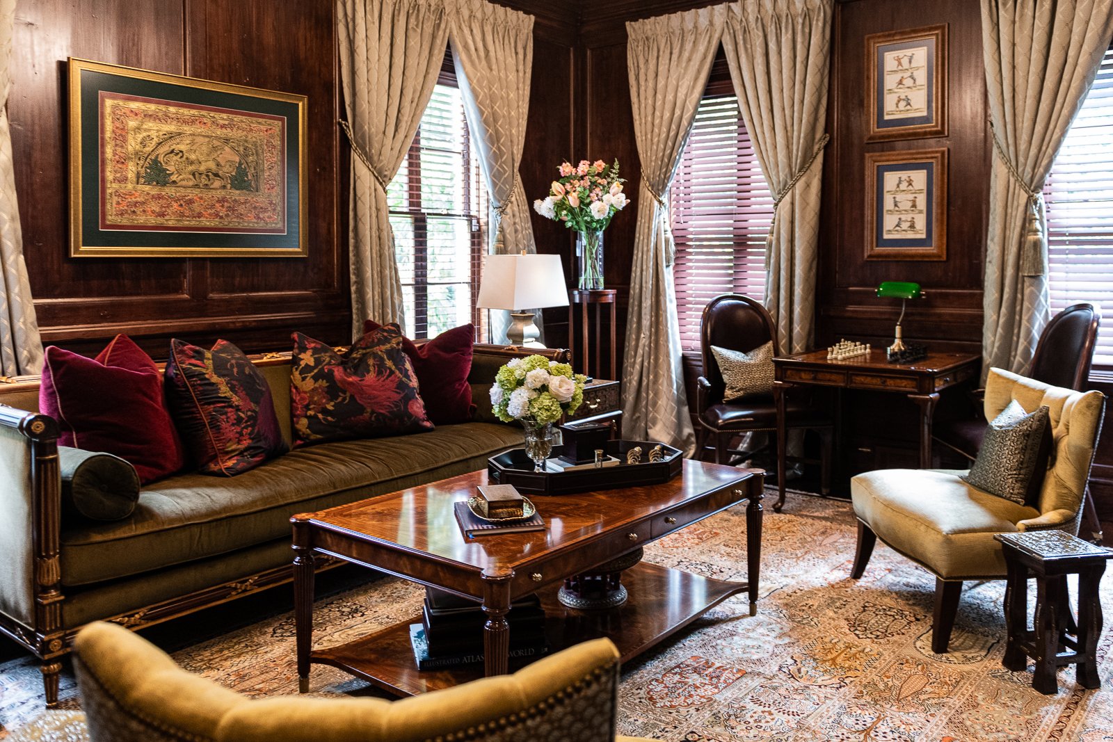
In the study across the hall we have a similar starting point. The dark wood panels add a lot of richness and the drapery is very dressy but we need function (intention) with the furnishings and floor plan. This gorgeous sofa can’t just live at the end of the room with a rug that is too small for the space.
First, we optimized the layout and made their beautiful velvet sofa the focal point of the room. When you walk by it calls you to come in and have a seat. We added end tables, a game table, and more chairs to fill out the room and make it more sociable.
We liked the game table nooked between the windows in real life, so that’s where it lives and we added art. They had most of the art in their home, we just found optimum spots for everything.
That’s why this is so fun.. it’s a big puzzle we get to solve.
They picked up the rug on a recent trip to India and I found these slipper chairs at an antique store and had them reupholstered in a green crushed velvet. The shape is classic.
We styled the bookshelves and we repurposed the chandelier from the entry in here. Looks great in this space (tone on tone) and adds a little brightness.
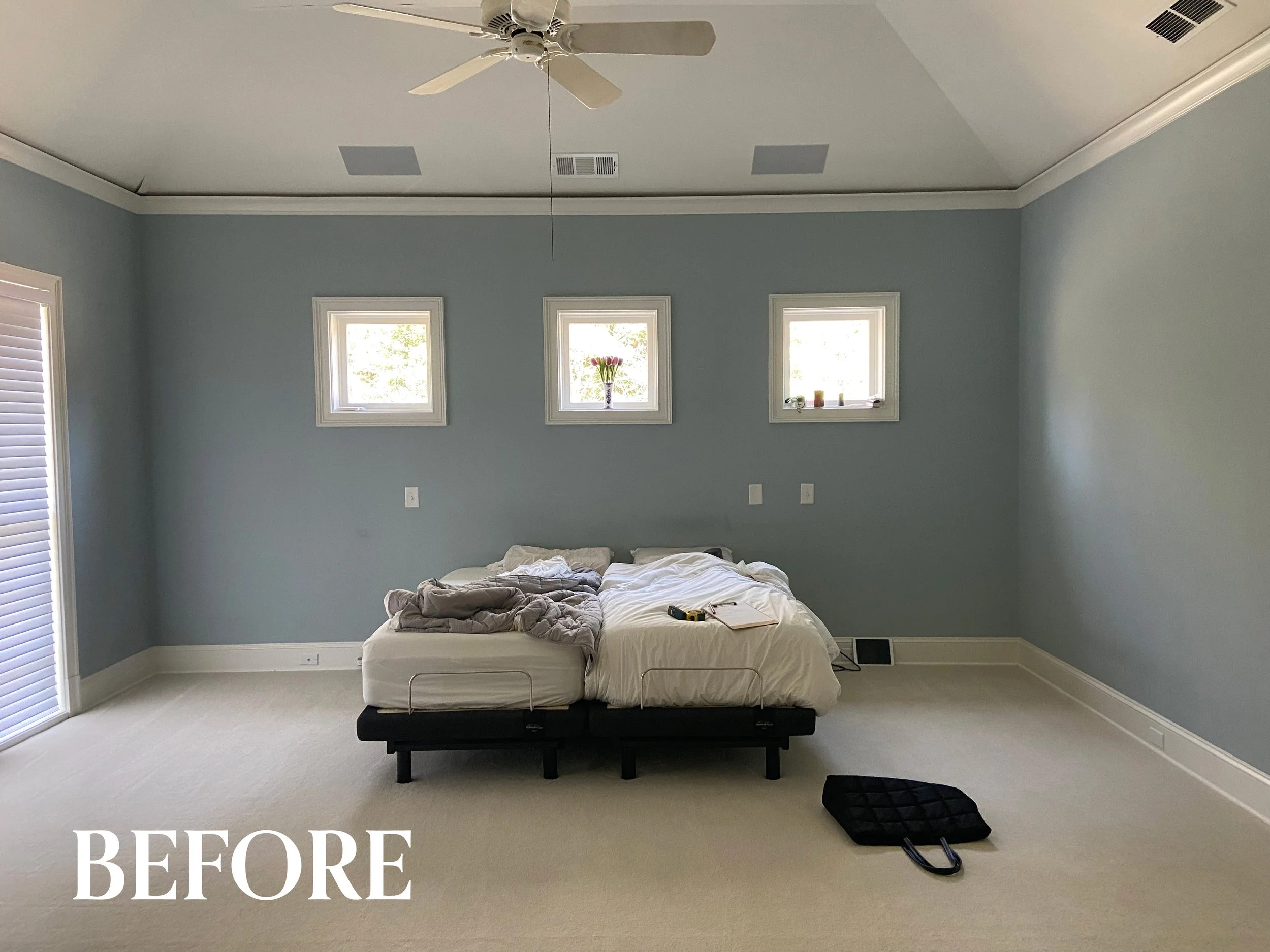
Moving on to the principal bedroom below… they lived like this for 5 years, relatable I am sure. They are two very busy doctors and this is what they had to come home to every night for way too long.
We performed surgery and now the patients have a much better quality of life! :)
They wanted their bedroom to be serene and spa-like with a soothing color palette and soft textiles. And more transitional in feel than some of the public areas of their home.
We wrapped the walls in a soothing pale blue green and built up the texture with gorgeous silks and velvets. We added in creamy tones and touches of gold to give it brightness and soft contrast.
The layout here is fairly simple — a king size bed with oversized nightstands and a curved upholstered sofa at the foot of the bed. Because the scale of the room is large we could have added a dresser or an armoire to a wall opposite the bed, but they didn’t want any additional furniture or need the storage. Instead we added a writing desk which breaks up the plain corner.
That drapery detail is dreamy. I love each and everyone of the fabrics we selected in this bedroom. We played with pattern scale to add texture but keep it soothing.
I am not sure what my favorite element is .. it’s a tie between this stunning chandelier and the gorgeous custom velvet drapery with the gilded wood rod. This light fixture is a series of textural resin pieces and the adjective I would use to describe it is, watery. This fit so well into our spa-like direction. It’s a spa at the Four Seasons… not just any old spa.
It’s calming, refined, and luxurious.
We toned down the brightness of the ceiling just a tad by painting it a creamy color rather than leaving it flat white. It’s these little details that I love obsessing over, that contribute to the overall feel of the room.
The final transformation I will share is the son’s bathroom. And in reality, we did this little bathroom first before the rest of the house because his shower just stopped working altogether - so it was urgent.
What we see in these before images is a perfectly fine bathroom built in the 90s. Metal wrapped shower, a soffit for lighting, a super low bathroom vanity, and square white floor tiles. It’s in great shape and has aged very well.
They wanted this room to be more modern than the rest of the house so we went with a black and white tile and LED mirror. In the shower we opened up the niche and made it curb-less so the tile just flows from the room into the shower. I couldn’t get a great photo of the shower so you will have to use your imagination, but the black floor tile continues up the back wall to break up the white tile we used on the walls.
And that is a wrap! One more house made more personal and more comfortable for the great people that live there.
At Violet Marsh Interiors, we specialize in transforming Atlanta homes into personal, luxurious retreats. Whether it’s a grand Vinings estate or a cozy bungalow in Virginia Highlands, our goal is to create spaces that reflect your unique style and the timeless elegance Atlanta is known for. Ready to make your home as beautiful as this Vinings transformation? Book a consultation call today and let’s bring your dream space to life.
Join the Party.
We promise not to bother you too much, but if you’d like to be alerted to new before & after blog content, please submit your details below.


