Historic Home Renovation in Manchester, New Hampshire
Transforming a Gray and White Palette into a Warm, Inviting Home
This lovely young family, relocating from Boston with two young boys under the age of 5, reached out after purchasing a recently renovated historic home in Manchester, NH. While they fell in love with the home's layout, they sought expert interior design services to make the space warmer, more personalized, and full of charm. With a focus on creating a family-friendly and inviting environment, we transformed their home into a space that reflects their unique style and needs.
The home had recently been renovated and as you can see from the before images, everything was painted gray and white. The previous owners added a lot of silver and crystal lighting throughout which makes the space feel very cold and is not in keeping with the history of the home which was likely built between 1900 and 1920.
These before images appear to be staged as well, which of course makes the home feel very impersonal and if I do say, seriously generic. The way this home was staged is what I will call ‘Home Goods country’ and if that isn’t clear, I really do not like the before aesthetic. For starters, the scale of the furniture items is too small and nothing in the home looks like it is made very well and will last. Now, that doesn’t mean that you have to spend tons of money on every.single.thing, but it is always better to play the long game with interior design and your home.
What does that mean? It means, have a plan and chip away at it and be ok if it takes a little time. Invest in quality materials that will age beautifully over time and will last. You invest in buying a home and you should also invest in making the interior work for you and feel good. Home is a resting place and is all about your refuge and self care.
Entryway Enhancements
Now, let’s start with the entryway, shall we?
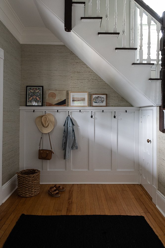
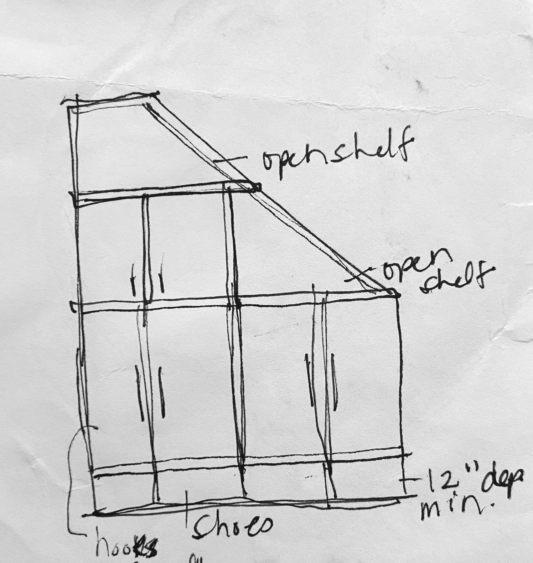
The previous owners installed this wall paneling and a few hooks. It sort of gets the job done, but for a busy family of four, it’s always better to have closed storage so the mess can exist, but behind closed doors. Keep the space calm and serene. The sketch below on the right is my initial vision of a closed storage mudroom for this family. We would utilize all of the space to add significant functionality to this one wall. The trade off? We would loose the under-stair storage.
For starters we painted the walls on the main level Benjamin Moore White Dove. This is a classic but modern warm white. In this entryway we added in a neutral but amazing grasscloth and added some baskets for additional storage for winter items. Hats, mittens, scarves...you need them in NH!
We also placed a larger black woven rug in the center of the space, added a small console table for keys to the left of the front door with a mirror so you can do a quick check before leaving the house. Eventually we will add a stair runner (which adds texture while also dampening the noise) and a soft treatment on the window in the stairwell.
And of course we replaced the lighting. We always do that.. it’s our favorite part!
Formal Dining Room to Playroom Conversion
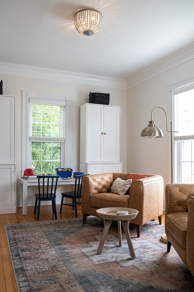
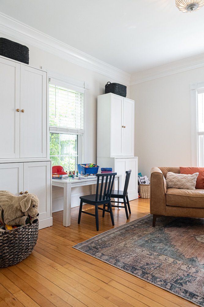
For the next few years they want to use the formal dining area as a playroom for their young boys, so we added lots of storage (thanks IKEA!) a kid friendly rug, and some comfy club chairs so the adults can also hang out in this room if they would like. That is some skinny, very sad crown molding.
But this is not. Look at this new crown molding! It really makes the space feel more historic and more proportionate. In the photos below, you can also really see the difference in whites between the White Dove wall color and the trim color. (I personally love when the wall color is painted the same color as the trim, but since the white trim was in good shape they didn’t want to go down this rabbit hole. Once you paint the trim, you have to paint all of the doors so you can see how much bigger the project becomes.)
Pictured is a polypropylene rug from World Market. The colors are beautiful, the price is so right, and it is very easy to wash. Eventually the couple would like to add soft roman shades here as well, but are going to hold out until it’s the official dining room.
Personalizing the Living Room
Moving through the beautiful double pocket doors which are so prevalent in historic New England homes, we come to the living room. This is still a work in progress, but look how far we have come! We lost the gray wall color, updated the furniture layout to fit the space better, and added a more appropriately scaled light fixture which is a focal point in this space. And those drapes!
Any room design starts with a site survey. I measure every detail of the space (radiators, vents, light switches, windows) and create a floor plan. This floor plan then becomes the outline of each piece that needs to be acquired or built. We floated a sectional sofa in the middle of the room so that the family can face both the fireplace which is on an angle, and the media/ TV area. Although this room is large, the furniture layout is quite tricky because we do not have any walls to work with. Once we get the big pieces in place, there is always room to add smaller touches. In this example, there is enough space to add floor plants or additional stools for extra seats, and even a console table behind the sofa.
The large 9’x12’ rug grounds all of the floating pieces together.
Below you can see the mood board I created for this living room. The intent of the mood board is to communicate the feel of the space. It’s sort of a code of conduct if you will, when selecting the final pieces. With each piece, I ask myself, is this clean and subdued? I use literal adjectives to evoke the mood I want to create, textures, patterns and color.
Once this is client approved, we move on to sourcing the individual items. In this next iteration, you can see how the feel gets slightly more modern and graphic. I clip the items online as well some finishing touches to pull the space together. In this case, the flowers and the drapes. What you don’t see here, are the physical materials I am also collecting in real life. I have a large studio filled with all of these creative goodies — paint colors, rug samples, wallpaper samples, hardware finishes, tiles, and fabrics for every purpose. It’s my happy place and an incredible resource from which to start all of my work.
In this phase, the budget is reviewed and Individual items are then approved and ordered. Violet Marsh Interiors manages all of the ordering and product tracking through a network of vetted and trusted sources so no item is missed.
TaDa… here is what it looks like in real life! The drapery looks amazing and really warms up and cozies in the space. The sofa is the perfect fit with ample room for a family of four. The clients toned down the graphic elements of the former presentation by using their existing tables and a rug that leans a bit more traditional.
I love it! I think it’s unique and the colors are so striking. It has a Parisian feel to me which were some of the initial inspiration images the client shared with me. It is such a beautiful transformation. Again, look at that crown molding!
Here is a closer detail:
Invigorating the Dining Room with Charm
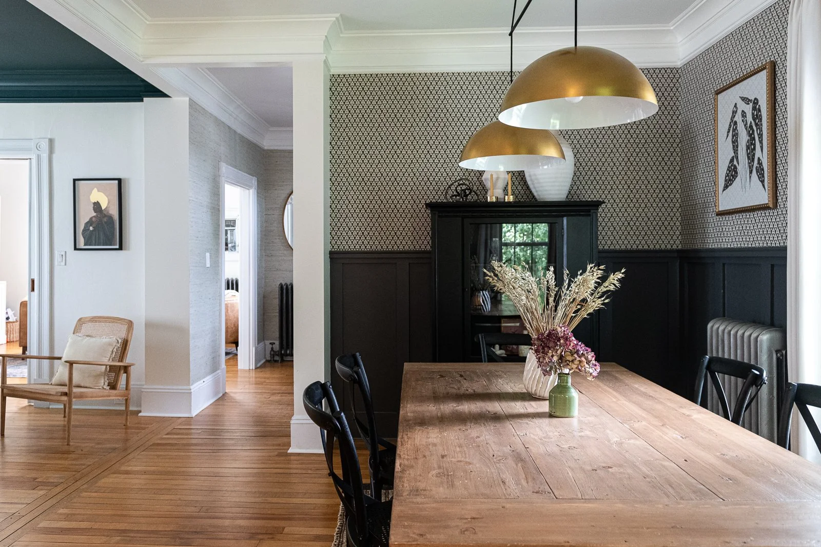
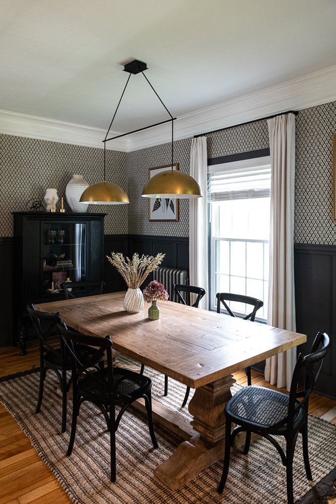
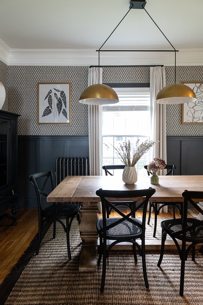
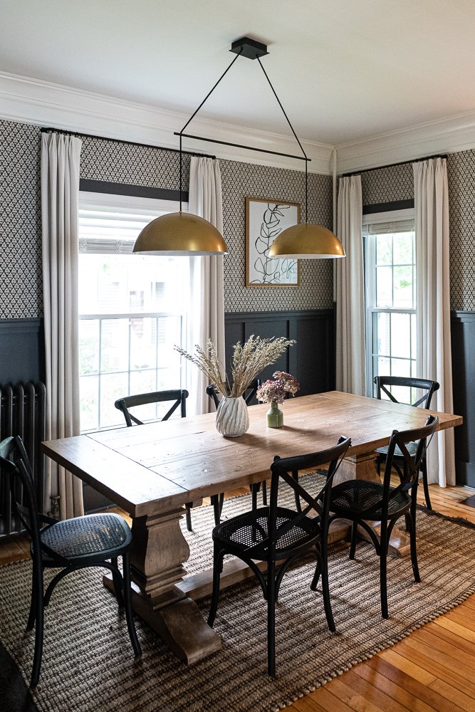
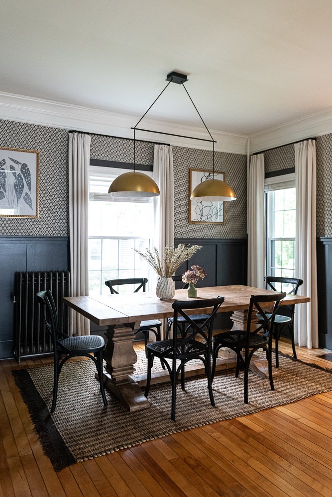
The dining room is open to the living room so we’ve complemented the colors and the feel. We went even moodier here because dining is all about taking in the visual ambiance that is around you and the lovely company you keep.
This is my favorite room of the house! See how much texture the wallpaper adds and that gorgeous crown molding? It is perfection! The clients had the armoire so we painted it with black chalk-paint and added glass. The scale is a little small for the wall so I added large vessels on top of it to fill up the space. The modern chandelier is a great counterpoint to the more traditional furnishings and is so stunning. I love the oversized scale and the hard brass patina. It’s unexpected and interesting.
Side note: I recommended that the crown molding be painted dark gray to match the lower paneling. I think this would feel more cohesive in this small space and make the ceiling feel taller. Designing someone’s home is always an exercise in compromise and so here we have it.
Small Kitchen Updates with Big Impact
Moving along to the kitchen. They didn’t want to invest too much in the already updated kitchen, so we just make little tweaks. But, as you might suspect, every detail matters.
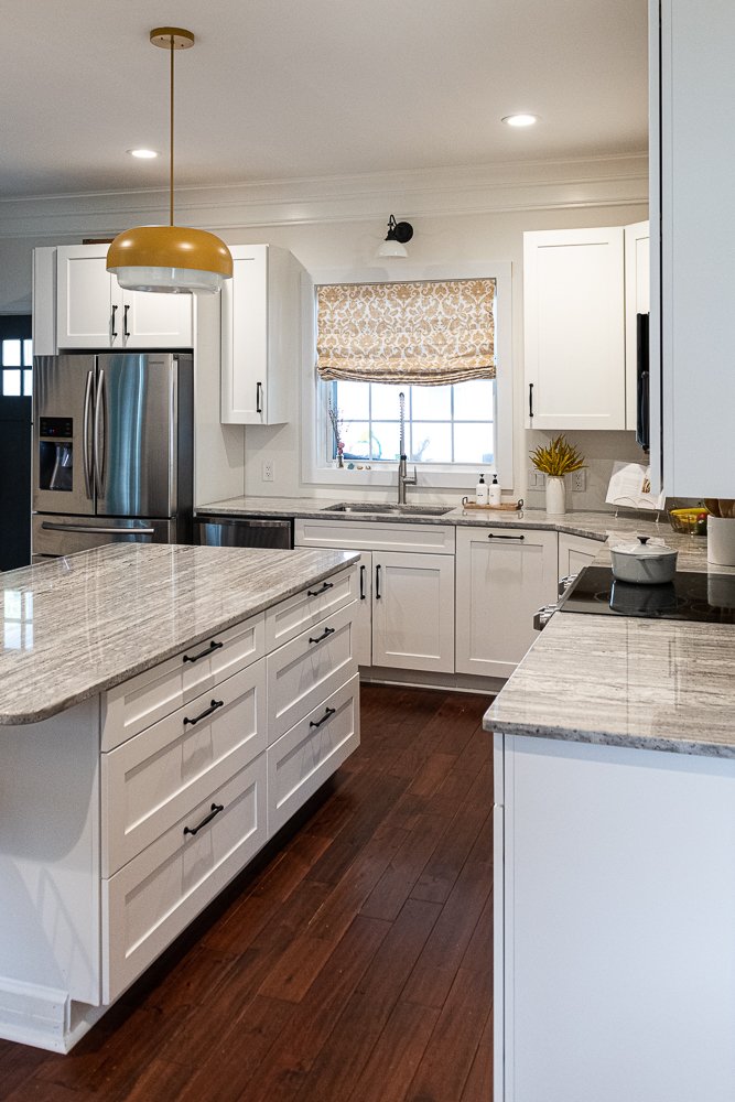
Here is what I proposed to the clients. Updating the lighting of course, adding a pop of color in the window treatments and with the island pendant, adding texture with a tiled backsplash, more crown, new cabinet hardware in matte black, and some natural elements with the furniture and a rug.
And here is where we landed. Keyword: WARMTH.
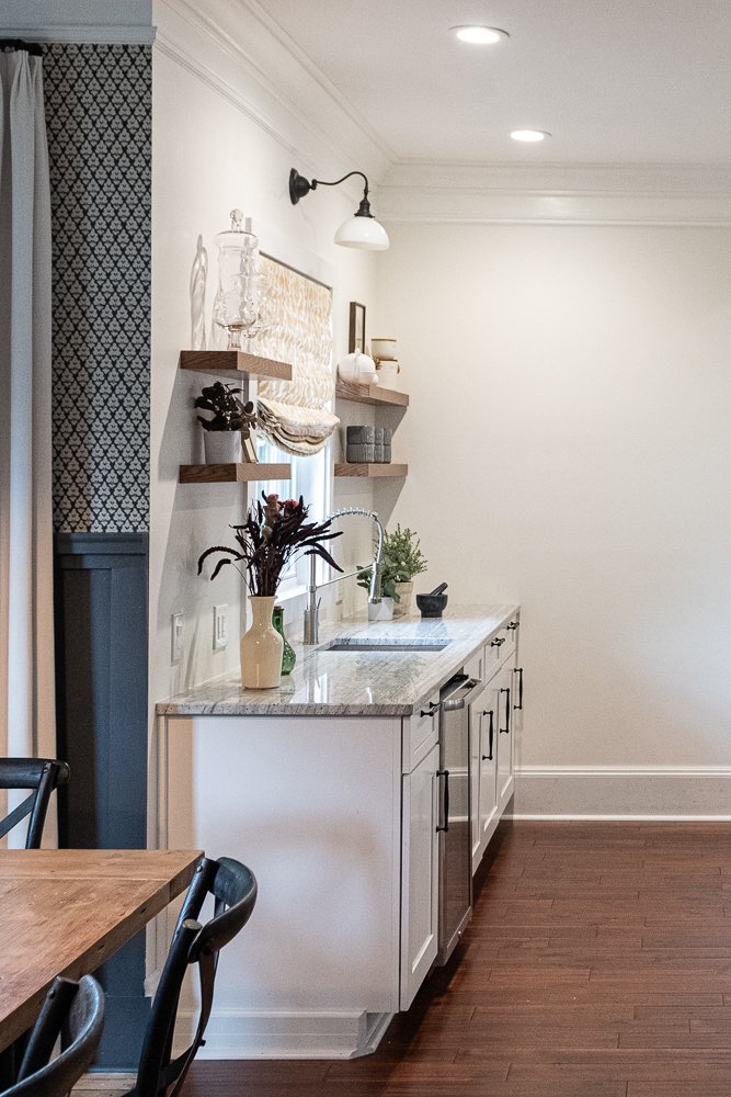
We replaced the white floating shelves with wood floating shelves, added wall sconces so they are more tailored and found more interesting, but subtle cabinet hardware to get rid of all that silver. We had to install the cabinet hardware in the existing drilled holes. It’s worth mentioning that these drilled hardware locations are not ideal. Because these top drawers are so skinning, I would have centered the hardware in the middle. Similarly, on the lower cabinets, I like to center the top screw (rather having it aligned lower.) Ergonomically, I think it’s easier to reach if they are slightly higher.
And here are a few more angles so you can see the beautiful lighting. Great lines! And the new yellow Roman shades have a lot more volume than the original ones. Have I told you how much I love Roman shades? Especially when they are cordless!
Transforming the Powder Room with Statement Wallpaper
Lastly, the powder room. More gray to snuff out. Shocking!
We are not quite finished but I wanted to share this incredible wallpaper and new lighting. We plan to add a brass mirror, another Roman shade, and a more classical vessel faucet to complete the look.
The end.
Interested in working with Violet Marsh Interiors on your New Hampshire interior design project? Book a discovery call to see if we are a fit. Cruise around the site using the navigation links below and check out our Instagram for what we’ve been up to.


