Cozy Coastal Living: A Charming Maine Cottage in Harpswell
Bringing New Life to a Coastal Maine Retreat
Growing up in New Hampshire, New England has always felt like home. It’s funny how life works - you can move 1,100 miles south to Atlanta and still find yourself working on a project that brings you right back to your roots.
This charming Maine cottage in Harpswell was purchased as a second home by a longtime Mainer who relocated to Atlanta over 20 years ago for work. Wanting to stay connected to his family and share the classic Maine coastal lifestyle with his children—then 9 and 12—he set out to create the perfect retreat by the water.
While I’m focusing on interior design in this post, it’s impossible to ignore the breathtaking setting of this home. Located on a quiet, dead-end private road, the cottage overlooks the Atlantic Ocean and a peaceful little cove. From inside, the view is all ocean - the rugged, rocky coastline extending just beyond the porch railings. Harpswell, Maine offers a slower pace, a welcome contrast to the energy of Atlanta. Arriving here, you’re instantly greeted by the crisp salt air, and a deep sense of calm takes over - like a long exhale.
The home was originally owned by an older couple and sold "as-is," meaning it came fully stocked with everything they left behind. From kitchen essentials to shelves full of books, puzzles, and stuffed animals, the space needed some serious editing before it could truly become a welcoming retreat.
The first step was to create a functional furniture layout that would bring comfort and cohesion to each room. The “before” photo below shows an eclectic mix of mismatched chairs and metal lamps—elements that felt more outdated than inviting. While some may say there’s a certain New England aesthetic to cold, hard furnishings, this transformation was all about warmth, comfort, and making the space feel like home.
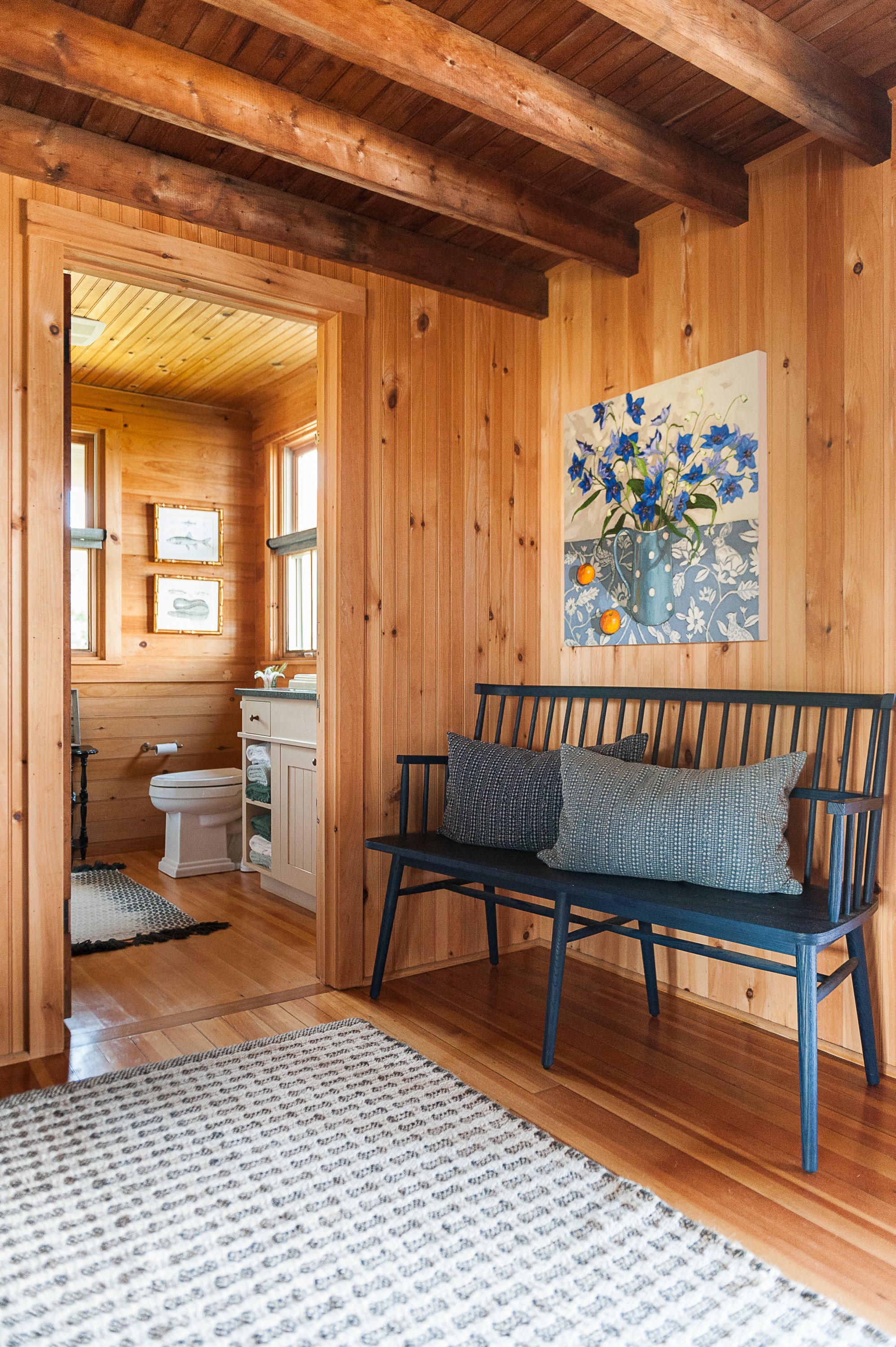
There was an L-shaped wall that blocked the view of the ocean and created a dark and narrow hallway that did not have any purpose.
We tore the wall down (pictured below) and removed the floating red enameled stove (you can see the red pipe above the art.) This allowed the space to really open up and connected the kitchen with the dining and living room.
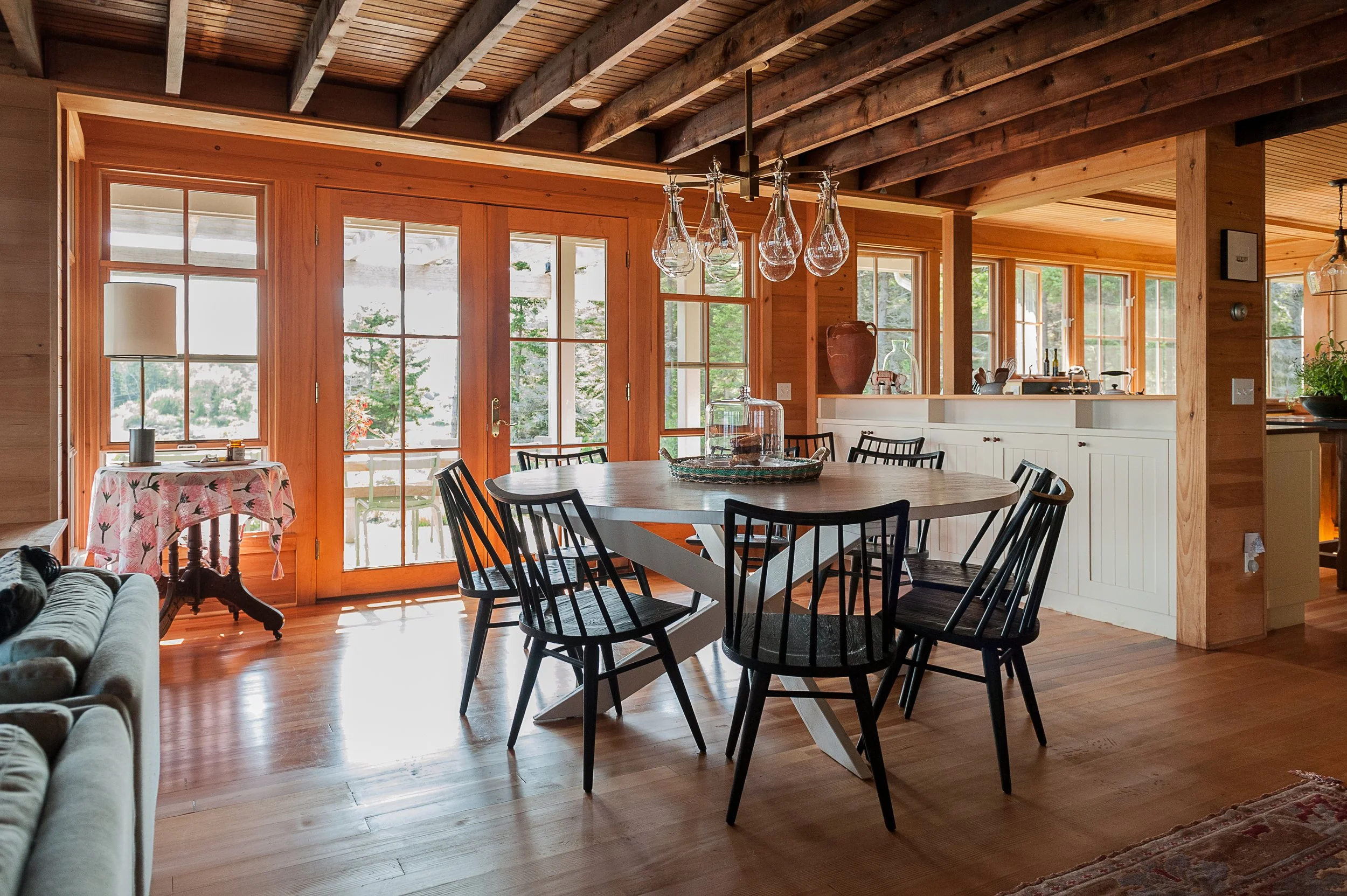
This change also helped to accommodate more seating in the living room and allowed for better circulation in the dining room because we were able to center a large table in the middle of the room to accommodate nine lovely people. Previously they had a rectangular table that was off to one side of the room near the French doors. Relocate a chandelier? No problem!
“That creepy crow has got to go!” was my cheer.
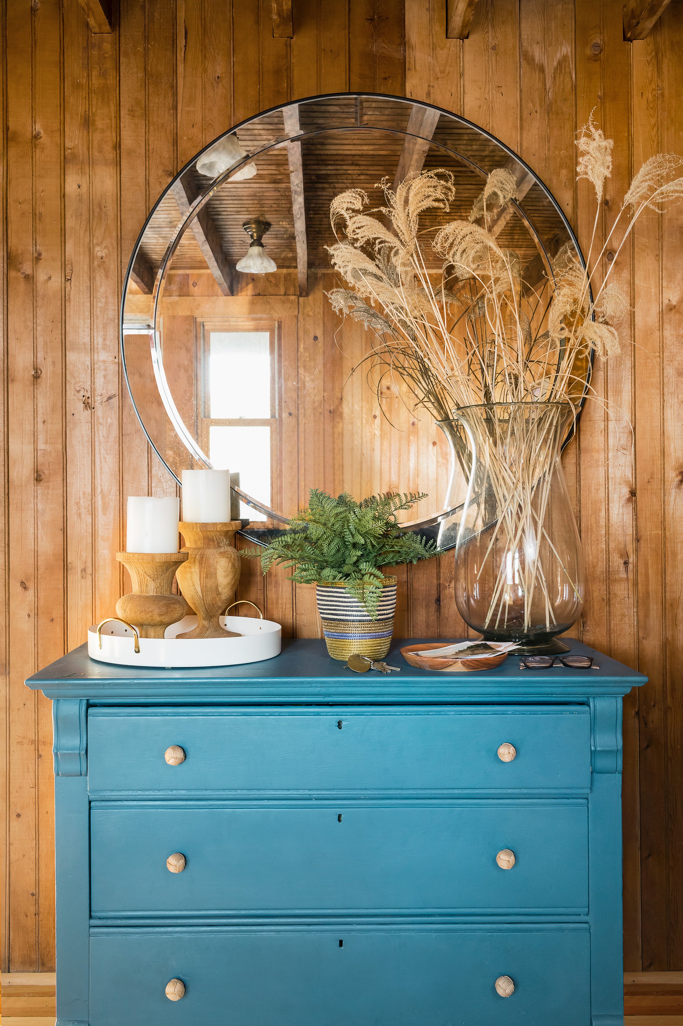
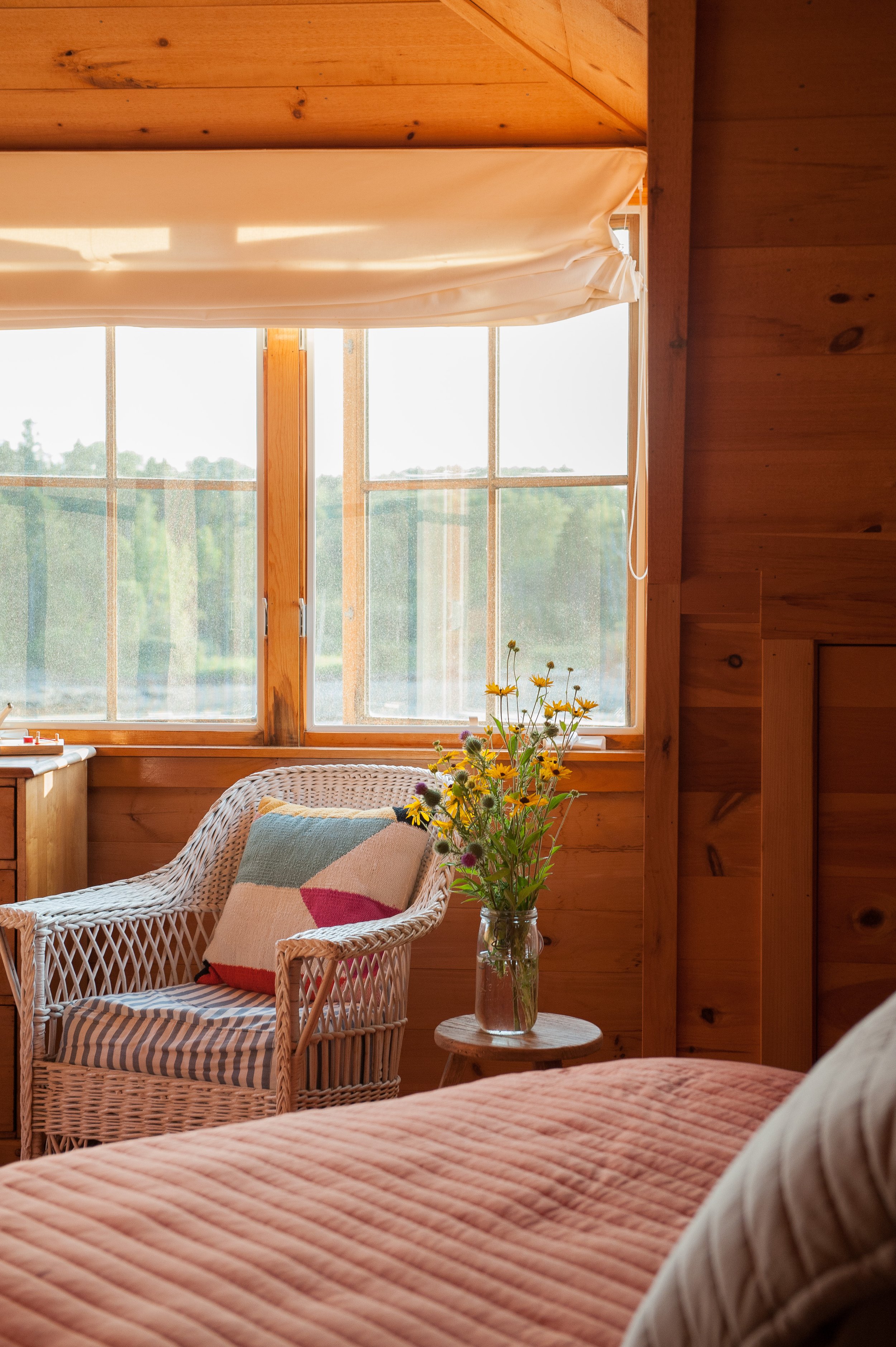
Having said that, however, there were a lot of treasures to keep. I love a day spent rummaging through second hand shops. I repurposed several pieces of furniture— wicker chairs, a few small occasional tables, and wood dressers, and kept several pieces of original art, and a few decorative items like a brass dolphin and a wooden boat. I also found a gorgeous clay pot in the shed (pictured below) and really great books like, The Romance of Casco Bay.
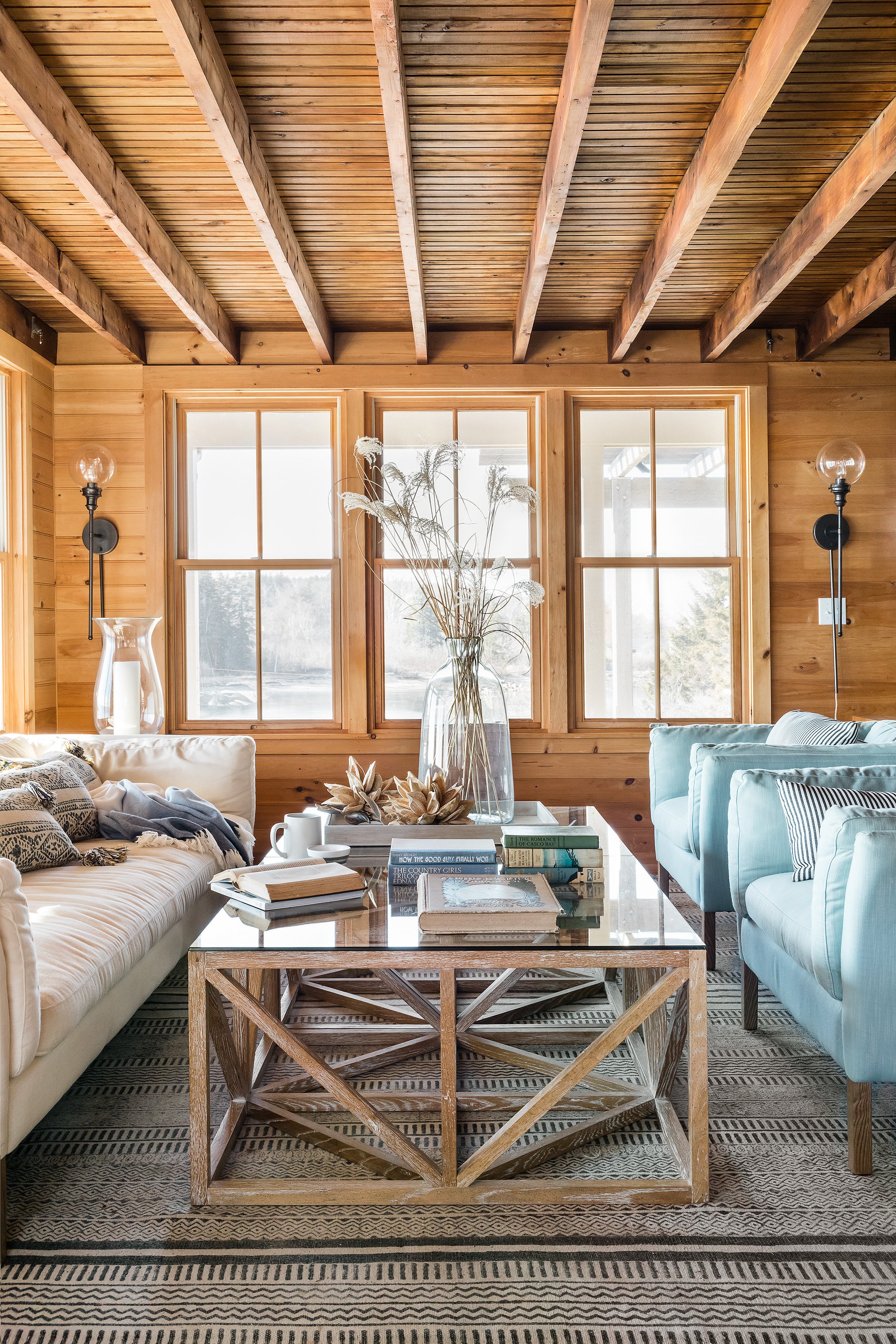
It never fails that the before images are always SO BAD! Rather than have lot’s of lamps everywhere, we added 3 plug in sconces along the walls in the living room. This saves table space and looks fabulous. The small living room can now accommodate 10 people very comfortably.
See that wicker chair below? I spray painted it fire engine red, made a new cushion and put it on the front porch. It’s the most coveted seat outside with the best view.
A Timeless Kitchen with Classic Maine Cottage Charm
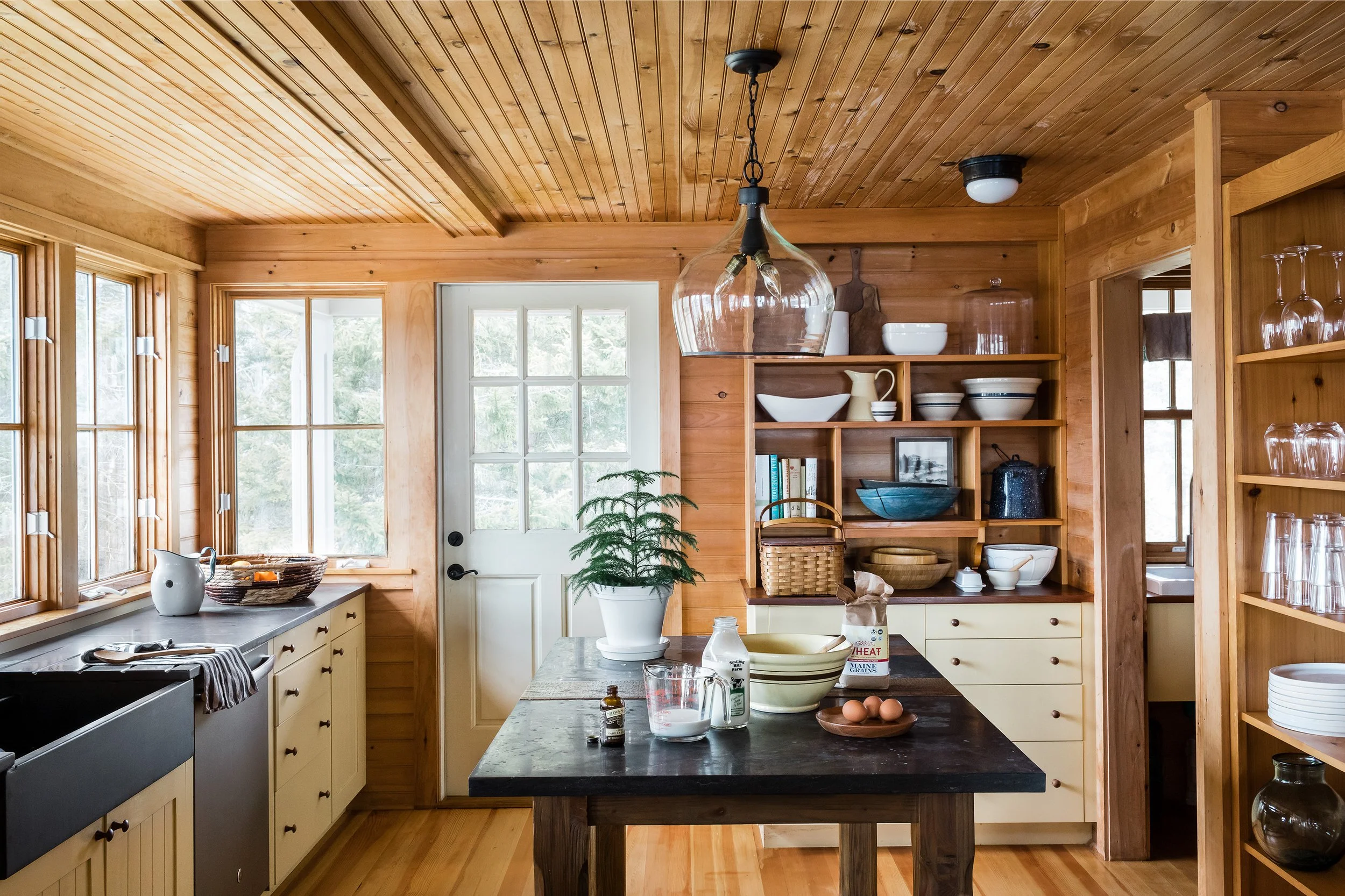
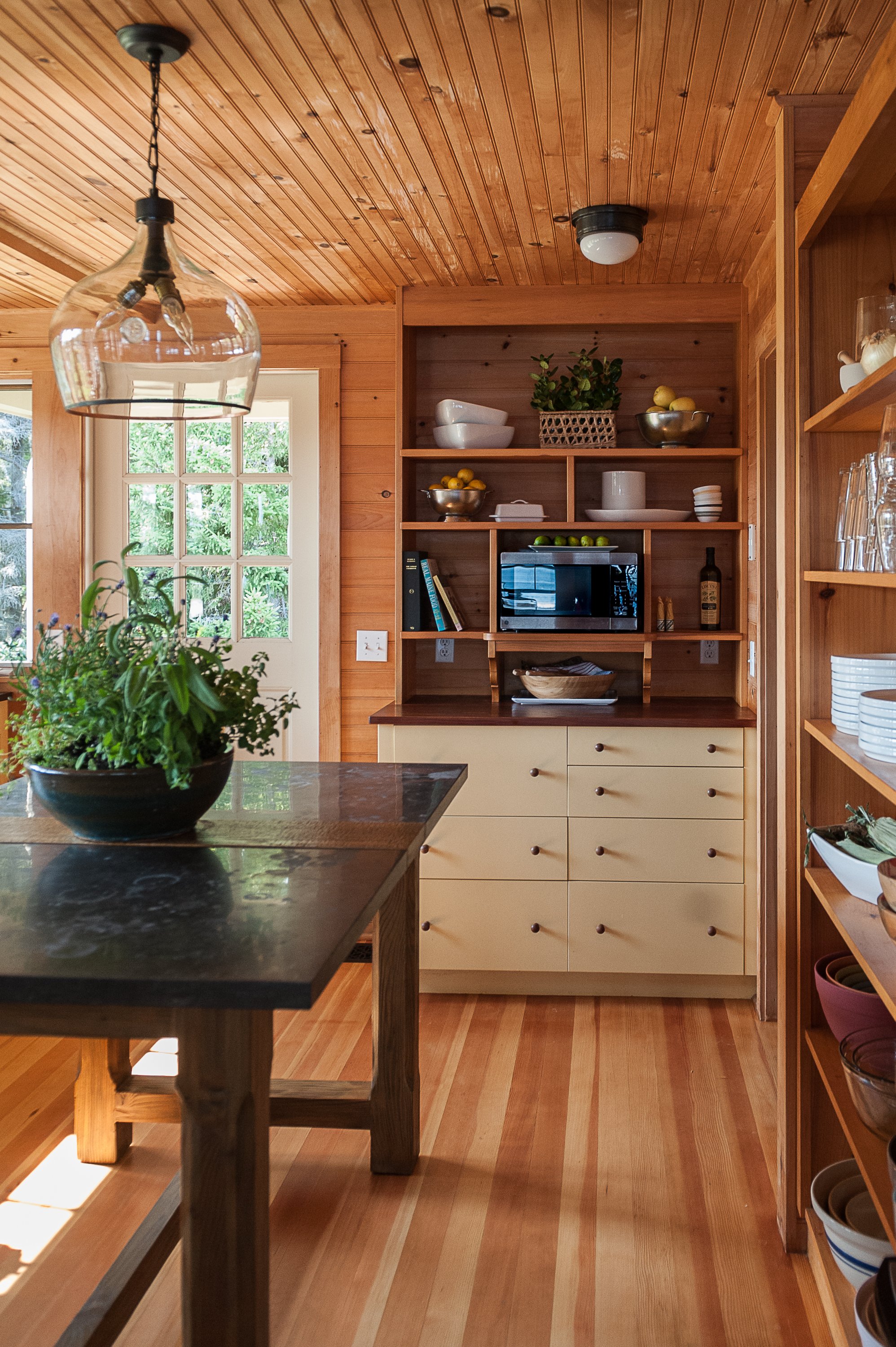
The kitchen renovation had stood the test of time, likely dating back to the early 1990s. Since it was well-built and still highly functional, we kept most of the existing elements intact, making only a few thoughtful updates. We upgraded the plumbing and lighting, installed a more appropriately sized kitchen island, and added finishing touches to enhance the overall aesthetic.
This space is a testament to quality craftsmanship—when you invest in well-made materials, they last for decades. The kitchen already had all the essentials: a large farmhouse sink, a built-in breadbox, ample storage for cookware, and plenty of natural and task lighting. With just a few modern updates and careful styling, it remains a beautiful and highly functional part of this coastal Maine cottage.
The new kitchen island fits the space so much better, proving that proper scale in interior design makes all the difference. And that ceiling light fixture? Its shape reminds me of a wine bottle, adding a unique touch to the room. Many homeowners underestimate scale when choosing furnishings and fixtures, but in most cases, you can go bigger than you think for a more balanced look. The dark island color also feels far more sophisticated and timeless compared to the original pine finish.
When it comes to styling open shelves, there’s a bit of an art to it. The key is to mix varying sizes and shapes while maintaining a cohesive color palette so everything relates harmoniously. The beauty of these shelves is that they’re both functional and visually appealing - every item serves a purpose while contributing to the overall aesthetic of this coastal Maine kitchen.
Bathroom Updates: Blending Modern Comfort with Classic Maine Cottage Style
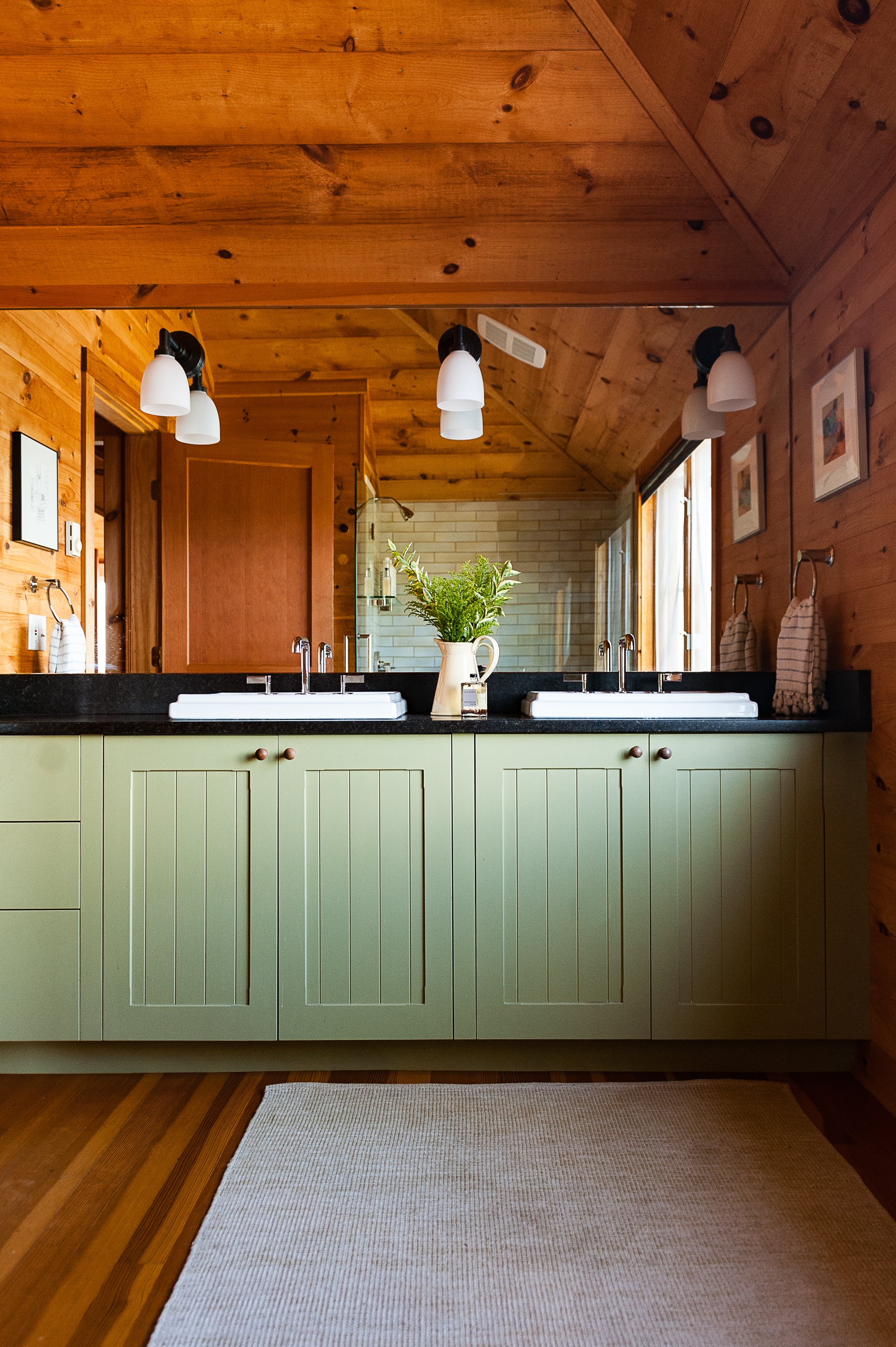
The bathroom renovations followed a similar approach, preserving what worked while making strategic upgrades for a more refined and functional space. The existing bathroom cabinets were in great shape, so we kept them, but we wanted to elevate the overall feel by replacing the rustic, camp-style lighting with more modern fixtures.
To enhance the design, we introduced a new bathroom countertop material, upgraded all plumbing fixtures, and improved the bathroom mirror setup for better functionality and aesthetics. One of the biggest transformations was replacing the outdated plastic tub enclosures with custom tile work, adding both durability and timeless appeal. We also updated one tub and converted another into a walk-in shower with a glass door, creating a more open and luxurious feel.
These thoughtful changes brought a fresh yet classic look to the space, perfectly balancing the coastal Maine cottage aesthetic with modern convenience.
Awww isn’t that so much better? Clean and fresh but still cozy and cottage-like. (Yes, that is me taking the photo in the shower…I suppose I could have cropped it but it’s nice to see the new subway tile in the shower.) You can also see how wood when exposed to sunlight darkens over time. I removed a square picture that had been hanging on the left.
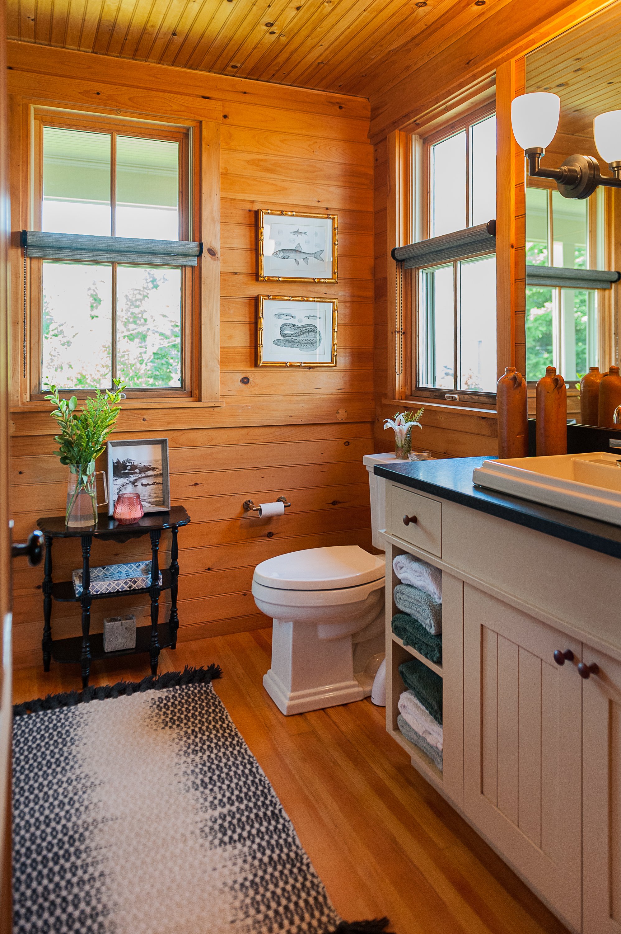
We used the same drop in sinks, plumbing fittings and sconces in both of the bathrooms. I like to keep it simple when I can. There is no need to reinvent the wheel.
Odd location for a hand towel, don’t ya think?
Coastal-Inspired Bedroom Updates for a Cozy Maine Retreat
There are 3 bedrooms in this home and the guest room below has sort of a “Coastal Grandma” vibe which we decided to expand upon.
We updated the furnishings in the bedrooms and the roman shades (after these images were taken.) We added blackout shades which is so nice for guests when the sun rises at 5 am in the North East.
Do you see those stuffed animals tucked into the closet drapery rod? If you want to torture me, make me live with stuffed animals. I don’t think I ever liked them even as a kid. I wanted to talk about the wallpaper and your parent’s bedroom.
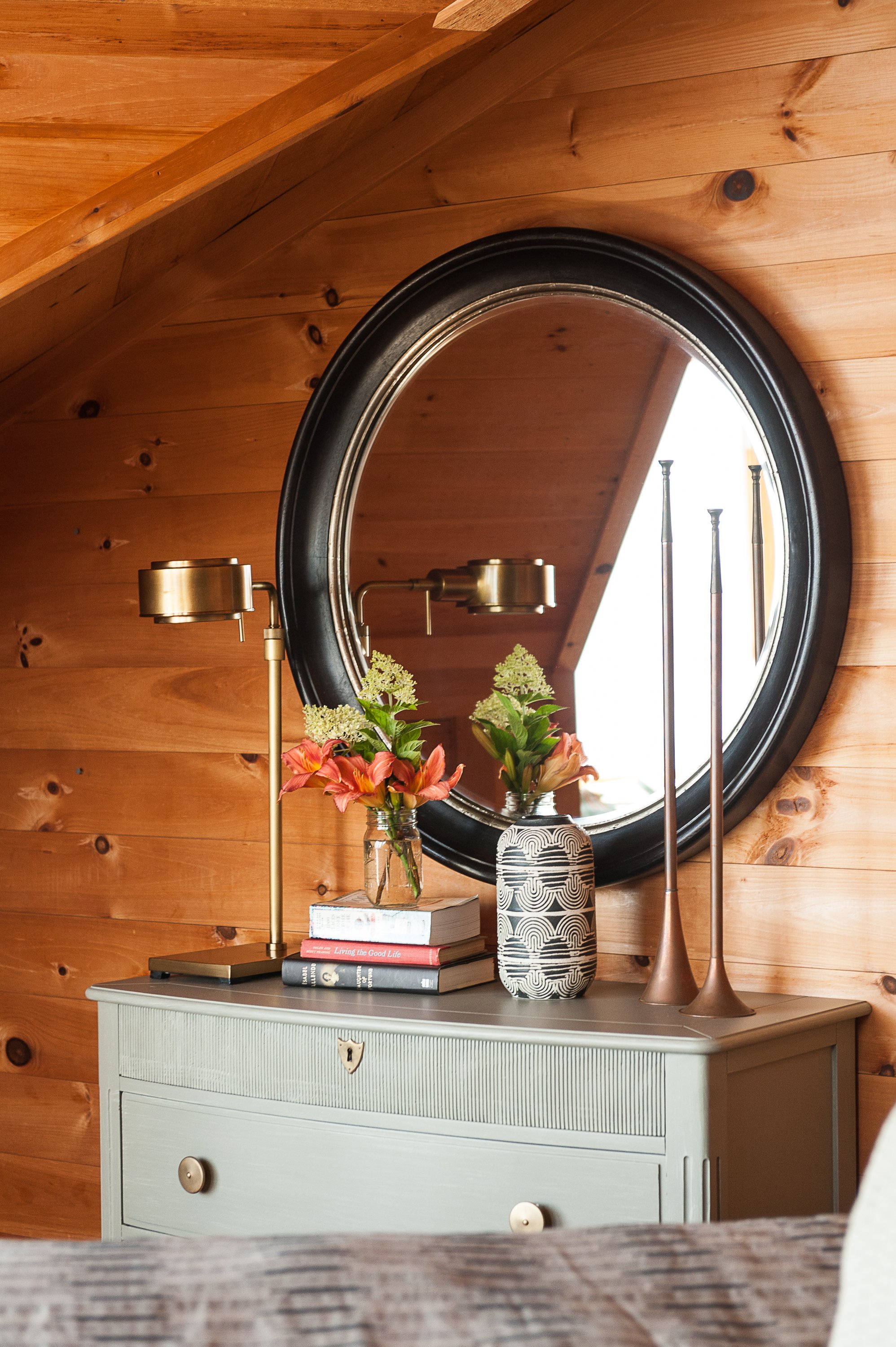
I cannot emphasize enough how important accessories are! I hope this before and after helps to deepen this point. Accessories personalize any room and bring interest and texture. Here we have a beautiful nautical feel, brass mirror, more art, hats as a collage, and dried foliage. I am pretty sure that this makes me a typical interior decorator, but I love fresh or dried flowers and greenery. They are always appropriate. That basket of guest towels is pretty cute too. The painting on the right side is a watercolor of the cottage that came with the house… you can see how it sits on the rocks. Don’t you want to be a guest here!?
Below is my Pinterest inspiration for this project. I love the discovery part of a project and looking through the work of so many talented and creative folks. It gives me all the feels, as they say.
As I am pulling a project together, I create a private Pinterest board to organize the final selections. It’s very helpful to see how the elements come together digitally. The items below were all sourced for this project from a variety of places. I use a mix of trade-only vendors and retail stores depending on the project budget, location, and timeline. The client and I loved each and every item below. Do you see most of these items in the finished space? I suppose I am a nerd, but it’s a fun game to play.
Principal Bedroom Refresh: A Timeless Update with Classic Coastal Charm
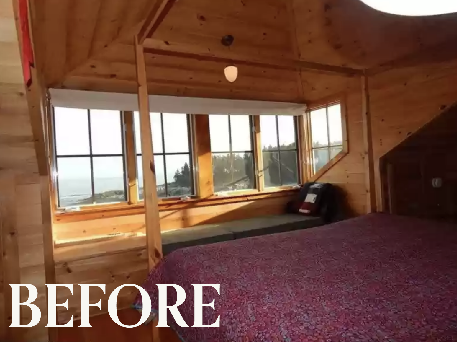
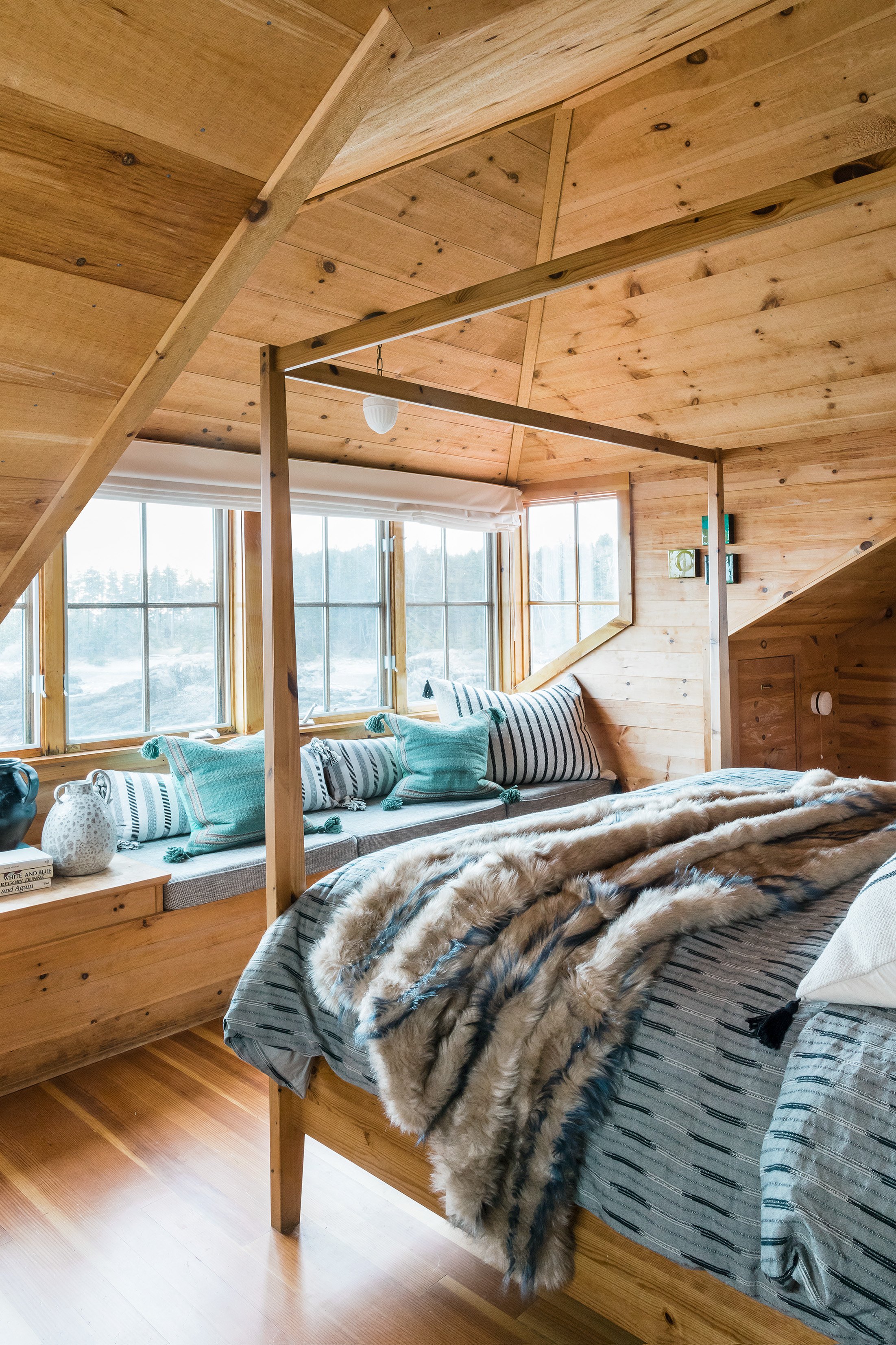
Moving upstairs to the principal bedroom, you can see we kept the ceiling light and the bed frame. There was a lot of hunter green and cranberry red in this house which are two popular colors from the 90s. We neutralized the color by adding lots of black and white and a touch of green. Have I mentioned how much I love pillows yet? You can’t have enough! A window seat is the prime spot for layers of pillows so you can actually sit there and be comfortable. I see so many window seats that don’t have ample cushioning. We can do better than that.
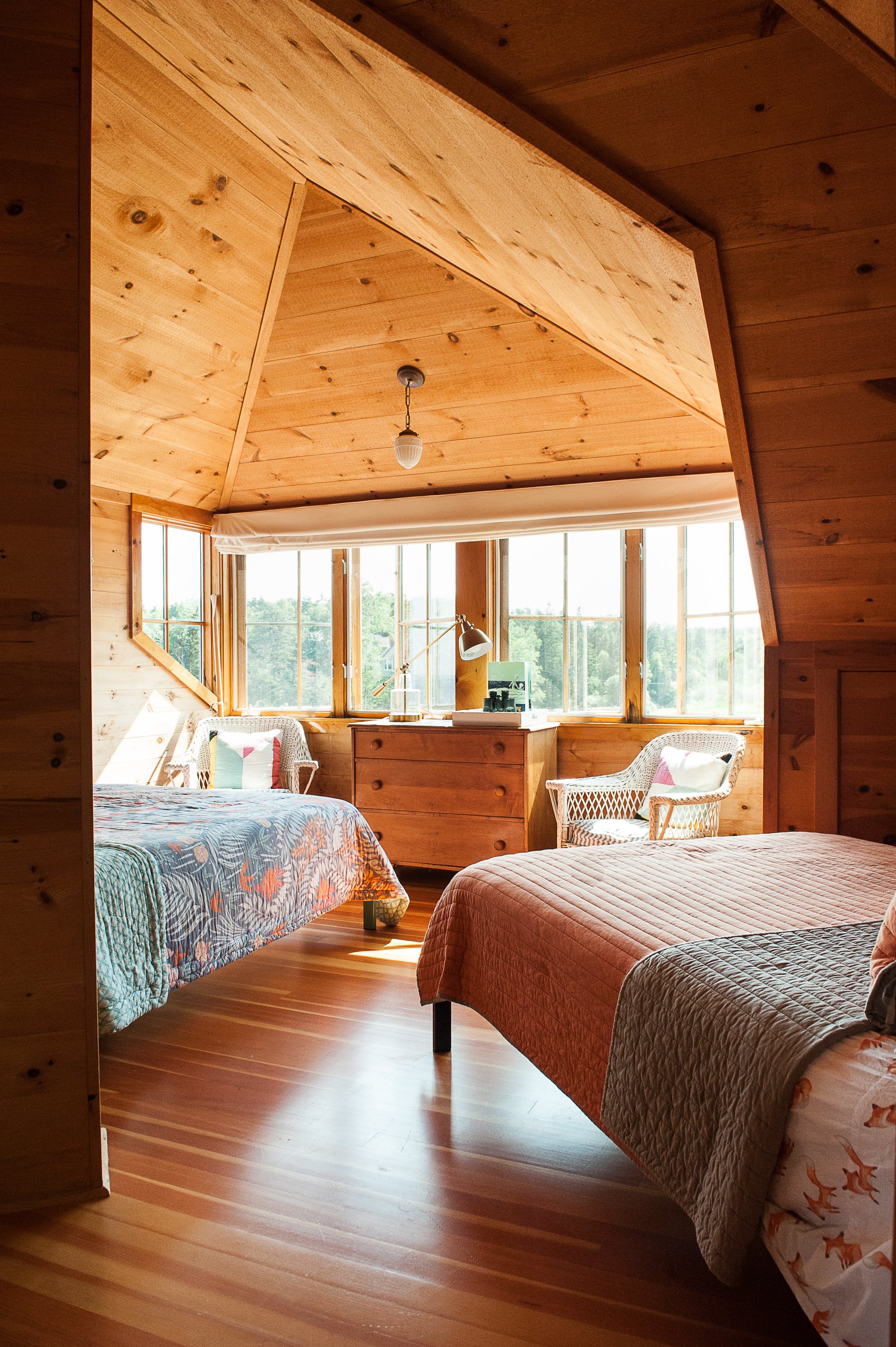
In the kids room, we went a little more playful and light. Aren’t these high ceilings lovely?
A home is always evolving and changing just like we are.
The end.
Interested in working with Violet Marsh Interiors on your Atlanta interior design project? Book a discovery call to see if we are a fit. Please cruise around the site using the navigation links below and please do let me know how I can help.

