Family Friendly Chastain Park Residence
This young family found this house in an ideal location near Chastain Park in Atlanta. The layout and the natural light is great but the cabinetry, flooring, millwork, and lighting was in need of an update.
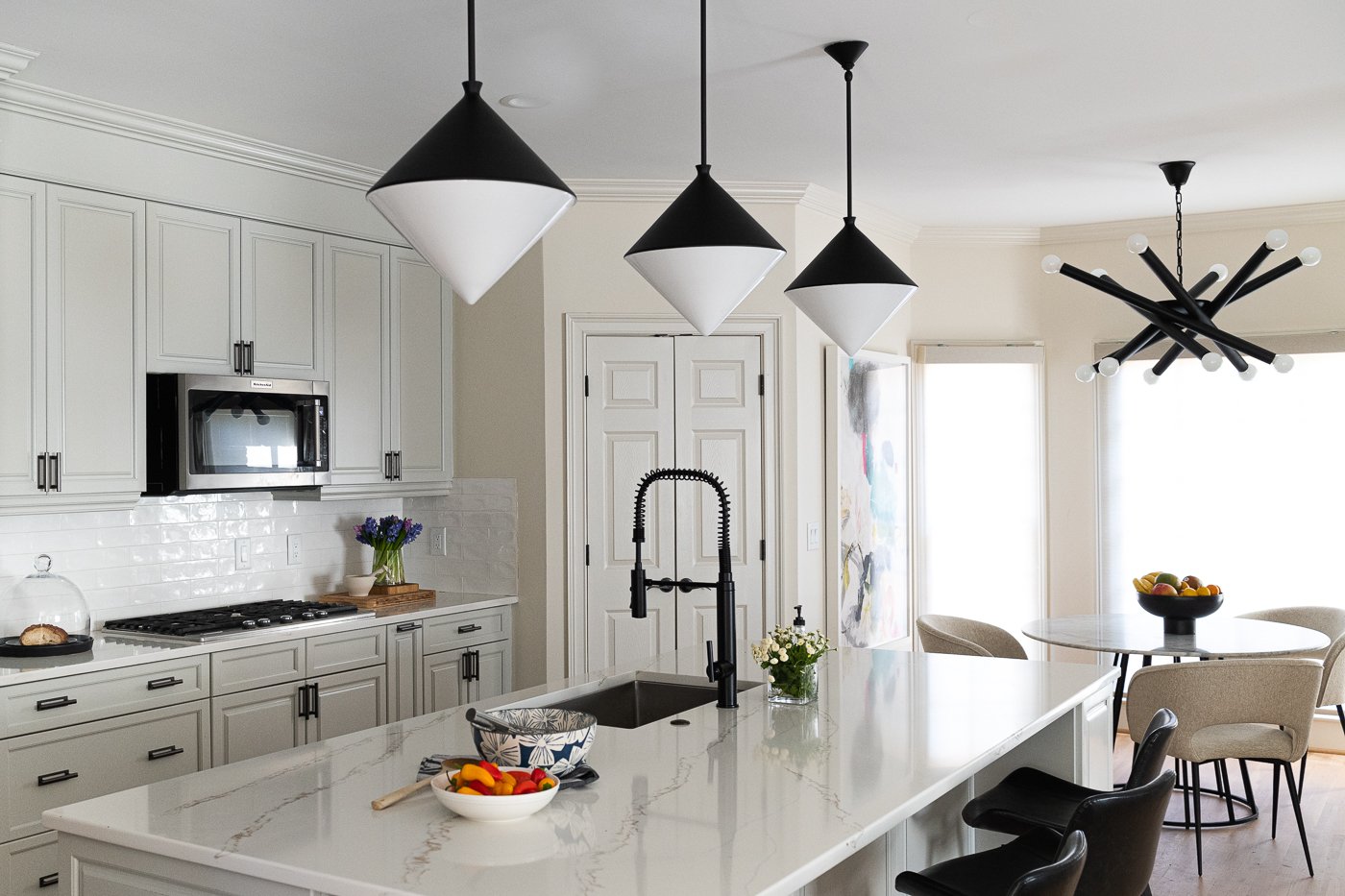
This kitchen is massive! There is storage for days, seating at the island and it conveniently connects to the open family room. The client wanted to update the look of this kitchen while also furnishing the rest of the home. The appliances were in great shape, the layout is strong, and the tile backsplash and quartz counter were neutral and easy enough to work around.
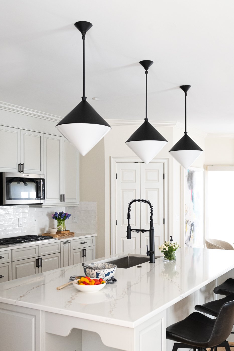
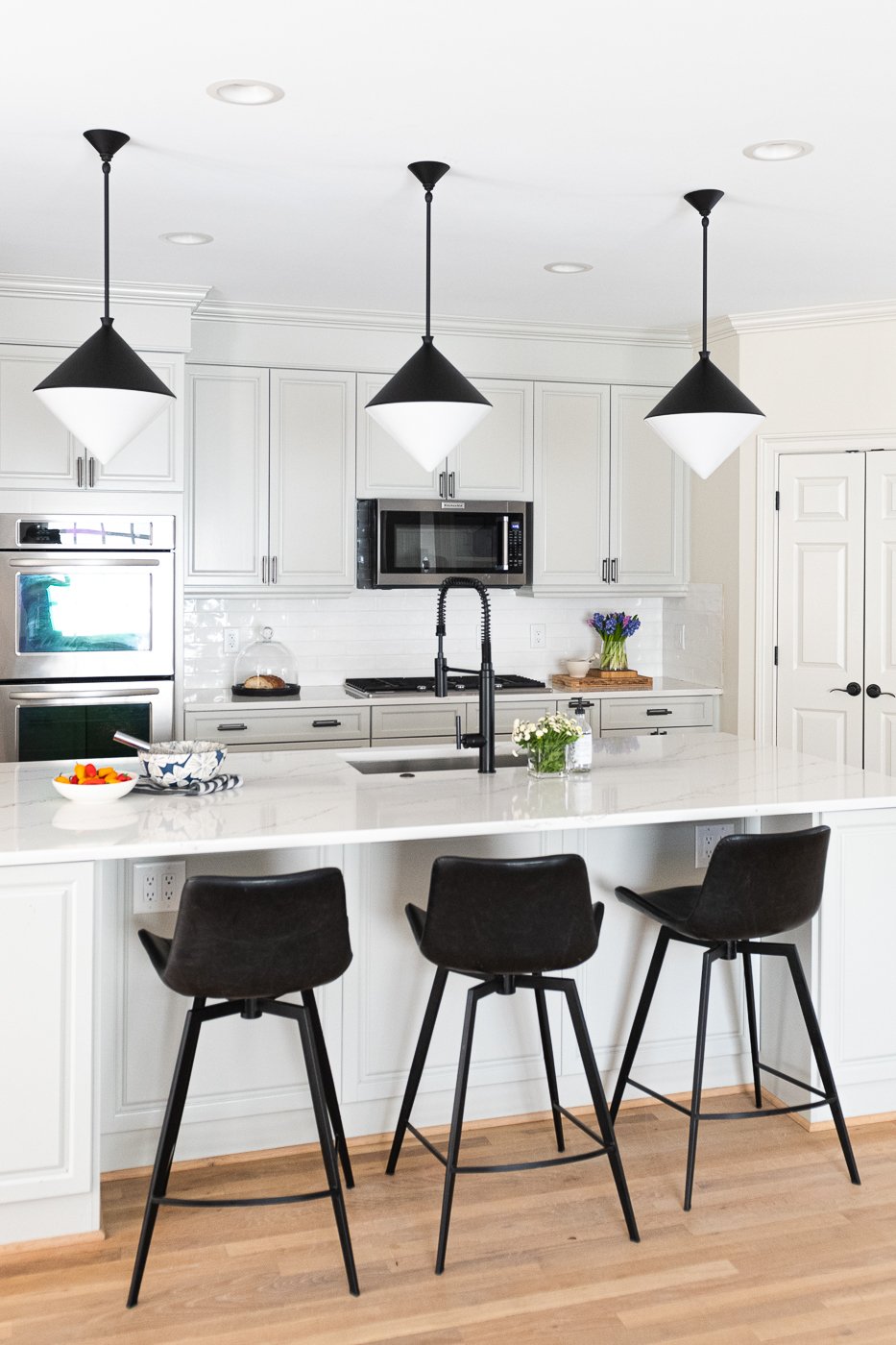
We lightened and neutralized all of the hardwood floors throughout the main floor. We decided on a pale gray paint color for all of the kitchen cabinetry and added dimension with the bold pendant lighting and the matte black faucet. The other change we made here is swapping out the cabinet hardware. This makes such a difference! Cabinet hardware is one of my favorite small details of a design project. In this case we used a beautiful dark nickel, almost black finish. It’s very unique.
Looks like a completely different kitchen, right? I love how the natural light bounces all around. These pendant lights are from Visual Comfort and the counter stools are from Arhaus. They are faux leather and easy to clean. In the Pinterest below you can see all of the selections. The client had the table already and in the Pinterest you can see some window treatment ideas that I proposed.
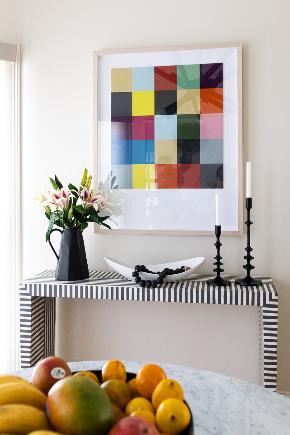
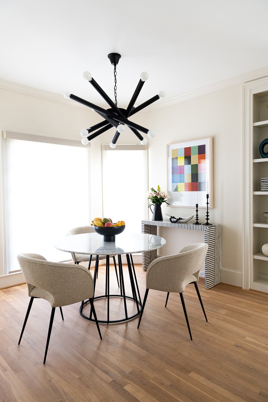
Moving along to the spacious breakfast nook, check out this before and after. You just need the right paint color, the right lighting, the right furniture and the right art. That’s ALL!
We carried the theme of dramatic black lighting in this area since everything is neutral and white. The client had this table which fits nicely and I added oversized colorful art to brighten the space and add energy and this amazing black and white striped console table. It’s so cheerful and welcoming and is such a great place to start the day.
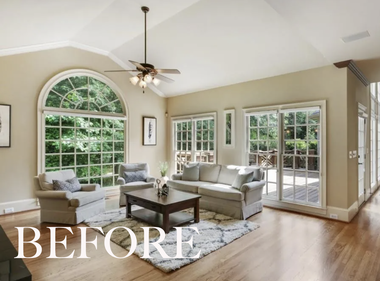
Directly across from the kitchen is the family room. Again, the natural light is perfect but the color of the walls is drab and depressing and that old fan has gots to go. And the wood trim that is creeping in over in the corner.. will never understand what people do that.
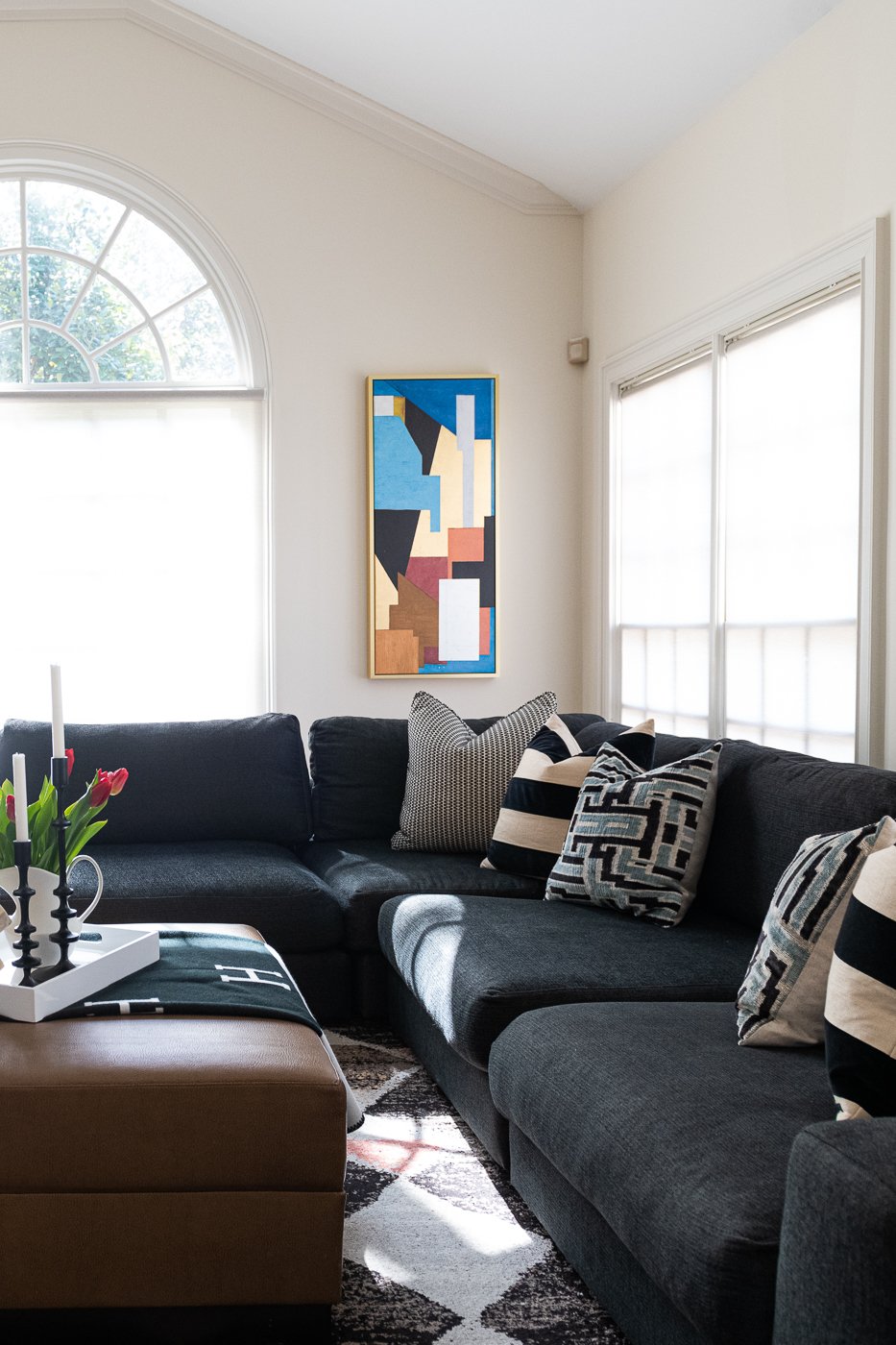
The room needed energy. This client loves black and white and lots of contrast and so do I! We found a massive, super soft sectional sofa; we recovered an oversized ottoman with a faux leather to add some texture and to break up all of the dark gray. We added interesting art, a large scale patterned rug, and a pair of sculptural wooden floor lamps that add warmth and functional lighting in the evenings.
The room is still in need of window treatments, and I know this is shocking but, I don’t always get my way. Even without the window treatments, it’s a dramatic interior transformation.
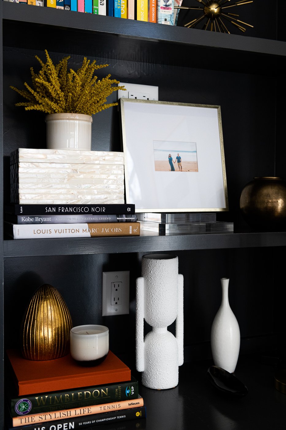
We styled all of the built ins with some existing family photos, books, boxes, and vessels. Every sofa and chair in my opinion looks best with a pillow. Don’t be afraid of pillows. They add so much to each space.
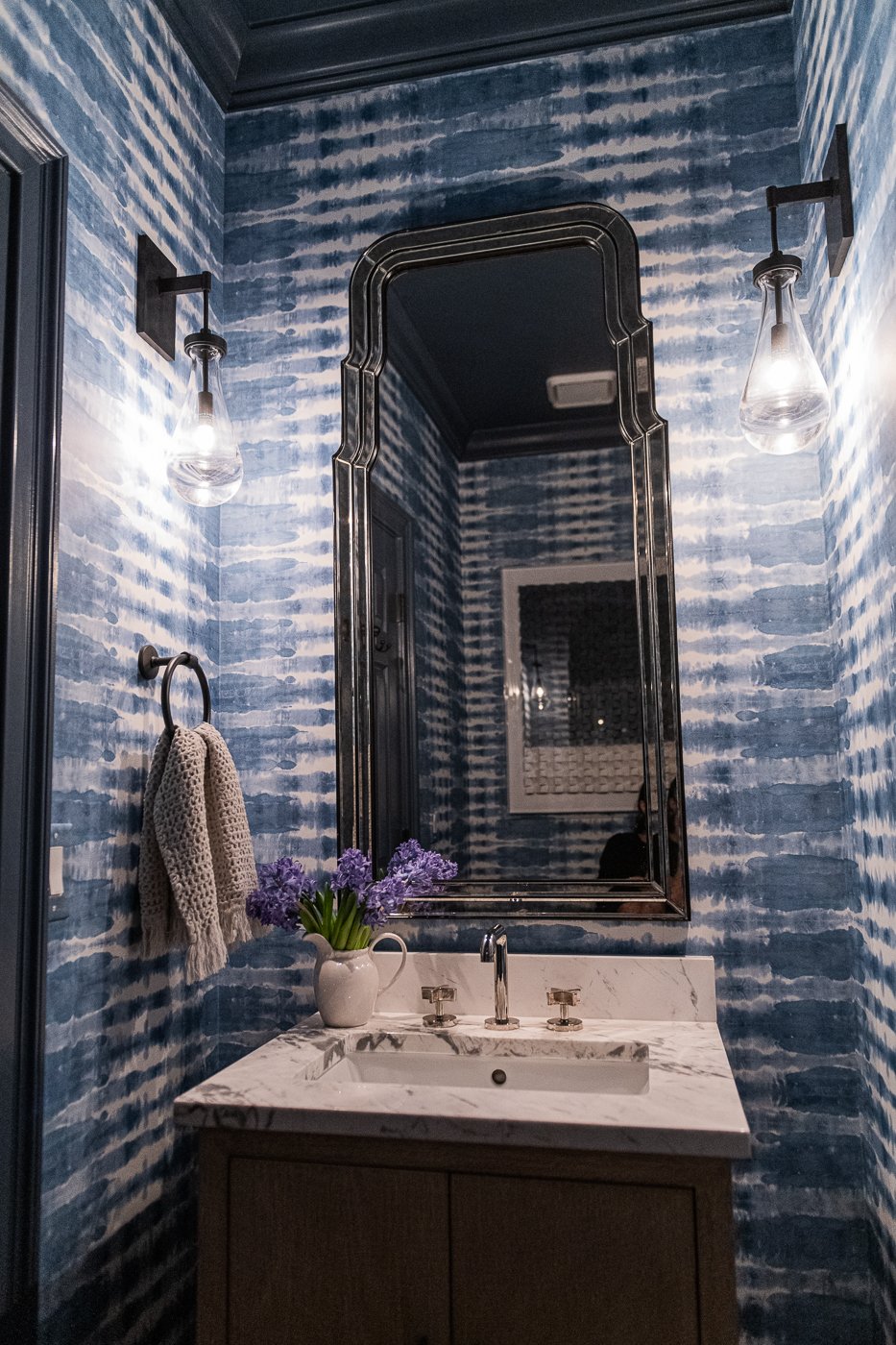
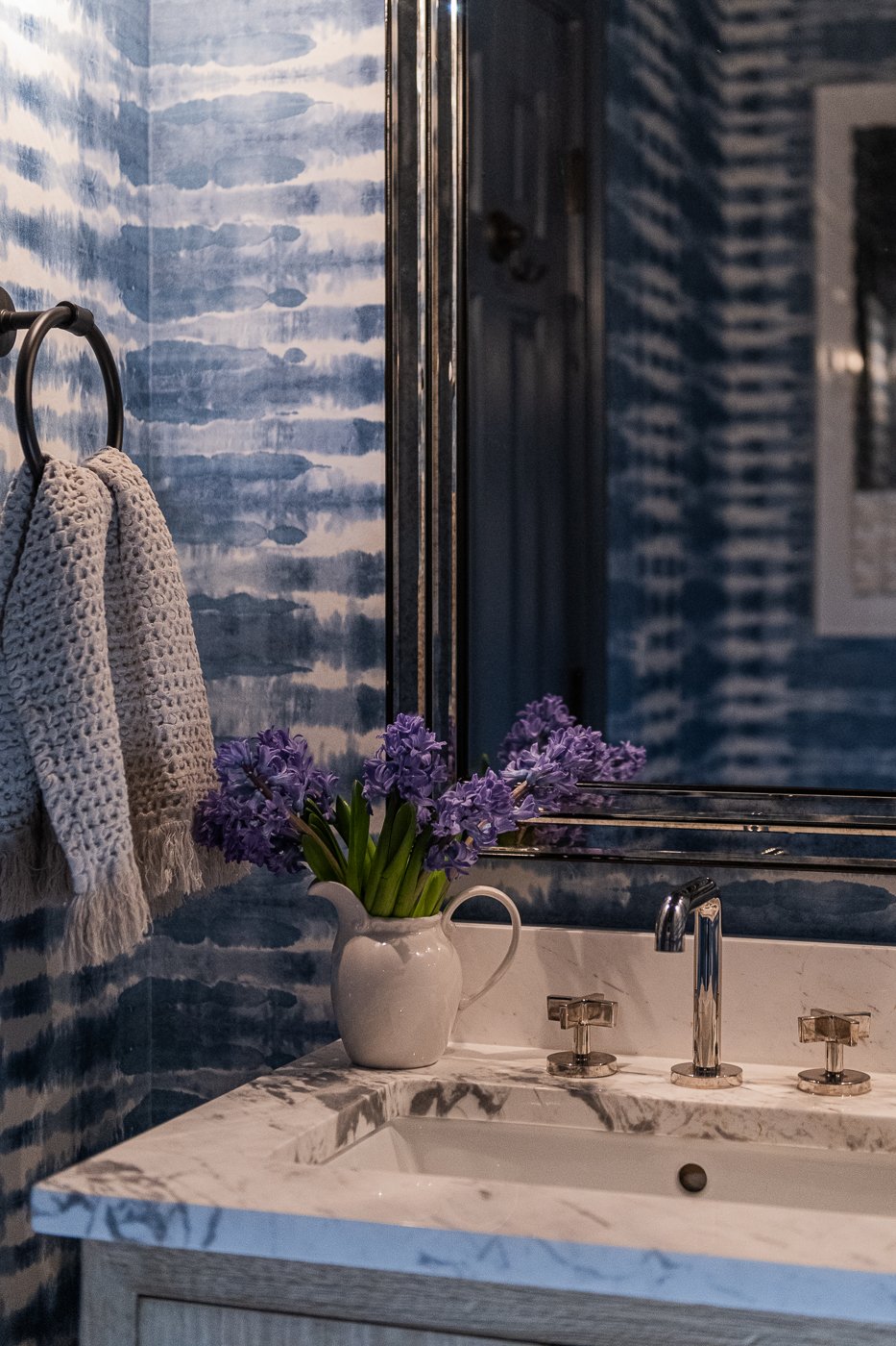
In addition to black and white, this client really loves the color blue. For the powder room, we went bold with this gorgeous watery wallpaper, a new vanity, sexy lighting from RH, a dramatic oversized mirror, new plumbing and a marble counter top. It’s very hard to photograph these small dark spaces, but this gives you the feel. We get all the drama out in our interiors so we don’t have any in our lives.
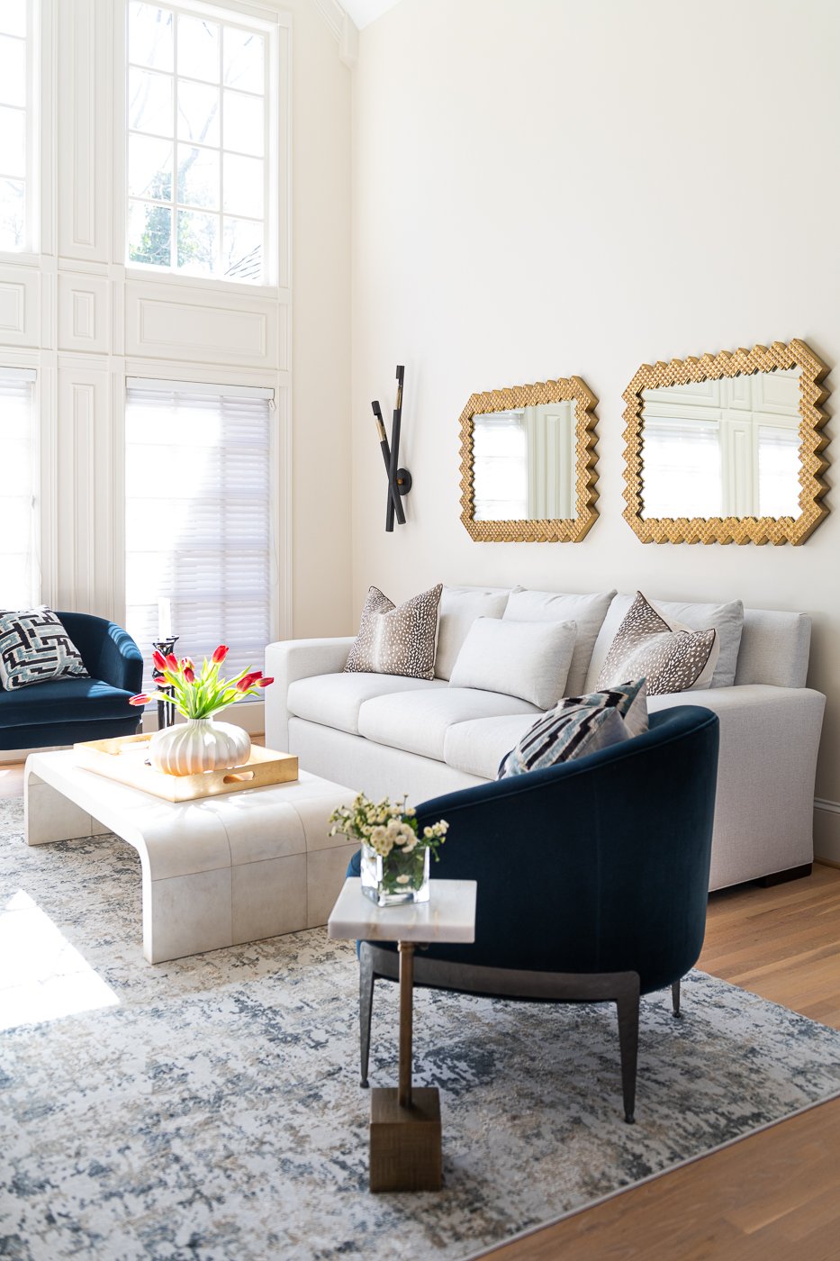
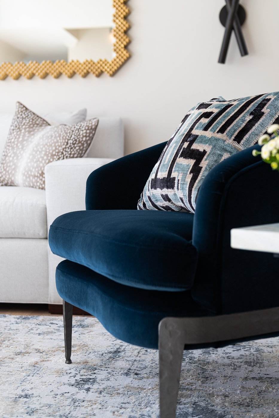
The formal living room is on the other side of the kitchen, and again has an abundance of natural light but didn’t have any wired lighting so we added the wall sconces for evening ambiance. We paired a set of white modern sofas with two blue velvet chairs on top of a large modern rug.
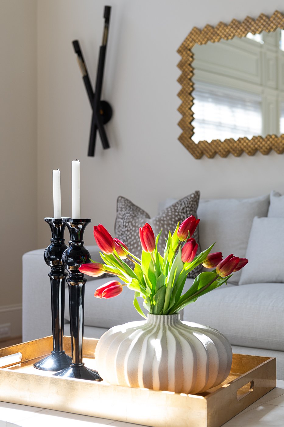
I love the texture of the gold mirrors. They add warmth and sophistication.
The coffee table is made of parchment and is a creamy white with great curves.
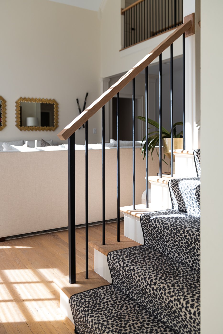
You may have to reference one of the before images to remember the existing railing. They were super traditional and chunky. We fixed that. We also added runners up both sets of stairs which not only looks great but dampen the sound of people running up and down the stairs. The living room reads very neutral but this deep blue velvet is delicious.
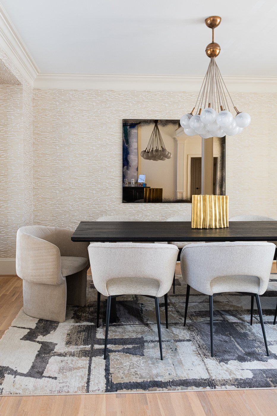
In the dining room, we were working with a clean slate. We wanted to keep it fairly neutral but add texture.
Here’s what we picked. A beautiful cream and gold wallpaper, a moody oversized antique mirror, a modern and playful chandelier and a dark rug to ground everything.
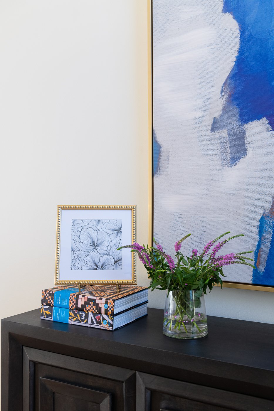
I love the pattern play! The small scale wall covering with large scale dark and moody rug. You can’t see the gold on the table from this angle, but it is there. In the reflection of the mirror, on the opposite wall, you can see the entryway where we added an oversized black sideboard and a giant piece of abstract art. We also added a dramatic oversized light fixture. The rooms flow from one to the next so the palette is constrained but never boring.
In my next house, I will have the principal bedroom, laundry, and my studio all on the main floor. It’s SO convenient.
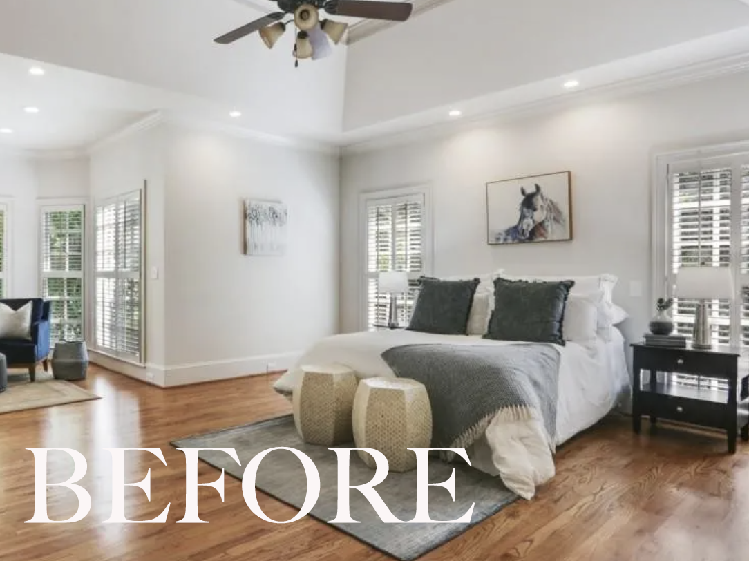
Feast your eyes on this serene bedroom. Isn’t this what you need when you have two small children under three? A retreat. A way to soothe yourself. A place for just the adults.
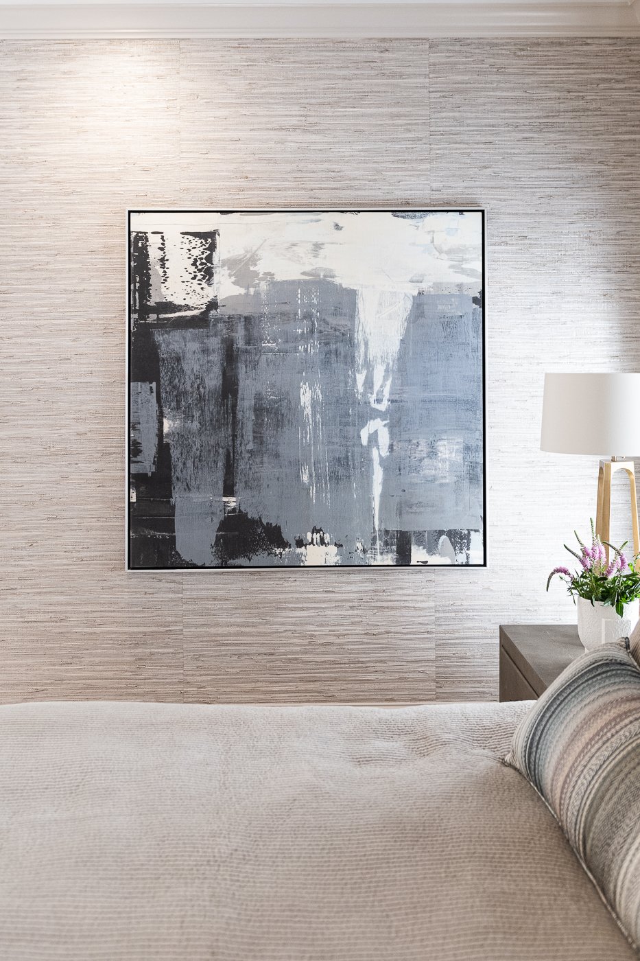
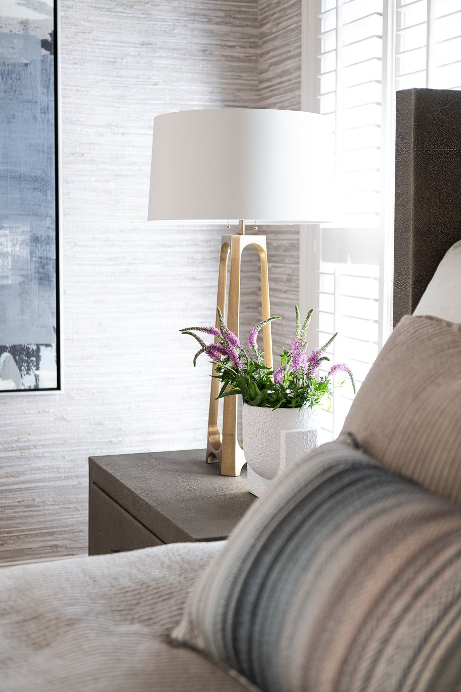
We started by wrapping the walls in this gorgeous grasscloth. The grasscloth has pale gray, cream, and soft brown tones. It softens the room and makes the walls more interesting. The client had already selected this bedroom set and the rug from RH, so we layered in the oversized lamps, the bench, the bedding, the art, and the custom lumbar pillow. This lumbar pillow is my favorite. The fabric has several shades of every color of the room and ties it all in so perfectly.
Now that we have wallpaper, the plain painted walls above feel so cold. So harsh. Sharing a detail of the art and the airy brass lamps below.
The bathroom was probably the most dramatic change. You can tell this was originally built in the 90’s because the shower is on an angle and has a knee wall. In 20 years we are going to be saying that about all of the arches that we see this decade. They’re fun now because they are new, but they likely won’t age well. The other element that strikes me as particularly 90’s is the square earth colored tile and of course the earthy granite counters.
In this example, it’s well done on the floor but as it works its way into the shower it feels heavy. And the horizontal lines are not making sense. There is a line of dark mosaic tile in the shower, a line where the tile ends, a line where the glass frame is held, a line at the top of the window, and a different line where the tall cabinet ends. That is too many competing horizontal lines and they don’t seem to have a relationship with one another.
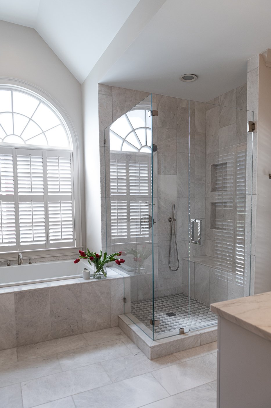
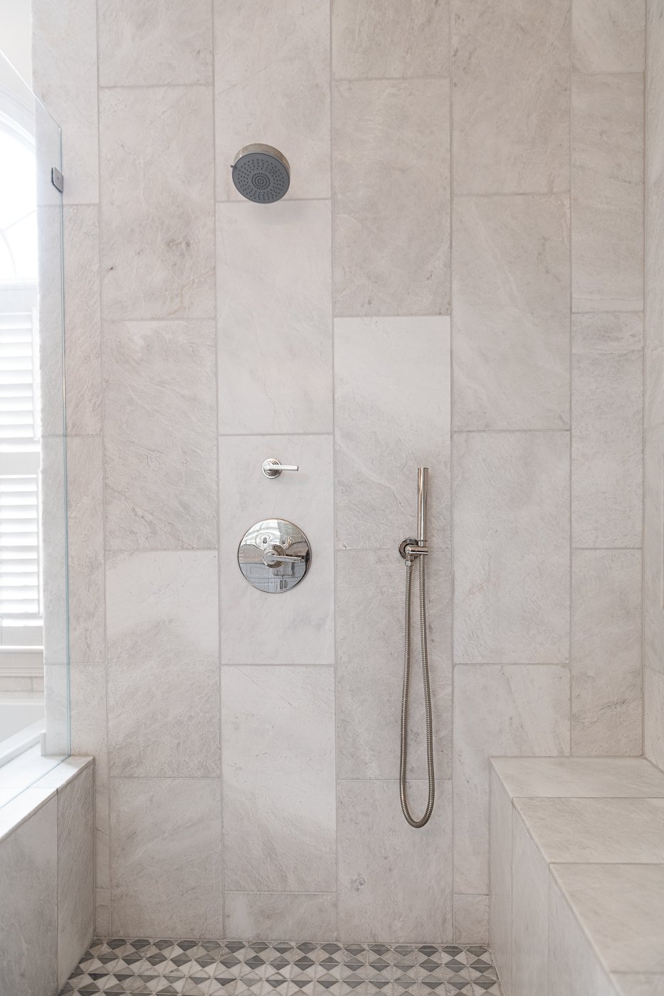
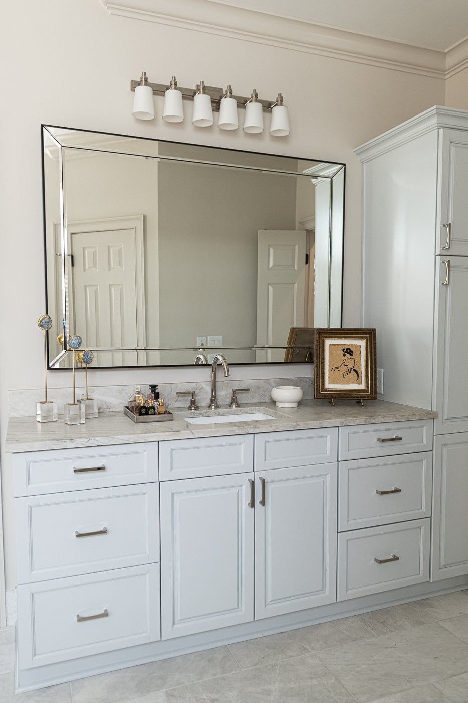
We lightened and brightened the space and got rid of the angles and the drippy bronze hardware. We painted the cabinets a pale blue, added new quartzite counters. The flooring is marble and runs vertically within the shower. And the tile runs all the way to the ceiling. We added a bench and a his and her niche in the shower. All of the plumbing is polished nickel which is so beautiful with the gray.
The mosaic floor tile in the shower is my favorite part. It’s so lovely! We found oversized mirrors, and updated the lighting with a large polished nickel fixture that has dainty white glass shades. Everyone loves a free standing tub, but those are also very trendy and not as functional. With a tiled in tub, you have a shelf to put your stuff.
Bye bye knee wall and towel bars. Hell tub filler centered on the window. I also love the look and functionality of a hand shower.
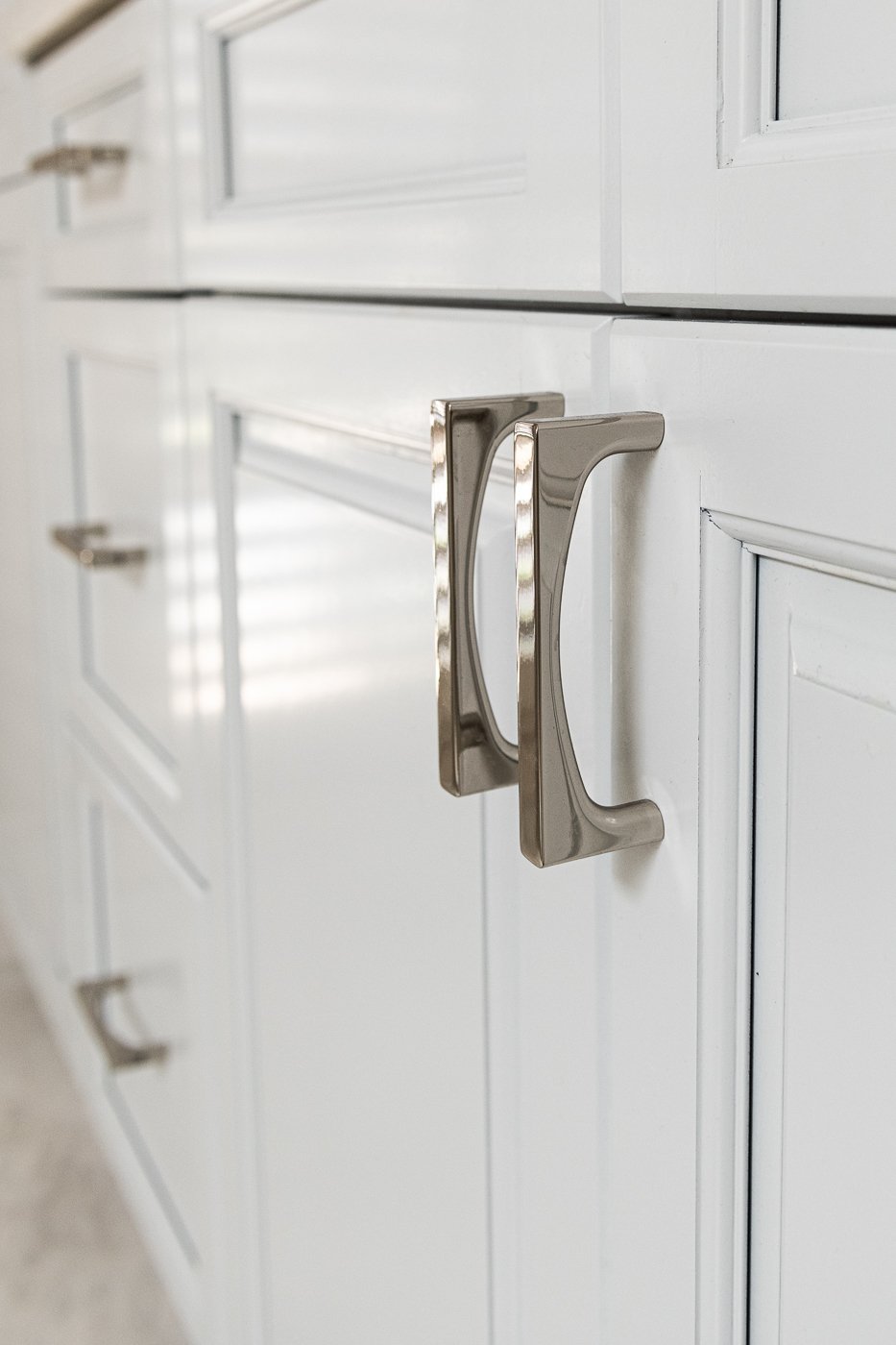
I love the high neck sink faucets and check out these special polished nickel cabinet pulls. They are beauties.
The end.
Interested in working with Violet Marsh Interiors on your Atlanta interior design project? Book a discovery call to see if we are a fit. Please cruise around the site using the navigation links below and please do let me know how I can help.

