A Historic Atlanta Restaurant Transformed
Old Vinings Inn is a historic property located in Vinings, Georgia just outside of Atlanta. It’s a two-story restaurant that serves lunch and dinner and has live music upstairs in the bar several nights a week. It has undergone various renovations over its history and has been a staple in the community as a post office, a general store, and a filling station. For 25 years it has been a restaurant and all of the nooks and crannies are interesting and the food is simply delicious. It’s American style (steak, burgers, chicken) with a Southern bent (grits, fried green tomatoes, candied bacon.)
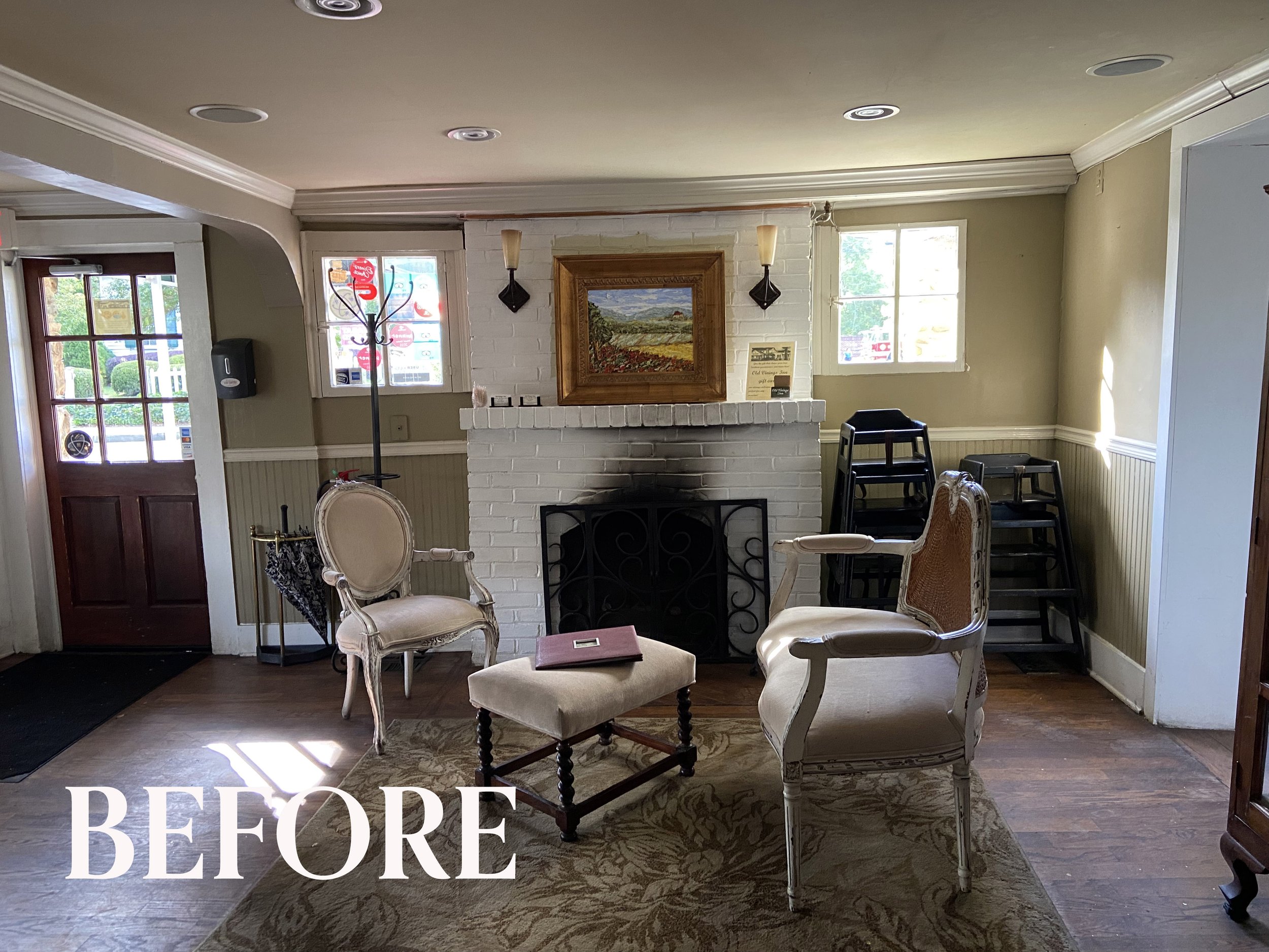
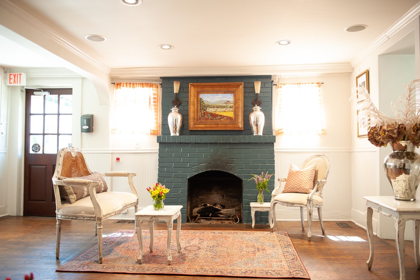
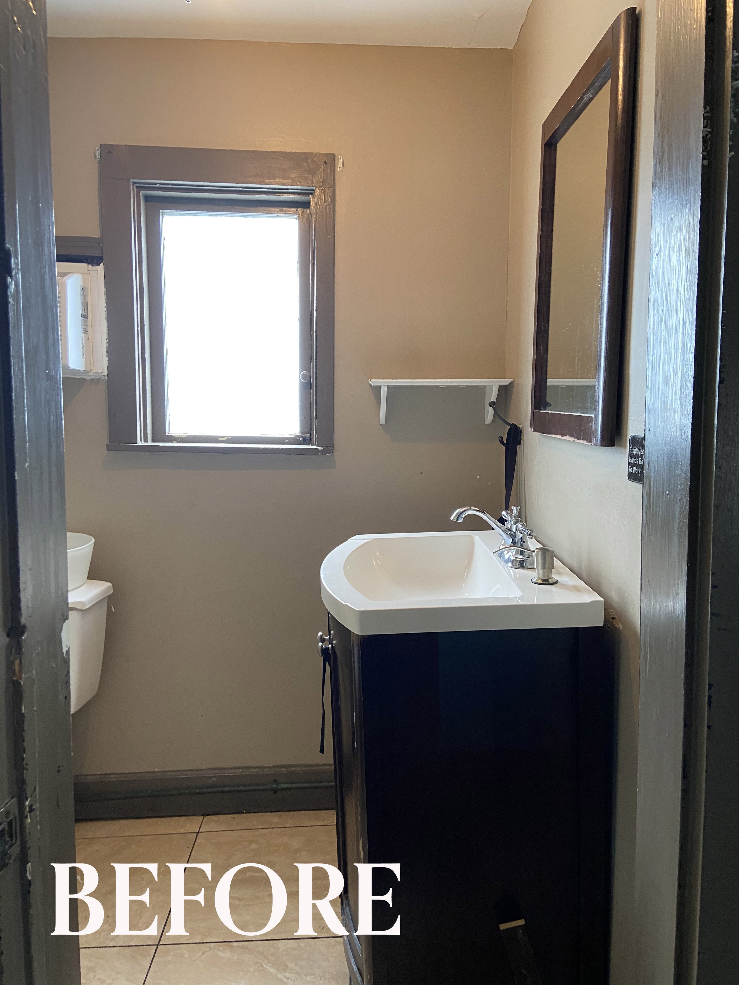
To start with, the owner wanted to update the look and feel of the bathrooms, one of the dining rooms on the lower level, and the small waiting area that you see below. While we were at it, we added a fresh coat of paint to the other dining rooms, styled their private dining room they call The Bear Room, and re-installed their existing art collection.
See what a fresh coat of paint can do? It’s transformative. We painted the walls, ceiling, and trim a warm neutral white called White Sesame by Sherwin Williams. We selected a darker color for the fireplace, so the soot marks are less noticeable and added a contrasting sheer orange curtain for a little texture and energy. We added a larger rug, rearranged the existing seating and tables, hung the art and added a few beautiful mercury glass vases and a dried flower arrangement.
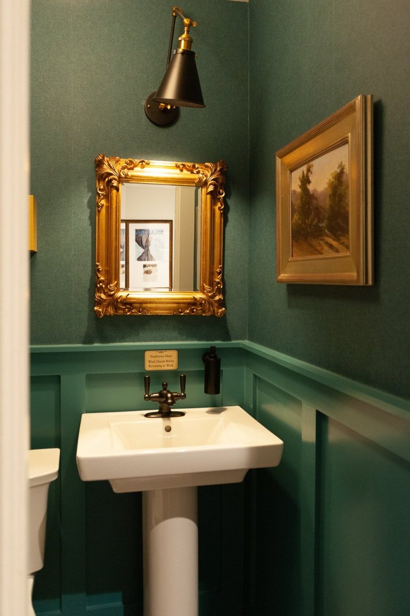
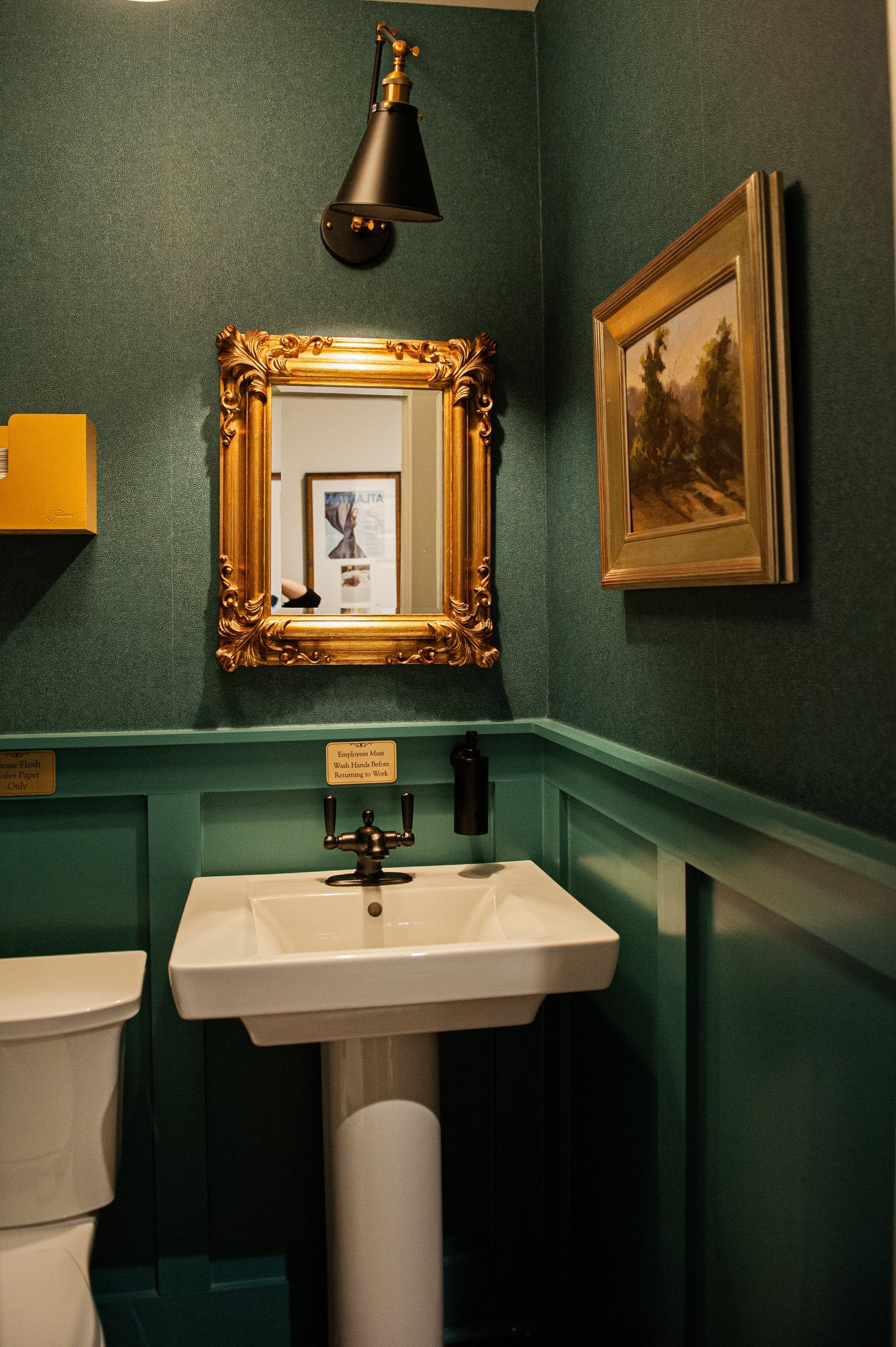
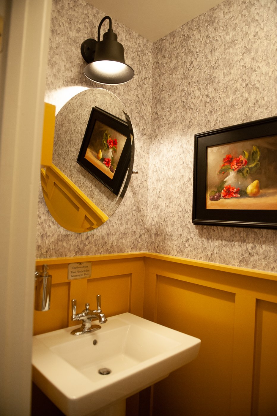
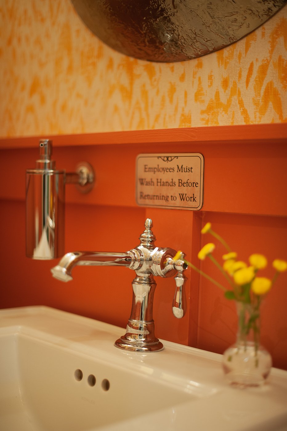
I had the opportunity to create four different jewel box powder rooms… how fun is that!? I made each tiny room a distinct and bold color.. red, yellow, green, and blue… but gave each space an updated, traditional feel. Upstairs in the bar area we updated the bathroom as well, made it more casual, clad in shiplap. For three of the faucets we went with the —- Kohler collection. I love the shape of this faucet and we installed a variety of finishes— oil rubbed bronze, polished nickel, and chrome. We added hooks so ladies could hang their purses, and I made custom “wash your hands” using a vendor on Etsy.
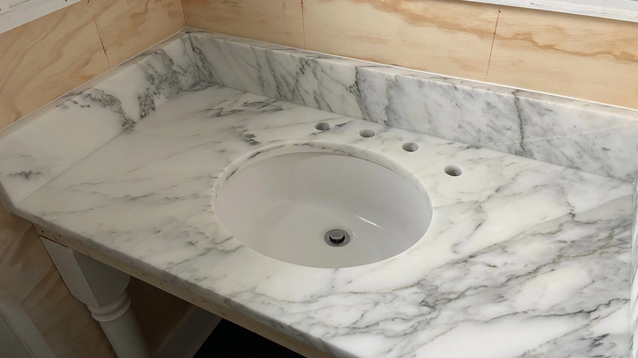
In the first and largest bathroom you can see that there is plumbing and electrical outside of the wall as well as bead board wainscoting at different heights and shiplap on the upper walls and ceiling. The marble sink was cracked and yellowed and in need of a replacement and the plumbing under the sink was exposed.
We did not change the layout or the floors but look at what a change a little woodwork, paint and new plumbing can make! It’s night and day! We decided to go with shaker style judges panel on the lower half of all the walls (which protects them) and added wallpaper on the upper portion of walls to bring in more color, texture, and general good vibes. We replaced and added additional lighting on sensors, so they turn on and off automatically, new fans, and mirrors, added artwork (a lot of this was existing to the restaurant) and new bathroom accessories.
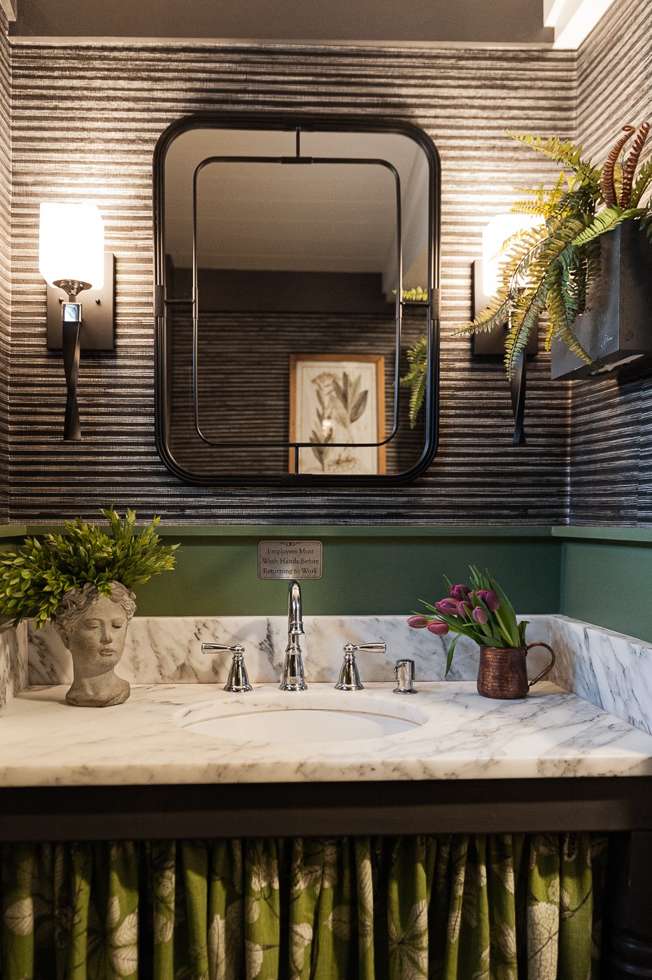
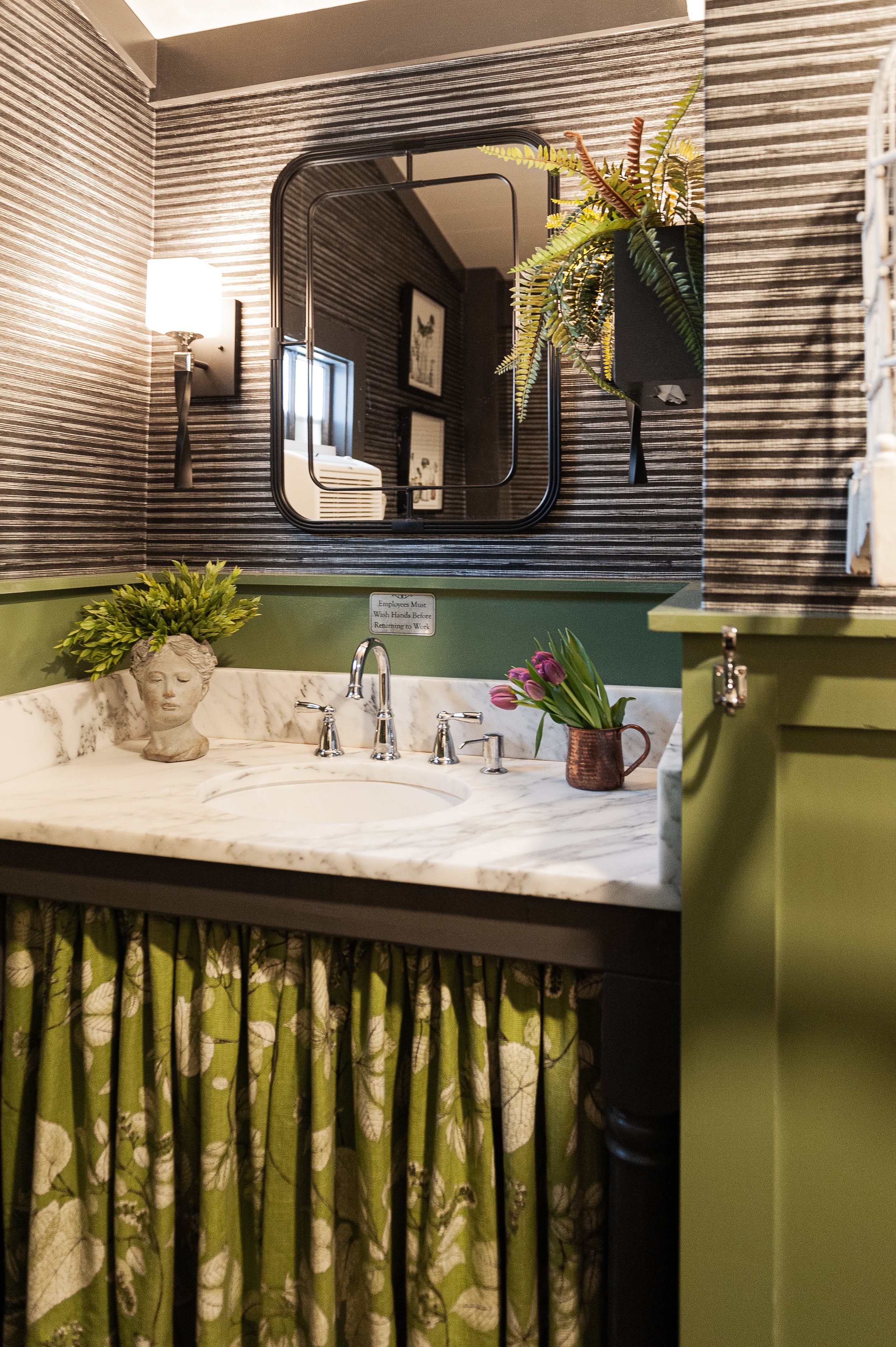
The green bathroom now has an identity! It has a beautiful new marble sink, a custom sink skirt to hide supplies and plumbing, better lighting, and a designated plug for the air conditioner. This green paint color is verdant and ‘garden-like” so for decor I went with a concrete bust that is also a planter, faux ferns, watercolor paintings of plants, and a few antique colorful bird cages. I love black, white and green together.
The blue bathroom is a study of tone-on-tone and the oil rubbed bronze and gold accessories really pop against this hue.
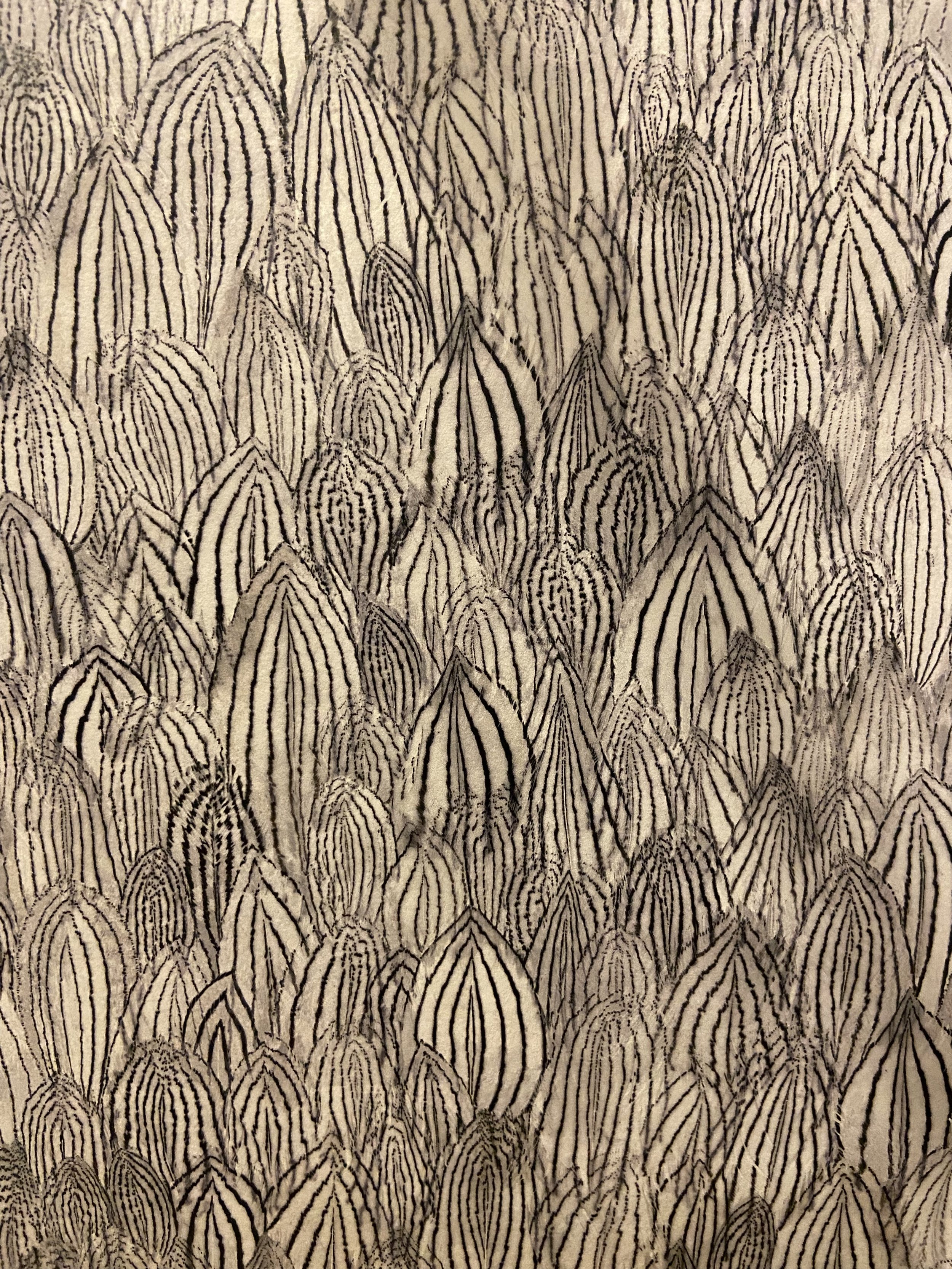
In the yellow bathroom, we custom color matched the paper towel dispenser and added contrast with the beautiful black and white feather paper from Schumacher. Recognize that mirror? We re-used it from the larger bathroom. Sometimes you can reuse and re-arrange rather than buying all new and that is all part of the fun and the puzzle that is interior design. The pedestal sinks are traditional by nature, but have clean lines with a square sink to mimic the judges panel.
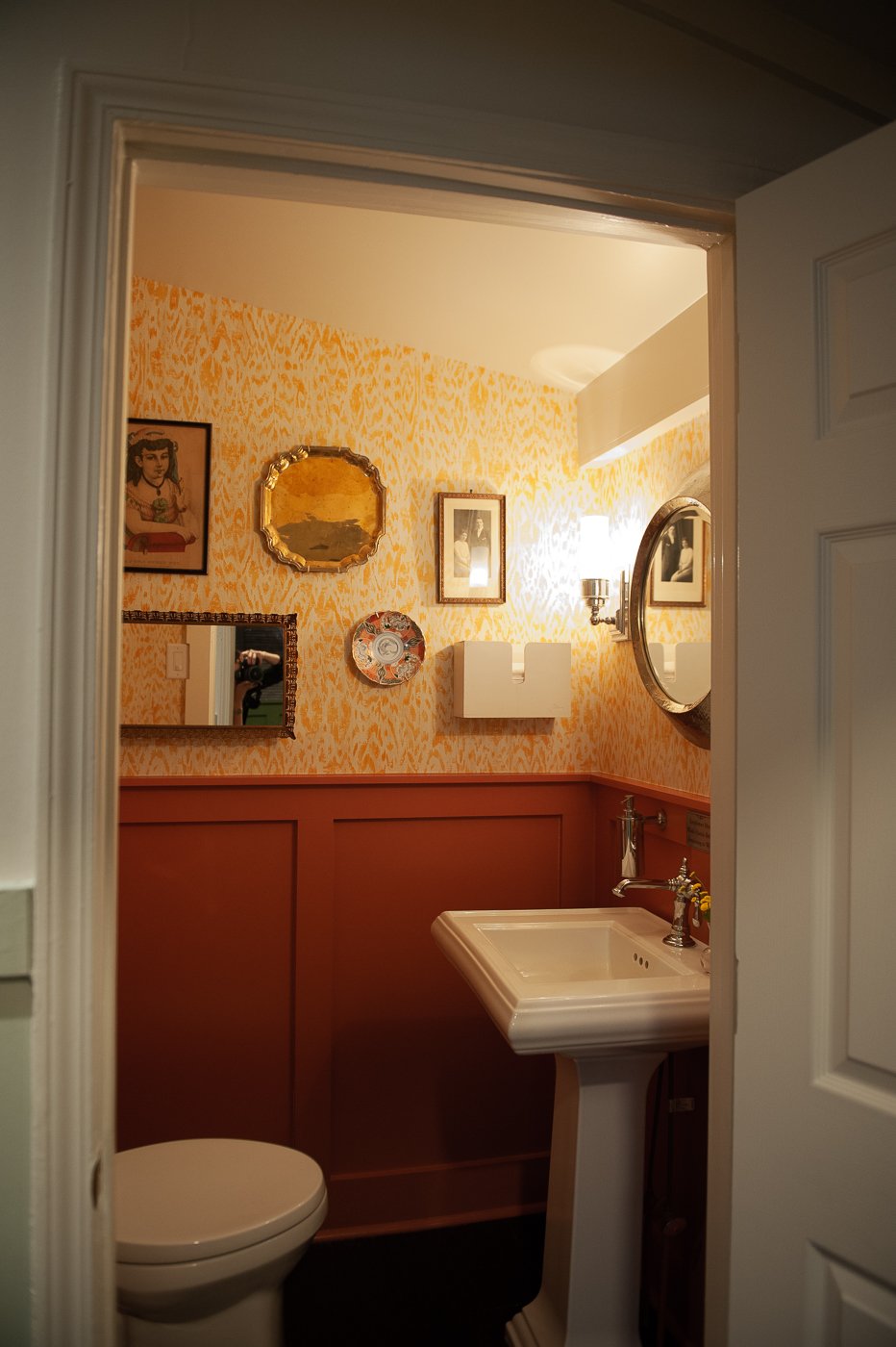
The red bathroom was the most fun to decorate. I went to one of my favorite antique stores, Antiques & Beyond, and picked up a few beautiful and unique pieces — a colorful Japanese plate, a delicate gold mirror, a round silver platter, an antique portrait and a print of a young girl— and created a whimsical gallery wall. The texture of the yellow paper adds a lot of movement in this space. And how lovely is this faucet? It’s my favorite traditional style faucet… such great lines and curves.
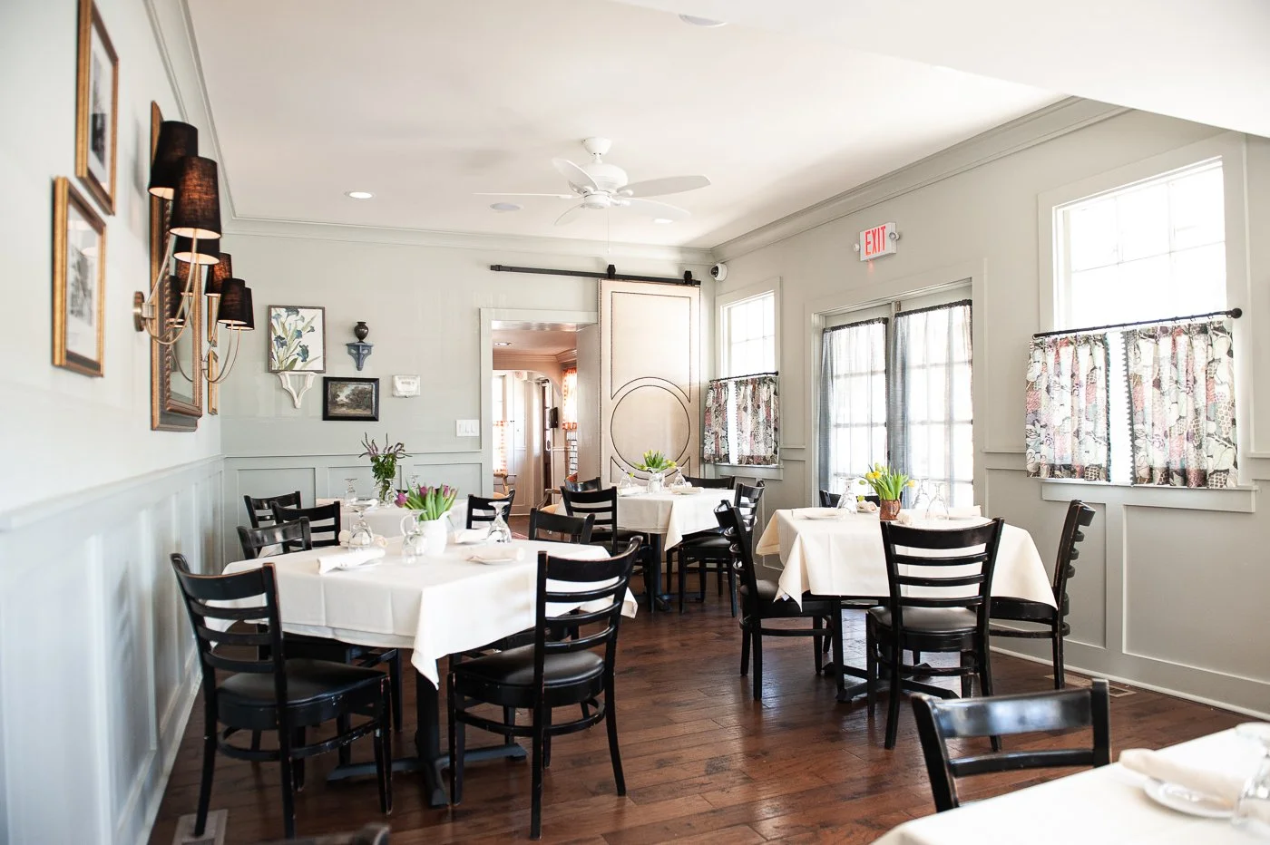
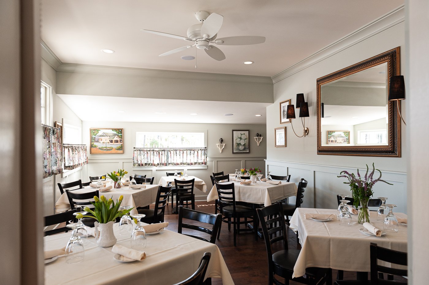
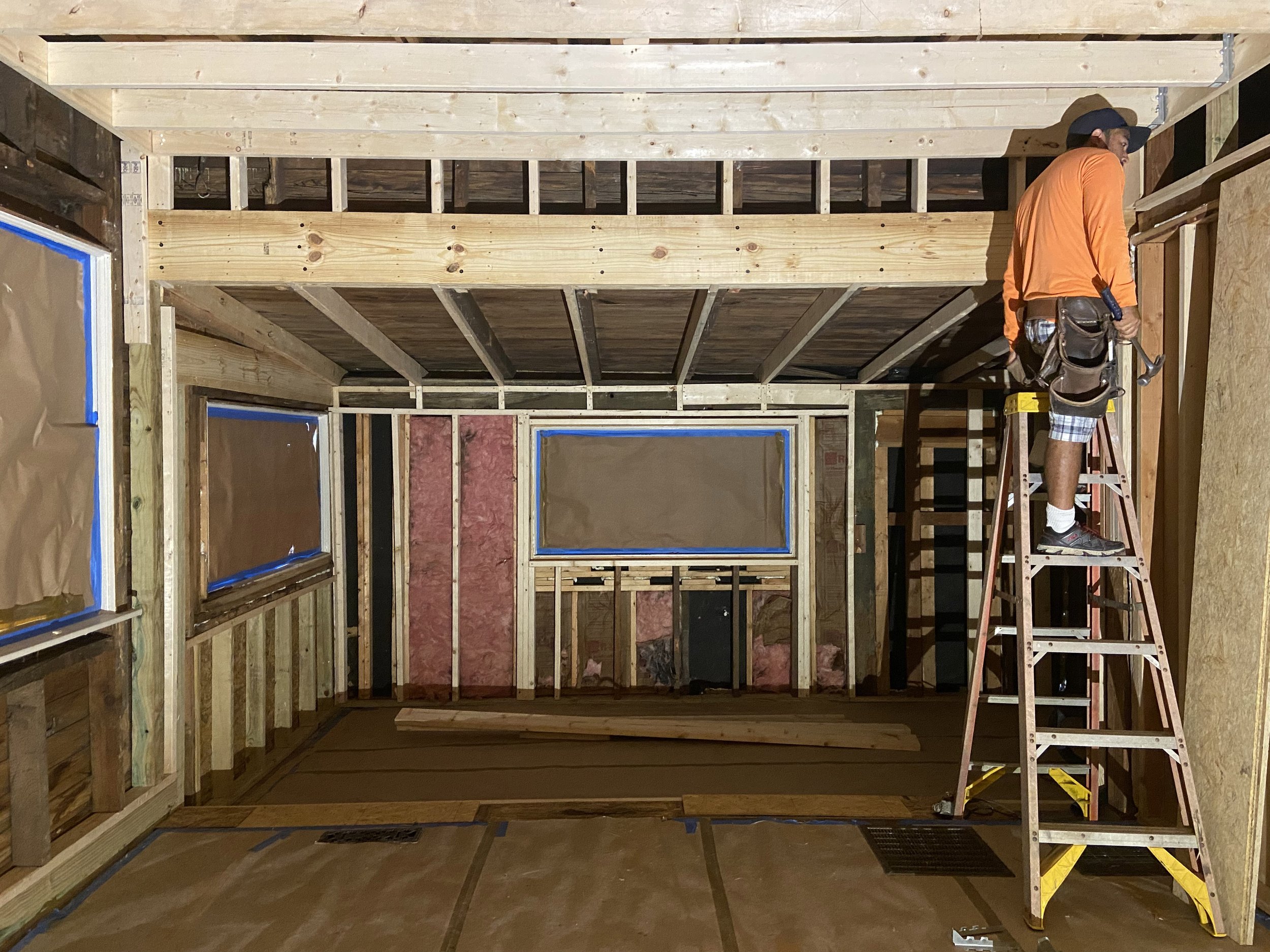
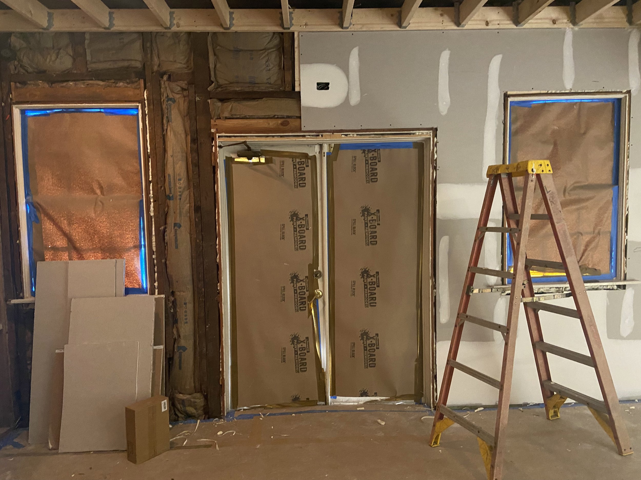
In the dining room we were dealing with low ceilings and an awkwardly divided space with a step down. We were able to raise the ceiling almost two feet and remove the knee walls that divided the space in two. Having one open space provides more versatility for seating arrangements.
We added the same judges panel that we used in the bathrooms, new lighting, a giant antique mirror, decor, window treatments, and a beautiful custom upholstered hanging door so that the room can be completely private. The tables, chairs and linens were existing. I love the fabric on the cafe curtains with the pom pom detail.
We chose a very soothing pale green paint color and added cove molding to scale. We also re- located the cabinet from the front entry and placed it on the back wall to add dimension and height and re-styled it’s contents with interesting dish-ware. The end result of this dining room is better function, better lighting, and much easier on the eyes.
They had a lovely collection of historic photos that we reframed to create interest and help tell the story of Old Vinings Inn.
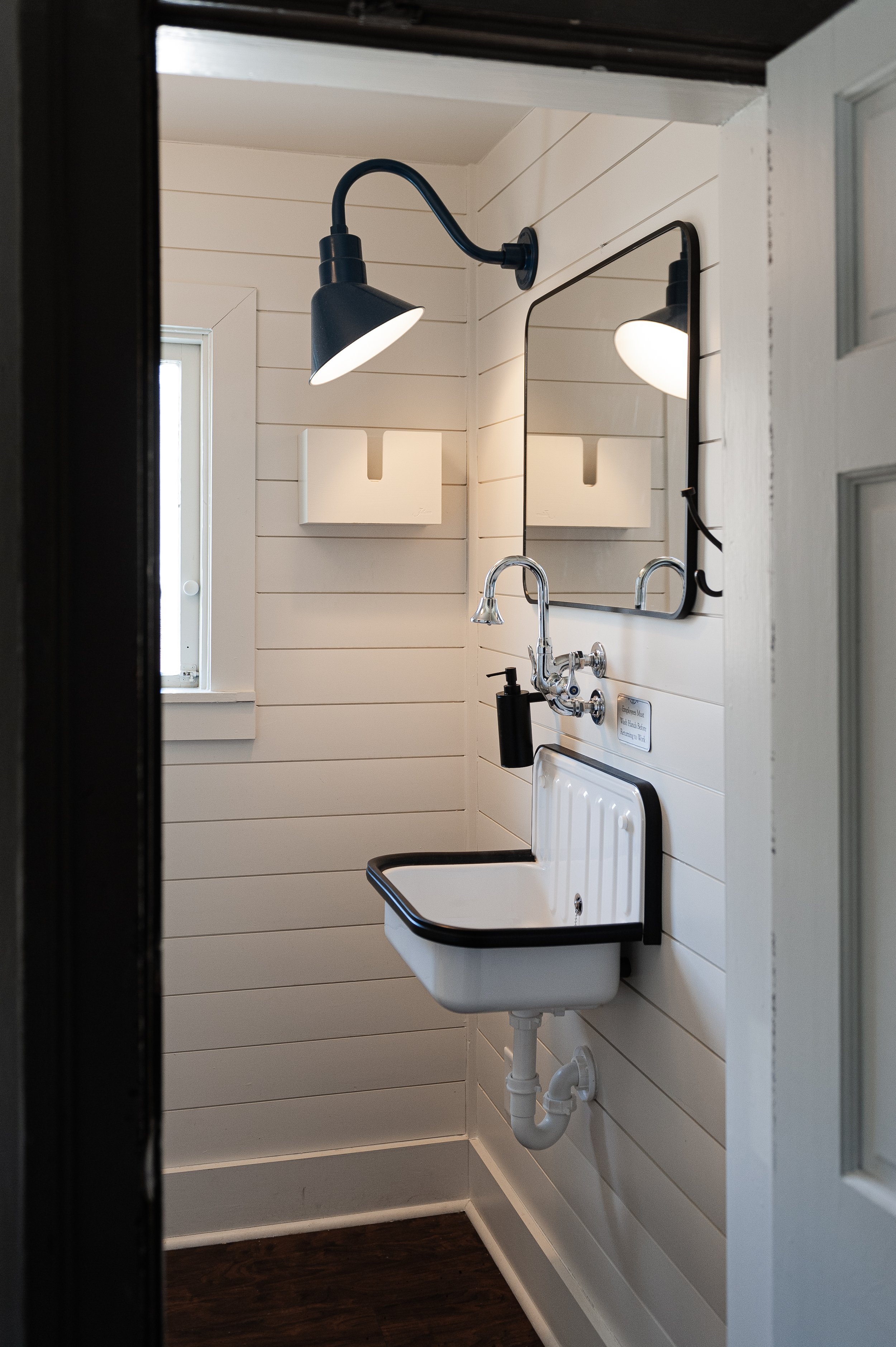
Below is a sneak peak of the bar bathroom. It’s all white but has a lot of personality. In this room we had to level the floors so we added some darker laminate to update the look.
The end.
Interested in working with Violet Marsh Interiors on your Atlanta interior design project? Book a discovery call to see if we are a fit. Please cruise around the site using the navigation links below and please do let me know how I can help.


