Family Friendly Ranch Renovation in Atlanta
Here is a very charming ranch home in the neighborhood of Smyrna which is just west of the city of Atlanta. This client reached out to me after she had renovated this 3 bedroom home and lived in it for a few years. She thought she would get around to selecting rugs, wallpaper, art, accessories and the many layers that finish a space, but as a mother of two young children with a full time career, it never happened.
I love this home! I have a particular obsession with ranch houses. I absolutely love that they are on one level and I love the scale of the ceiling height and the fact that you can see trees and other houses from every window.
They did a lovely job renovating this home keeping everything very neutral and easy on the eyes. It has an updated farm house/ industrial/Studio McGee vibe. They worked with their family friend who is in the design industry to purchase most of the furniture, again keeping everything neutral.
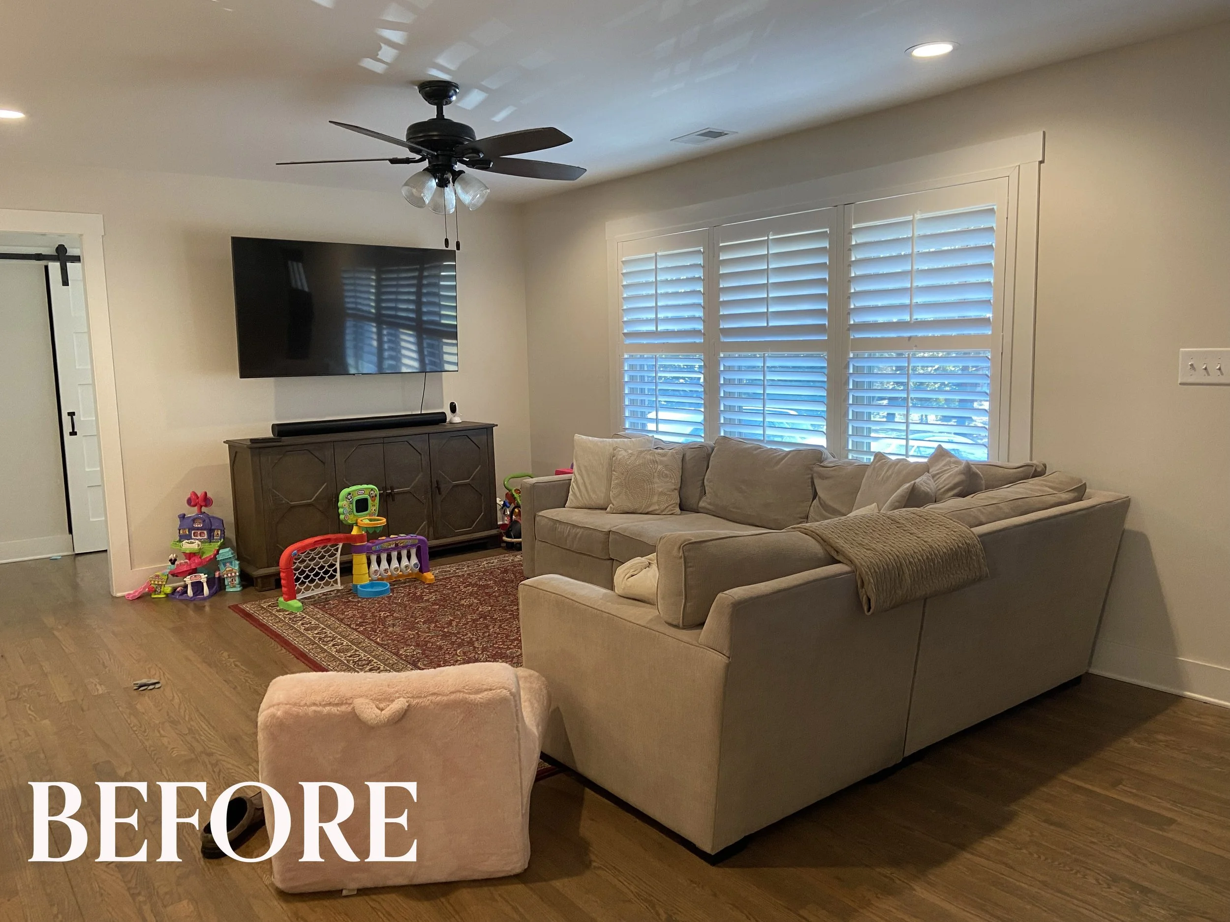
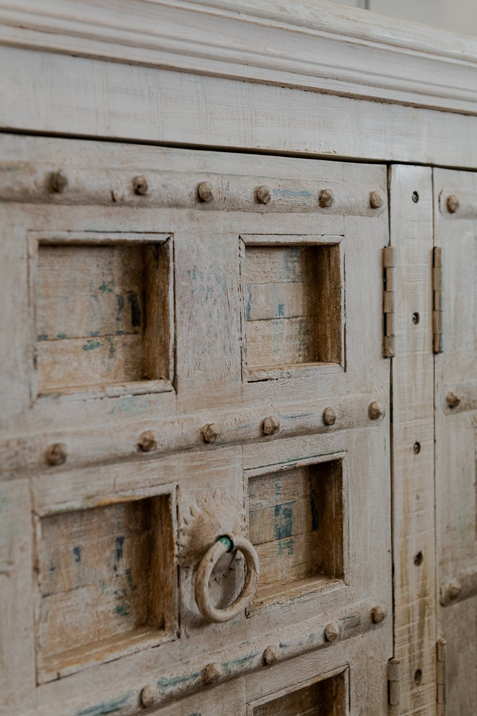
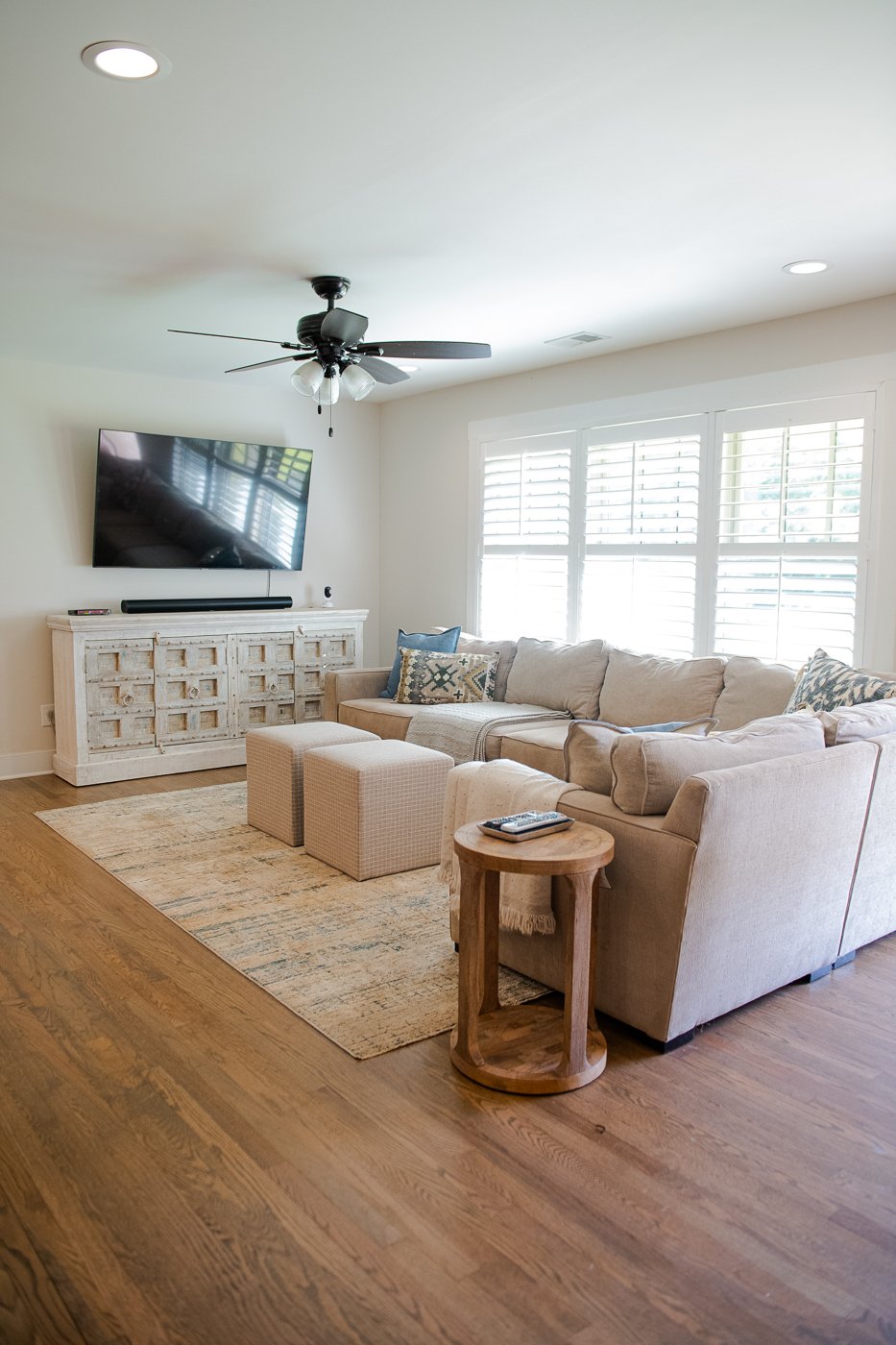
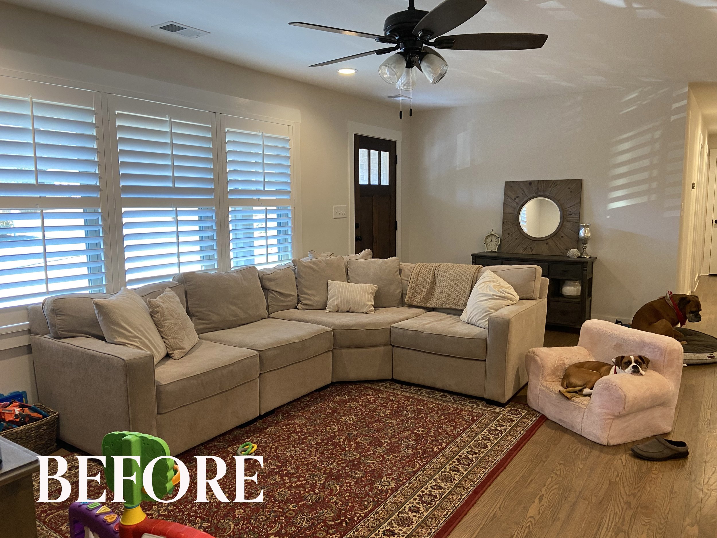
In the before image above you can see that a bigger rug is needed as well as a bigger TV console. I found this interesting white console at one of my go-to furniture shops in Atlanta and the scale and texture that it offers is just perfect. Because it is bigger, it actually provides more storage. Initially, the client was hesitant about this piece when I first presented it to her. When she saw it in her space though, she loved it.
I don’t know why that happens, but it is super common. Part of working with an interior designer is to gently be pushed out of your comfort zone. Trust is so critical in the design process and it does not happen over night..it has to be built. It’s so great when a client says to me, if you think it will work, go for it, and trusts me.
I live for those moments. I love control! ;) In the floorplan you can see how I have mapped out these updates to share with the client. We thought we might add a rug in the entryway and scrapped the idea.
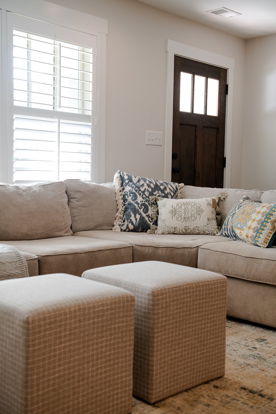
Neutral is the defining word in this project. She was open to small touches of blue and small touches of warmth so we used these colors sparingly. This new rug for example, has blue and yellow in it but remains very neutral. We added an assembly of mix and match toss pillows to infuse contrast and to add energy into the space, and these fabulous plaid upholstered square ottomans can be used as a coffee table or extra seating. She loves playing with her children on the floor so she didn’t want a heavy piece of furniture in the way. This accomplishes all of the above and is versatile.
Did you notice that we altered the shape of the sofa? She had an additional section stashed away in the guest room! We made the long side longer so it fills the space better.
I try my best to digitally illustrate all of the elements of a room design so we can see the relationships of each items. I usually can find pretty close stand-in items online, like this sofa. Sometimes the scale and angles are wonky but I think it still helps to communicate my design ideas. I always tell my clients it will be so much more beautiful in real life. And isn’t that the case here!? So fresh, so bright.
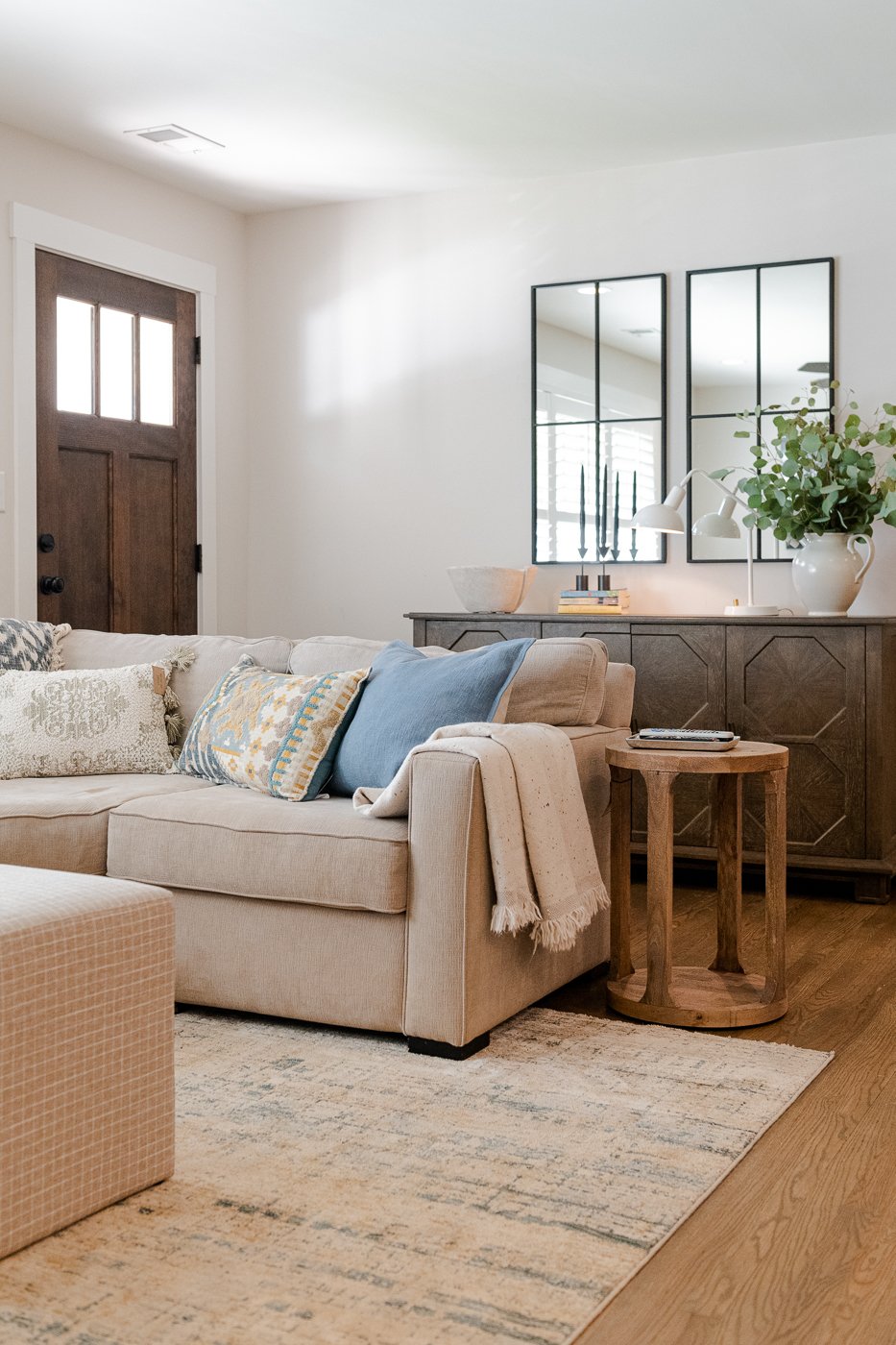
We re-purposed the dark sideboard that originally lived under the TV to the entryway (it’s a perfect fit!) and we added larger mirrors, lighting and some greenery to make the space warm and welcoming. They used black steel on the kitchen windows so these mirrors mimic that design. Clever, I know. In the before image below, the entry table is too small and we hung that mirror out on he porch. (Also, super cute dogs!)
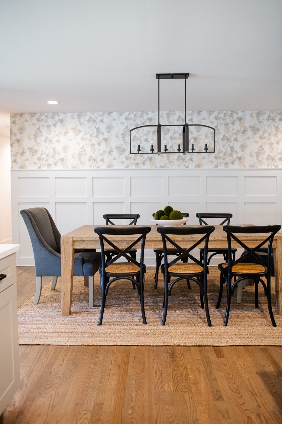
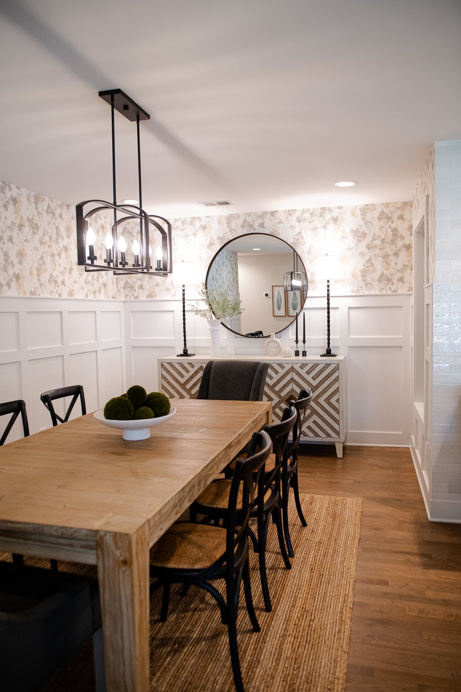
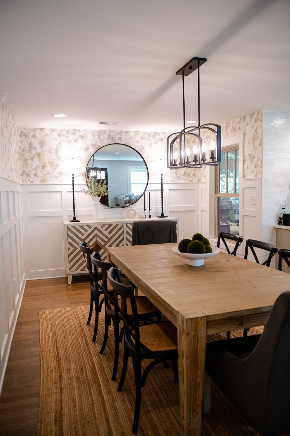
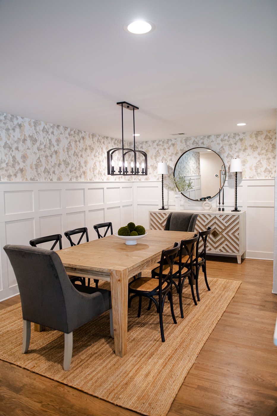
Moving into the dining room, we selected a quiet but striking wallpaper that really brings the space to life and added an oversized mirror, tall buffet lamps, a woven rug and a few accessories. The white footed bowl with spheres of moss is just the right amount of green.
See how sad the room is without wallpaper, a mirror and a rug? I am weeping.
Since I look at furniture so frequently, I often know where my client’s get their things and can find them online to help illustrate. We decided not to add any wall decor in here after it was papered because she loved the paper so much. The wallpaper can be the art.
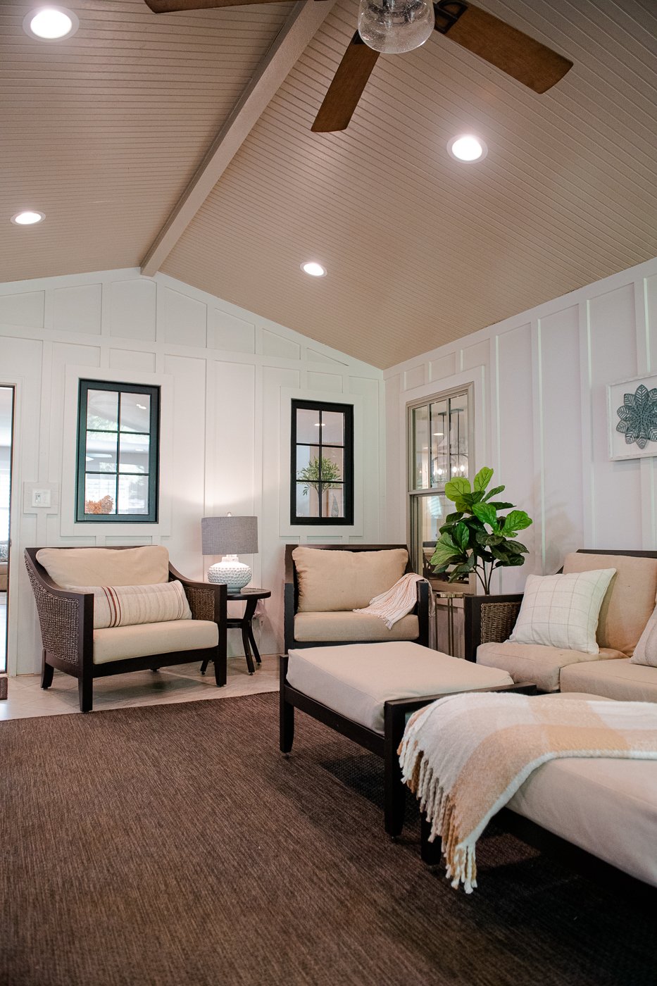
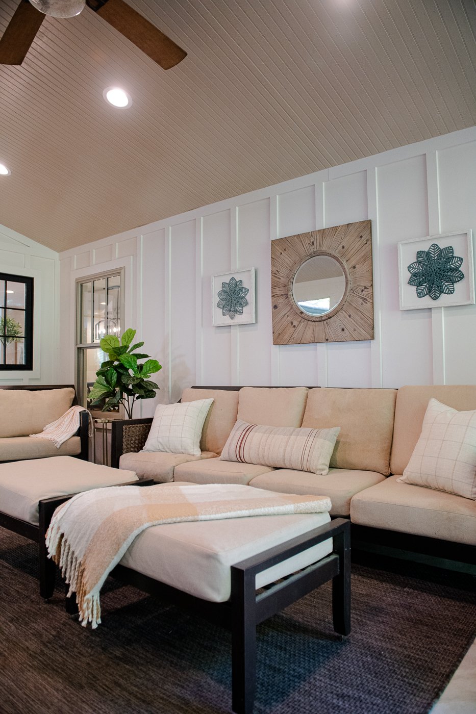
On the porch we added art and the existing mirror from the entry and re-arranged the layout of the furniture. We added pillows and throws to keep it cozy and some dried florals.
The guest room already had a very quiet and soothing feel so we kept it very simple by layering in neutral store-bought drapes, bedding, pillows, and lamps. We added a beautiful rug and a slim, white side board on the right that holds a few trinkets and has a mirror hanging above.
At the time this was photographed this bedroom was missing a couple of things— one copper pillow case and new nightstands— but even without these few items, the transformation is lovely.
I had these gorgeous bronze palm fronds that my assistant wrapped together in twine to hang above the bed. (Thank you, Alena!) On the left wall by the bed we hung a gallery wall with simple natural wood frames where they can showcase some black and white travel images.
Peaceful isn’t it?
I know it’s very cliche to say that I love all parts of design work but hey, it’s true. Check out the cute digital design I pulled together. In the collage the rug plays a bigger role than you actually experience when you walk into the room but you can see where I picked up the copper colors.
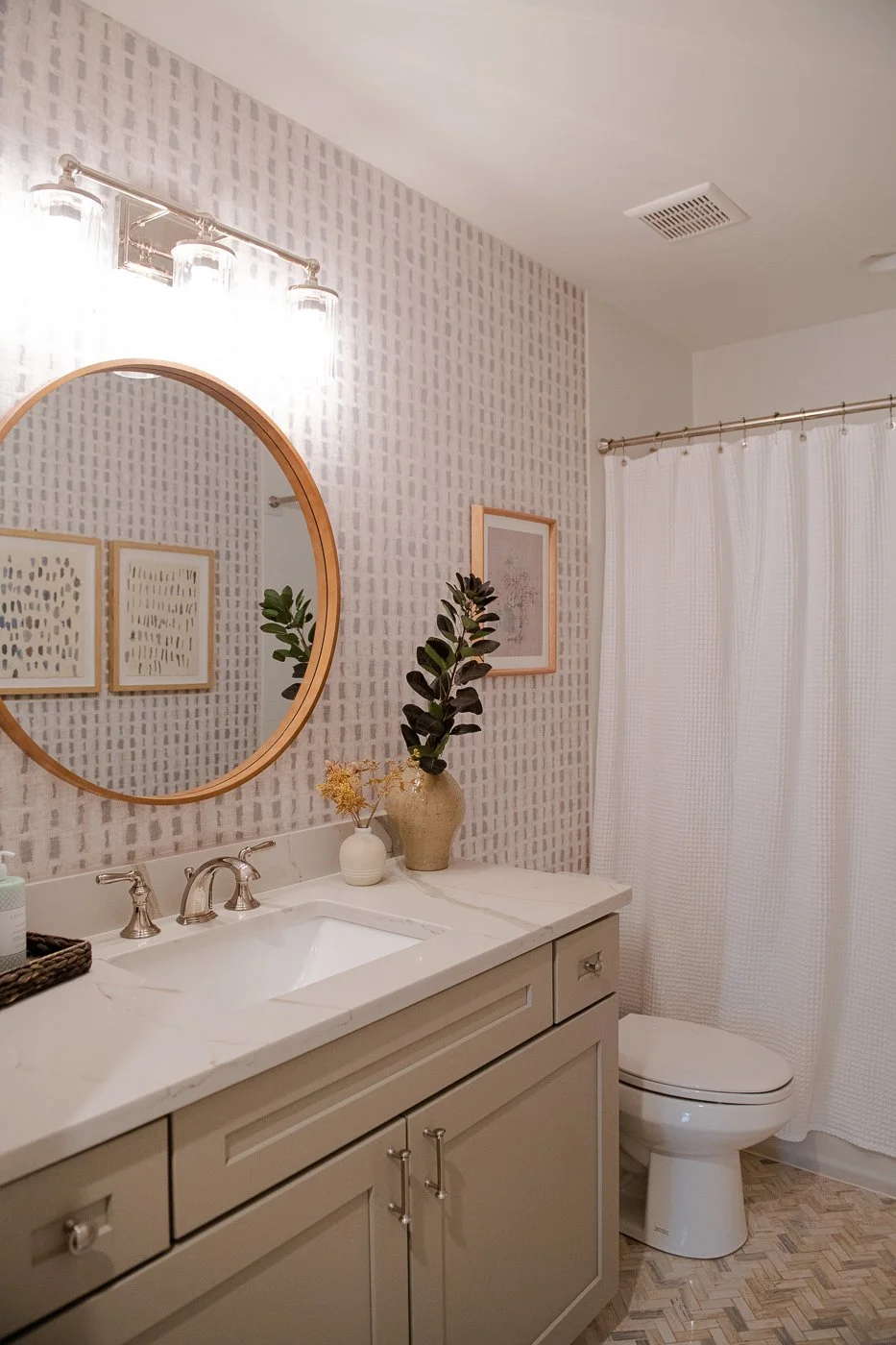
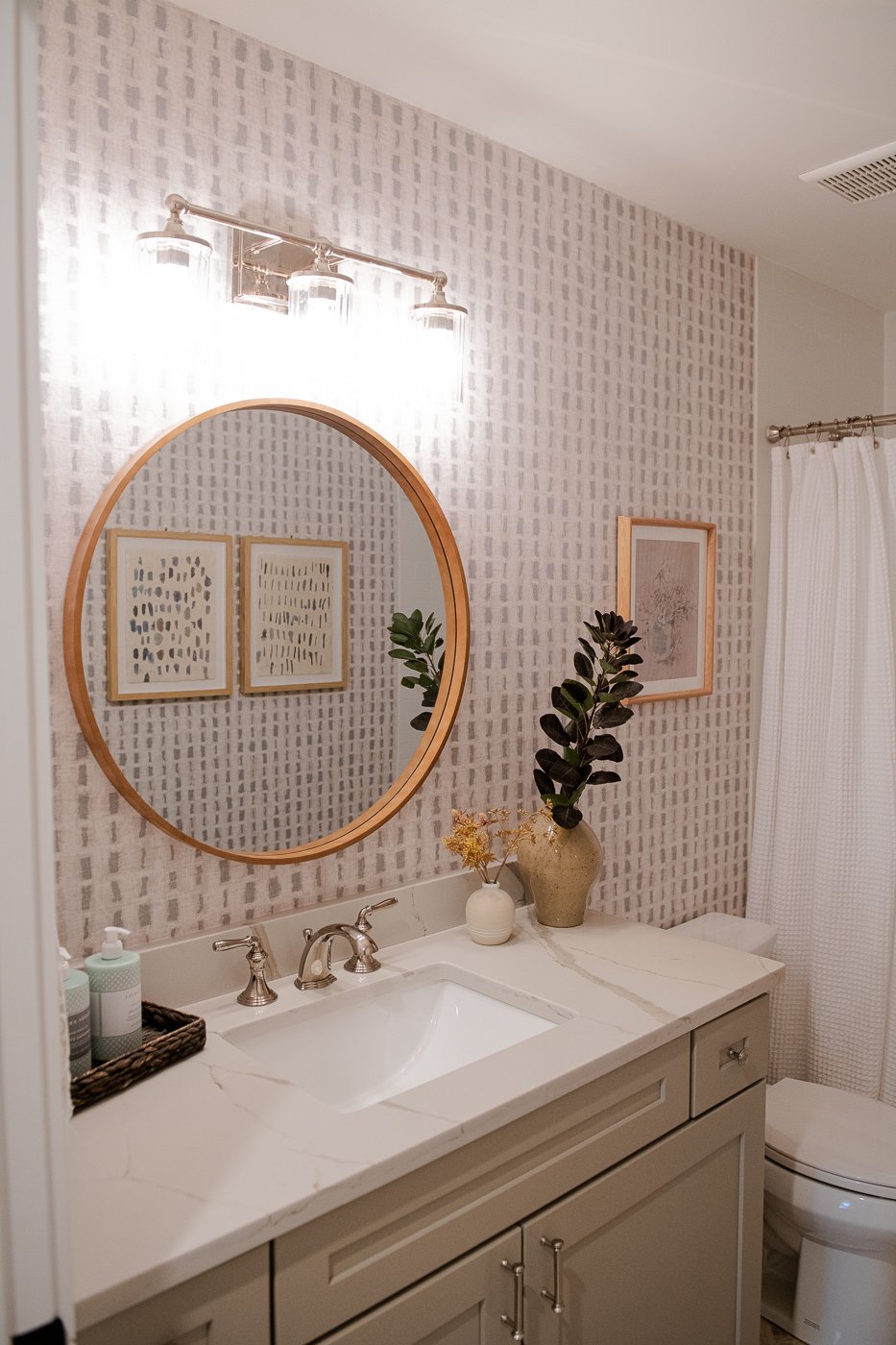
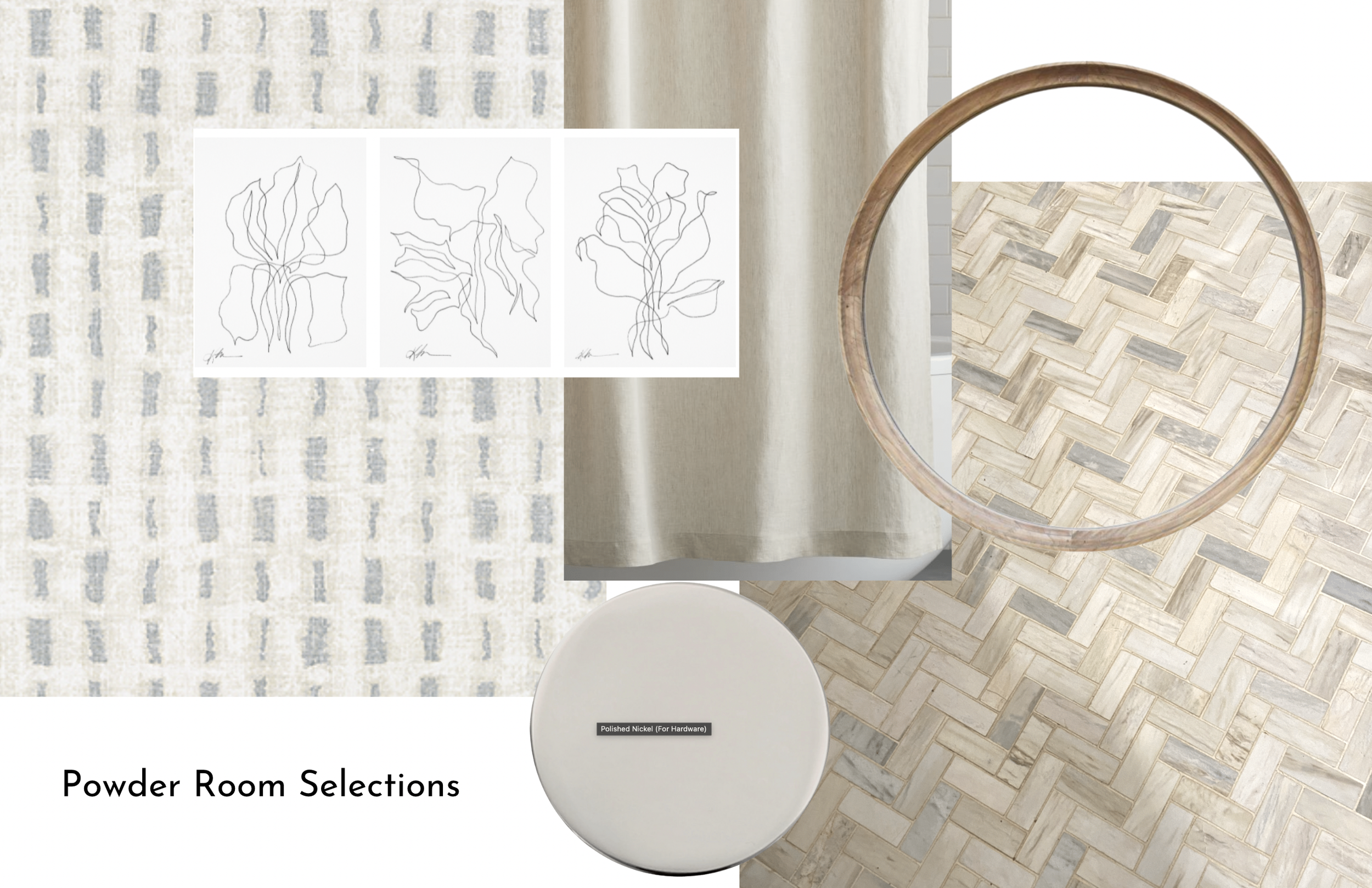
And here we are on the last room we worked on in this lovely home. The powder room. Nice paint colors, gorgeous mosaic floor tile, and polished nickel hardware to start but we needed some contrast and some energy!
I thought for sure I was going to replace the bright white shower curtain but once the wallpaper was installed and the new mirror and art was hung, I really liked the white curtain. I used the existing gold mirror in the guest room. I know a lot of interior designers like to source every single item themselves, but that is not what I do. I love that people have things and I try my best to incorporate existing items throughout a project. So often things just need to be rehung or positioned differently. I am known to shop in my client’s homes and pull things out that they forgot about and place items strategically.
So much warmth in this bathroom now. While I do not yet have the completed images of the principal bedroom, I thought I would share the elements that we decided on. This rug was on serious backorder and has just been installed. We found the most romantic bedding and added gorgeous chunky lamps.
Congratulations Smyrna family! Enjoy your new space. The end.
Interested in working with Violet Marsh Interiors on your Atlanta interior design project? Book a discovery call to see if we are a fit. Please cruise around the site using the navigation links below and please do let me know how I can help.

