MCM Interior Design in Midtown Atlanta
I have a thing for smaller scaled dwellings. I have never pined for a big house and cavernous hallways…a house filled with stuff… it’s too much to take care of. I am detail oriented and I like every surface to be considered and optimized and every item to have purpose and a resting place. I am talking every room, every cupboard, and every closet. I like intimate, cozy, and layered and I love using quality materials, textures, and color to achieve this.
This recent condo project is located in a historic building in Midtown Atlanta. The living space is spread out across three stories that are all connected by one spiral staircase in the center. The kitchen, living, and powder rooms are on the main level. On each of the second and third floors there is one bedroom and bathroom. My love affair with interiors started very early on, and when I was little I remember thinking spiral staircases were the.coolest.ever and so rare.
This client had lived here with his young son for eight years and it was feeling run down and cramped. This condo has a lot of challenges— the scale of the open kitchen and living room is fairly small and and he didn’t have enough storage or counter space in the kitchen or in the entryway. Things were sort of piling up on themselves. His wishlist included sun control for the giant windows, entryway storage and functionality (where do they put their shoes and coats), an updated cook’s kitchen, and ample record storage.
On the main level, we added custom shelving, an oversized armoire (not pictured), repainted, added new lighting, optimized the layout, designed a brand new kitchen, and hung his existing art. In his son’s room on the third floor, we added custom shelving, new paint and furniture, black out drapery, and some fun wallpaper and lighting in the bathroom.
The first challenge was to add more closets and storage throughout. Sometimes there are cavities within the walls we can open up, sometimes not. We were able to widen the entry closet (not pictured) and add hooks, shelves and shoe storage in order to create a mudroom for him which is tucked away completed out of sight. This closet was previously used as a food pantry but since we added more cabinetry in the kitchen, we could dedicate this closet to other equally important things.
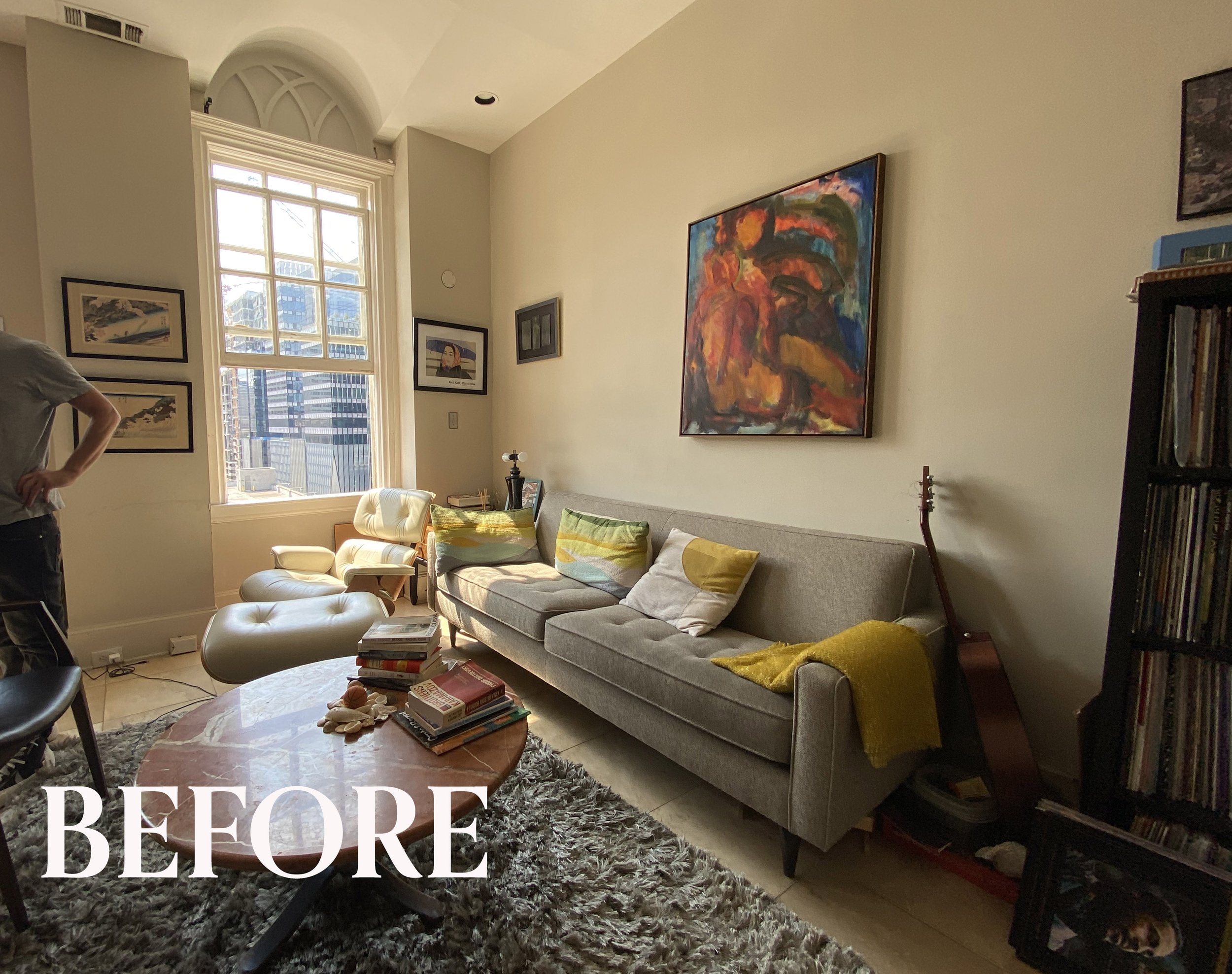
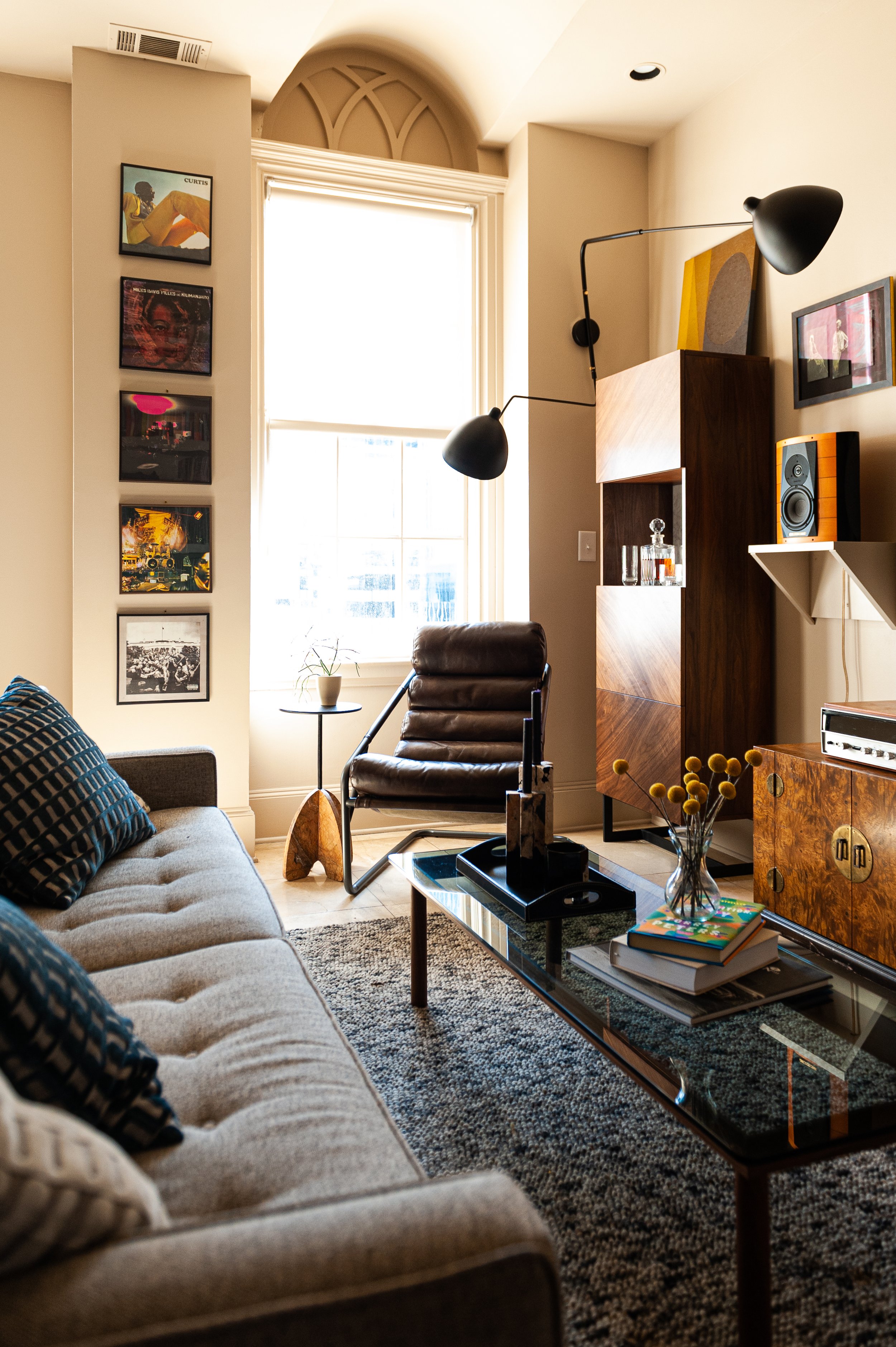
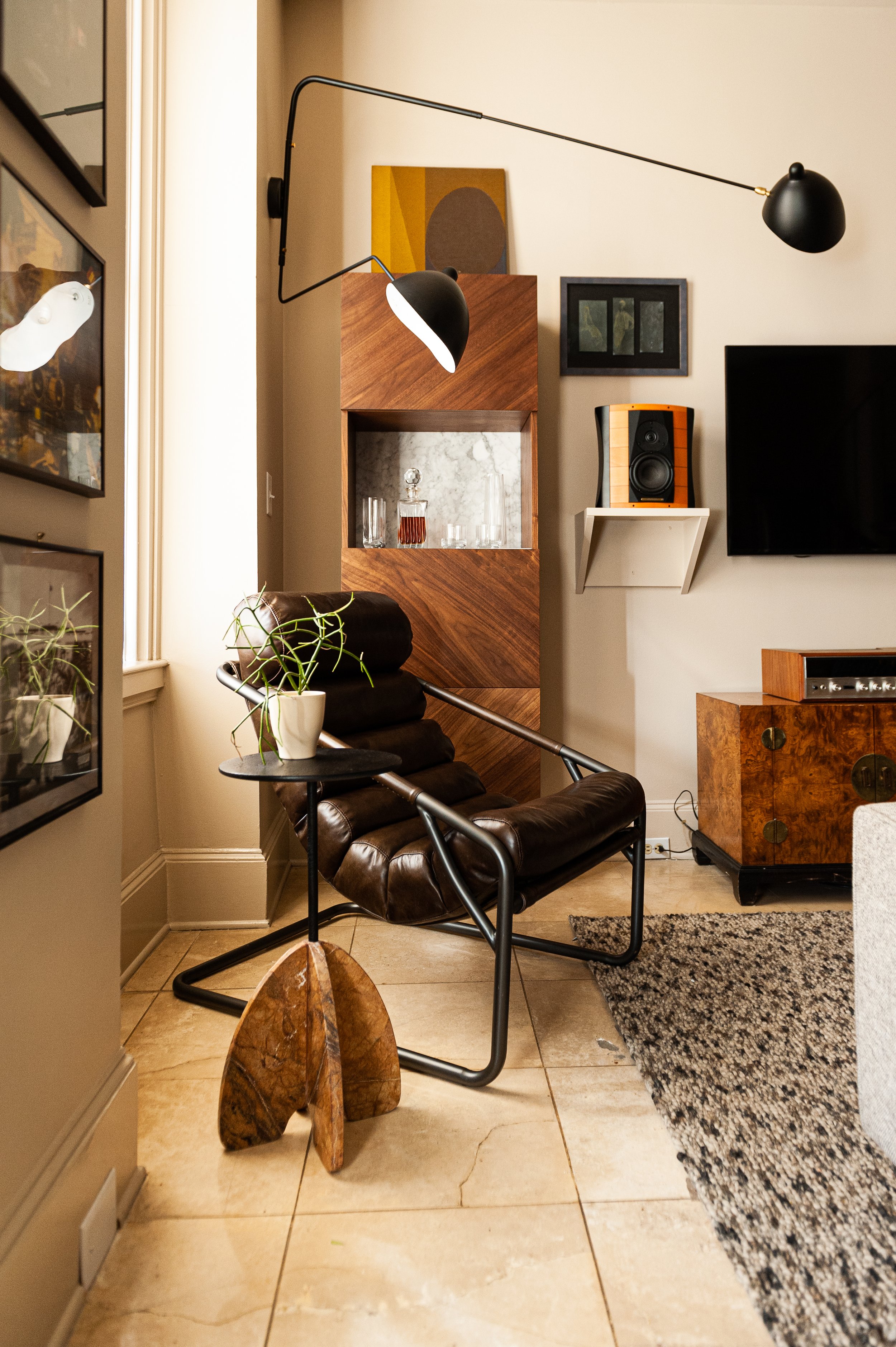
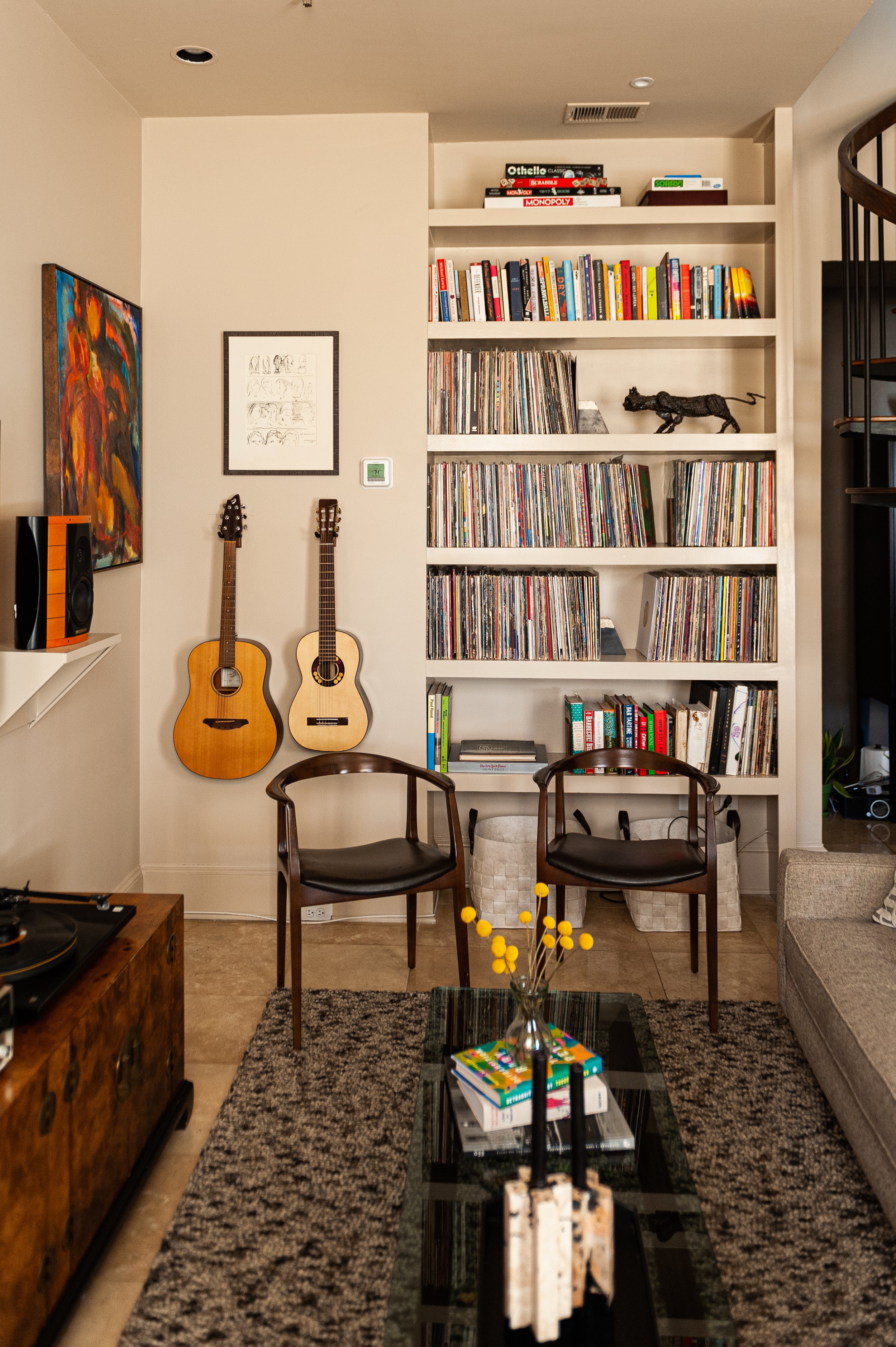
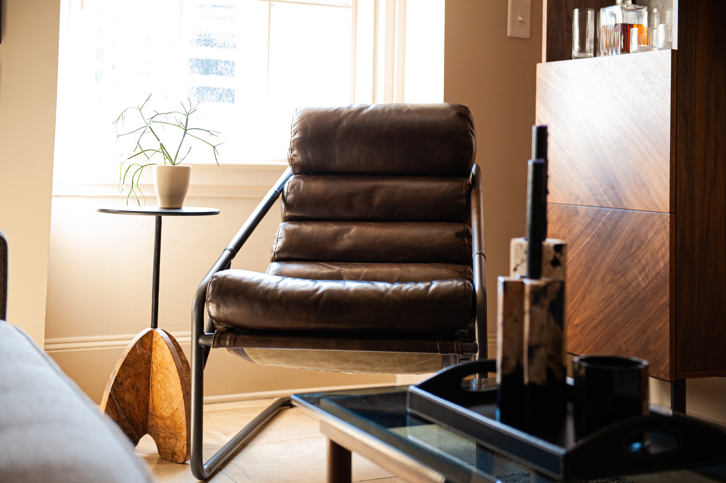
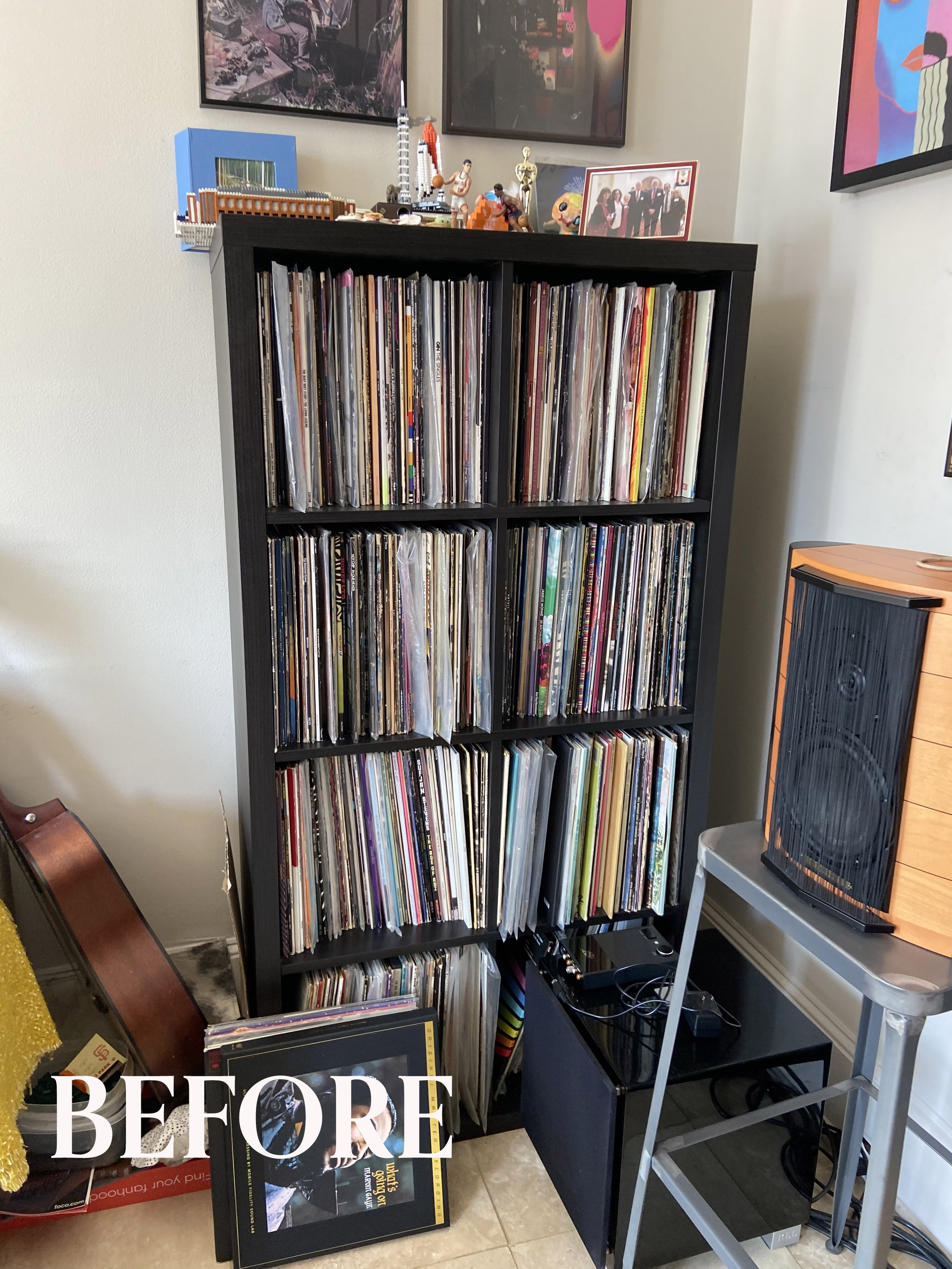
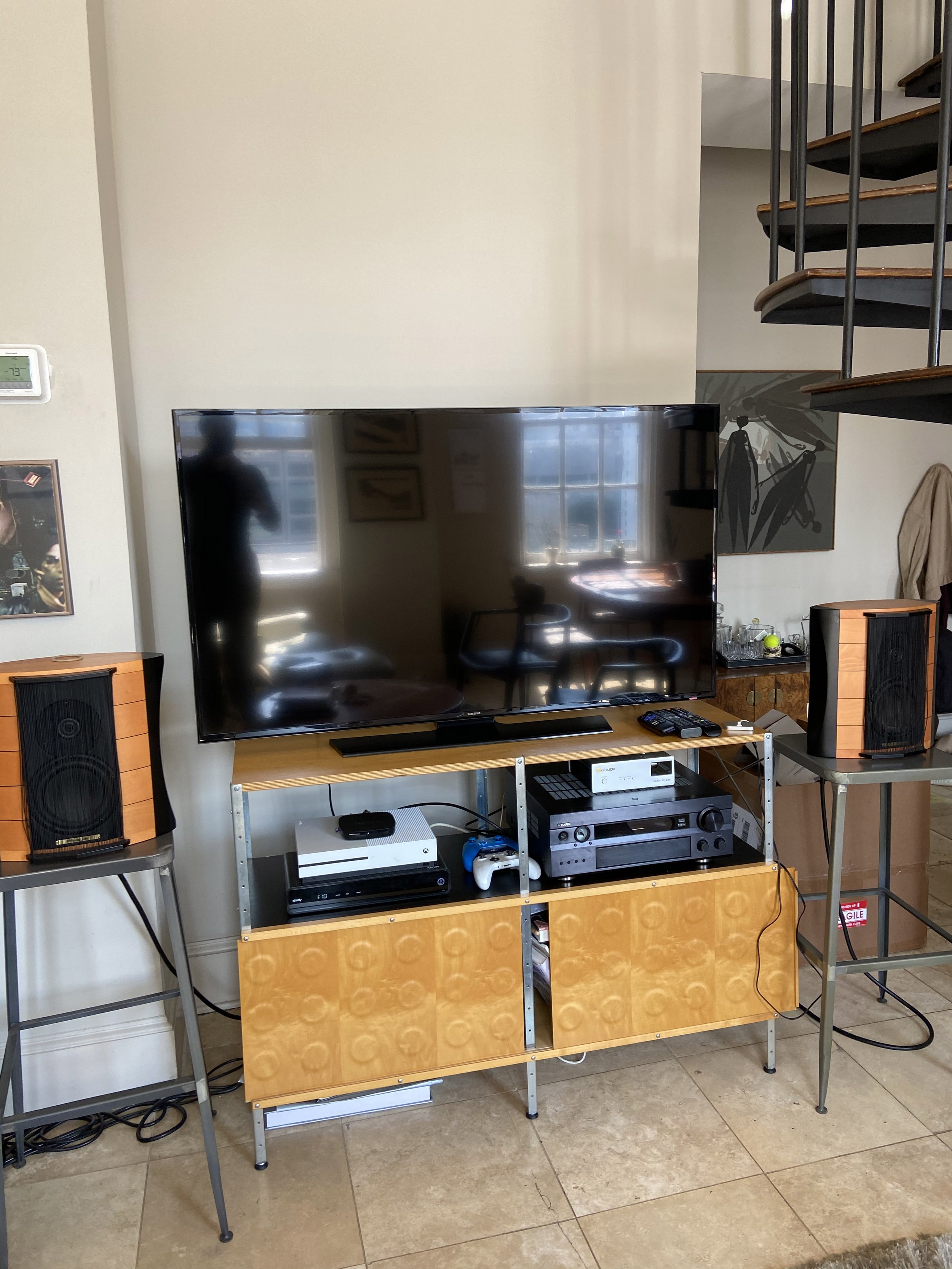
In this Midtown Atlanta living room, we floated his sofa and made the one large wall the TV wall. We added a bar cabinet, one lounge chair and small drink table, and used the smaller wall where the TV originally lived to create a floor to ceiling built in shelf for all of his records, games and books. We also got rid of the wires by mounting his TV on the wall and making custom shelves for his speakers. Could we have made that entire back wall a built in to accommodate more storage? Yes, but it can get expensive. For the windows I selected a simple solar roller shade that reduces the glare of the sun. I added one oversized spidery wall sconce to serve as a reading light for the chair and also add dimension along that wall.
It’s hard to see the detail of the rug, but it’s got great texture. We hung a couple of his guitars and found a slim smoked glass coffee table. Adding a few pillows, accessories, and using his art and some of his existing furniture, makes it very personal to him.
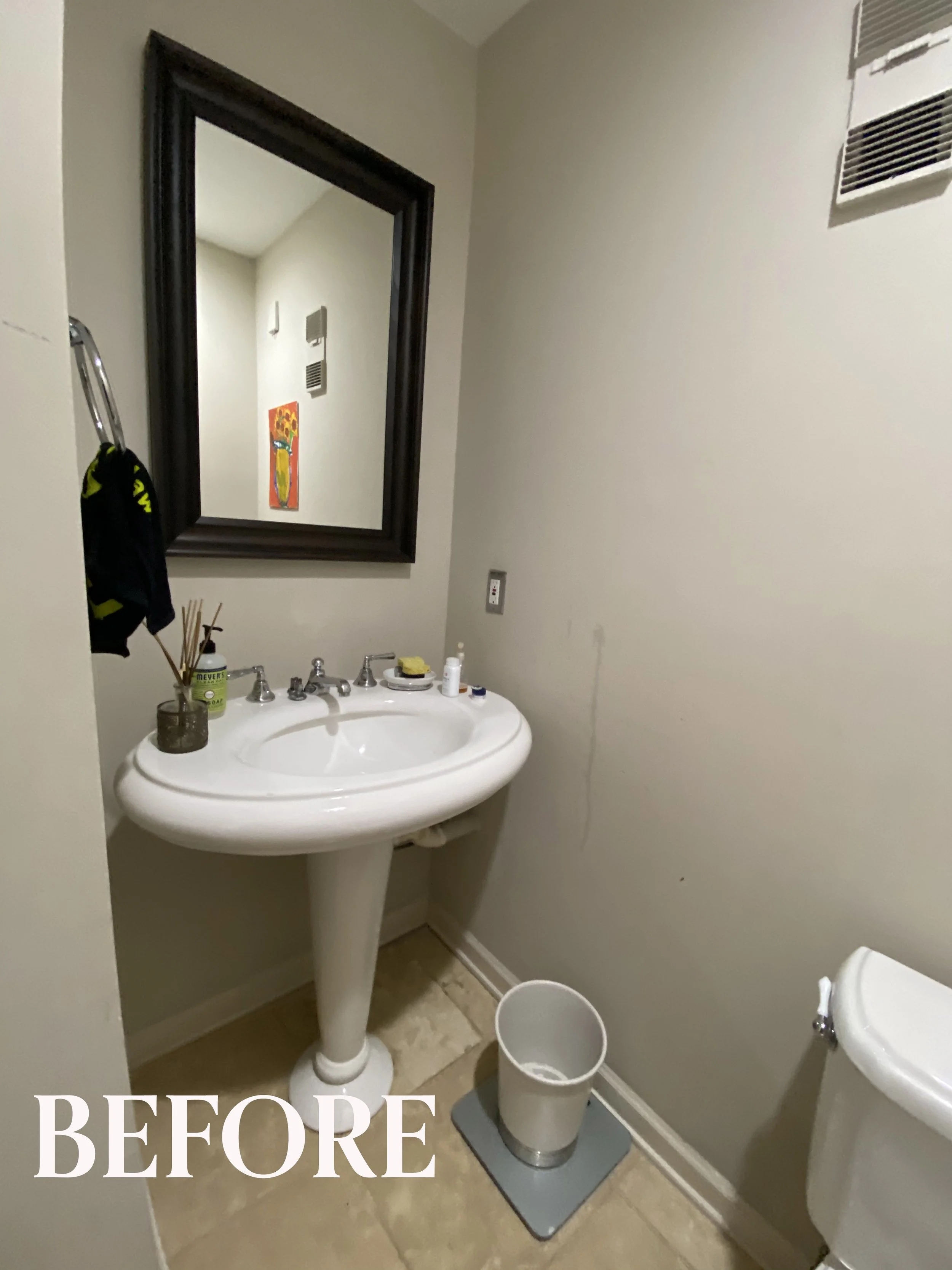
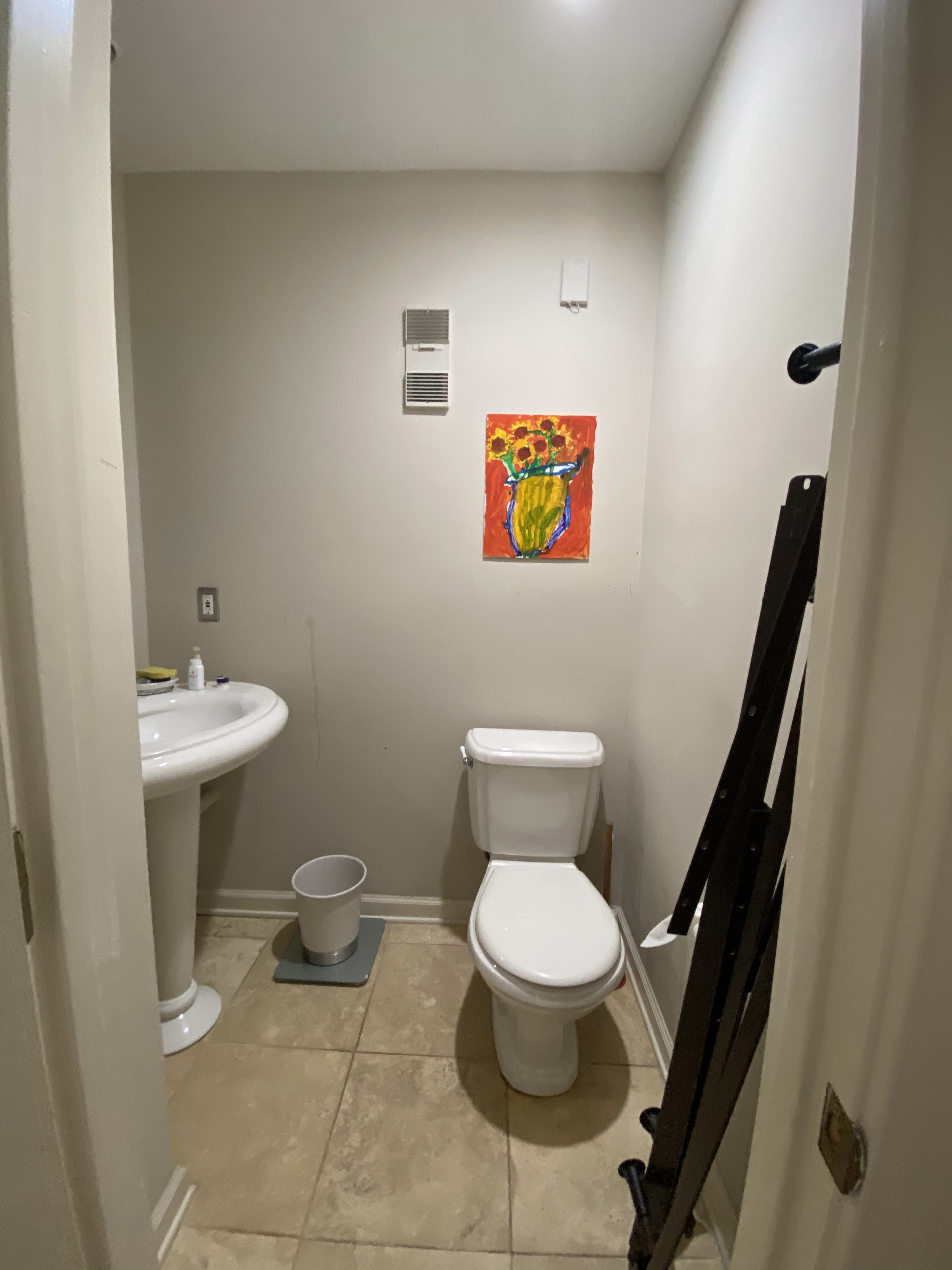
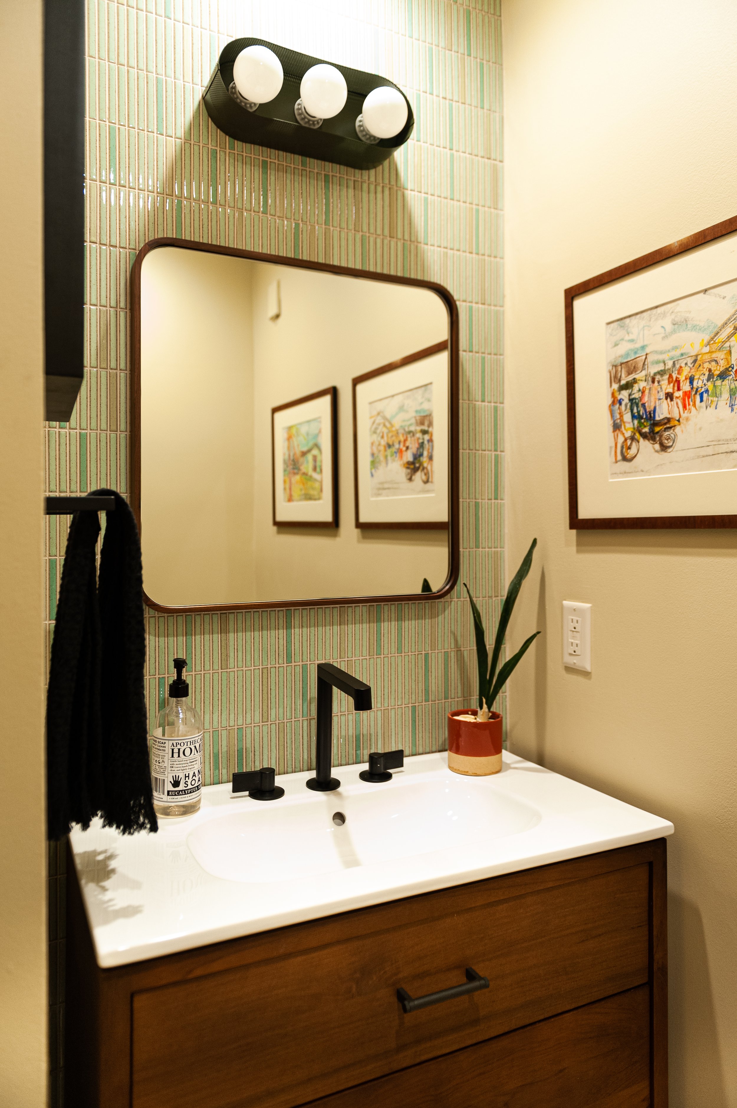
In the powder room (which is opposite the front door), we replaced the vanity, lights and plumbing and added mosaic linear tile behind the sink. This client is inspired by MCM and Japan and this tile hits both feels in my opinion. It also serves as a waterproofing for the wet wall. People often put pedestal sinks in small spaces, but having under cabinet storage for extra hand soap and toilet paper is always better. We sourced a modern square faucet and a wall sconce that has a perforated metal outline.
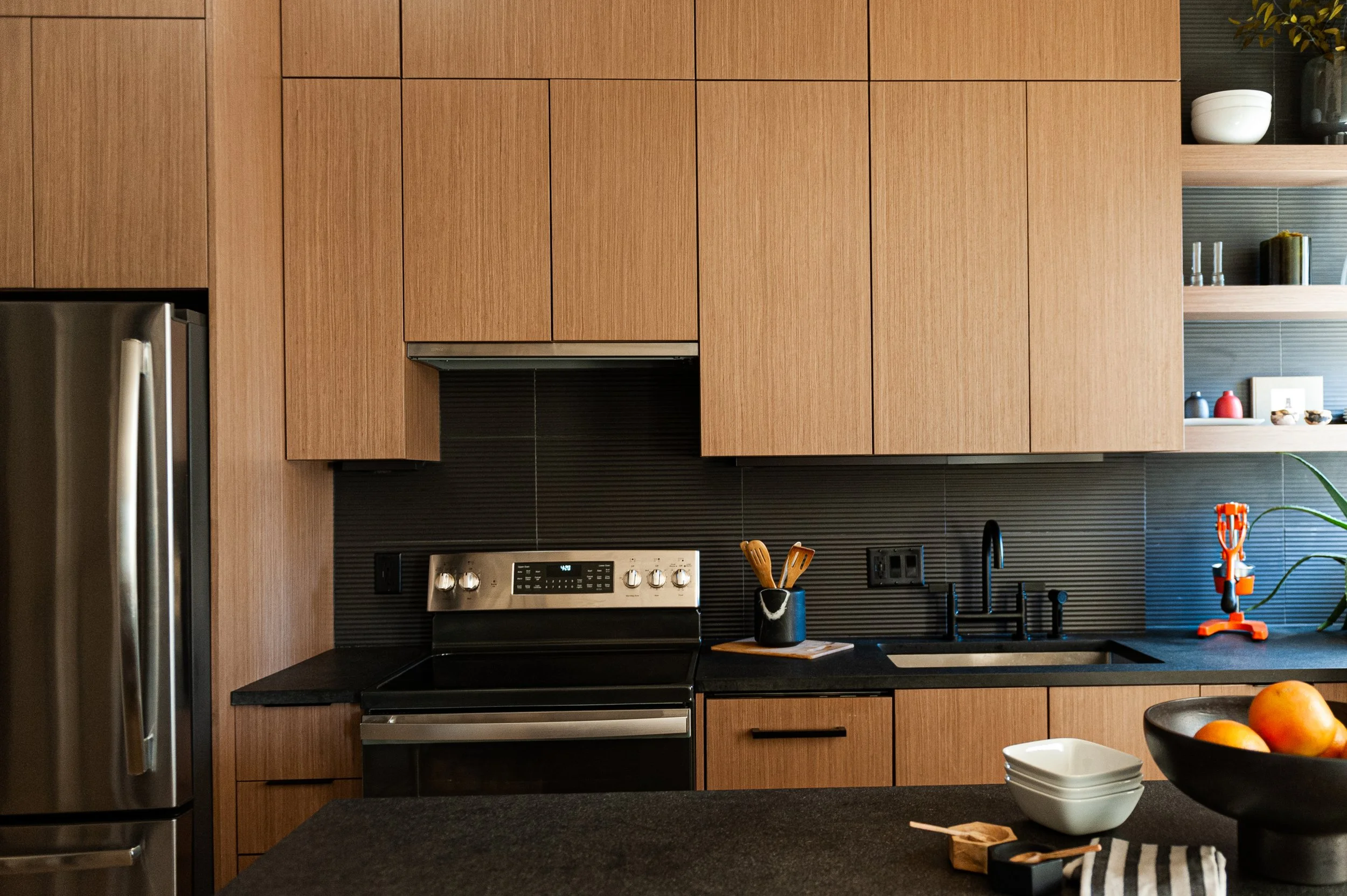
In the kitchen, we had to shrink one of the appliances so everything fits on the one wall. That appliance was the dishwasher which is paneled in this case. We didn’t have a lot of linear feet to work with and we were interrupted by the window on the right side. Storage was also critical. What you can’t tell from the photo is that the cabinet on the lower right was designed with articulating shelving that goes all the way back into that wall cavity.
One of the most obvious ways to maximize space in any kitchen is to bring the cabinets all the way to the ceiling. You can tuck away larger items and things not used everyday, extra pantry and household items etc. In this case we went almost to the ceiling. We had to work around the commercial sprinklers.
We added an island with a walnut table height counter that extends out. This allows for a full stack of drawers on the kitchen side for pots and pans and cooking utensils while also providing seating for up to four guests. To keep it minimalist, we used a wood veneer cabinet, with black architectural tile and black granite on the counters. The floating shelves remain but we made them more substantial and we fixed the odd double row of recessed lights.
In a condo you are more limited to what you can do with the layout. We would have loved to put the sink in the island but the floor is concrete so we couldn’t change the locations of the plumbing.
Everything in this main room was painted a warm creamy beige to better tie in the warmth of all the wood and the depth of the black.
Moving upstairs to his son’s room, we embarked on a very dramatic transformation. In this before photo, that large wall is just screaming for custom shelves, don’t you think? And you can see the bed is up on the platform across from sliding glass doors and does not have any sun control.
We maximized the wall to wall shelving to store all of his books and toys which looks so inviting and playful. We reduced the size of the bed to a full from a queen so we could add a nightstand and a lamp, We added custom black out drapery, painted everything and sourced this delightful custom upholstered bed and white lacquer nightstand. The charming dark blue lamp is from Blue Dot and switches on at the top.We went with a simple gray bedspread but made it more special with custom pillows. I adore these fabrics together! His favorite colors are red and blue so that is what we delivered.
The end.
Interested in working with Violet Marsh Interiors on your Atlanta interior design project? Book a discovery call to see if we are a fit. Please cruise around the site using the navigation links below and please do let me know how I can help.


