New Build in Morningside: Main Floor Reveal
Today we are talking about a new construction interior design project in the in-town Atlanta neighborhood of Morningside. Since the scale of this home is quite large, we are breaking it into a few different posts. We started with the beautiful kitchen and will now zoom out to walk through the main floor.
Let’s start with the front elevation, shall we? This was drawn by Atlanta architect, Linda MacArthur. On the street level or main floor we have the study on the far left, front entryway, dining to the right of the door and as we move back into the home we have a powder room, a oversized bar, an open kitchen and living area, screened in porch and mudroom. It took about a year to finalize the drawings and interior design of this home and about a year to build.
You can see how everything is layed out in the floor-plan below with the three car garage. It’s spacious. The stairs off the porch lead down to a terrace level backyard with a pool.
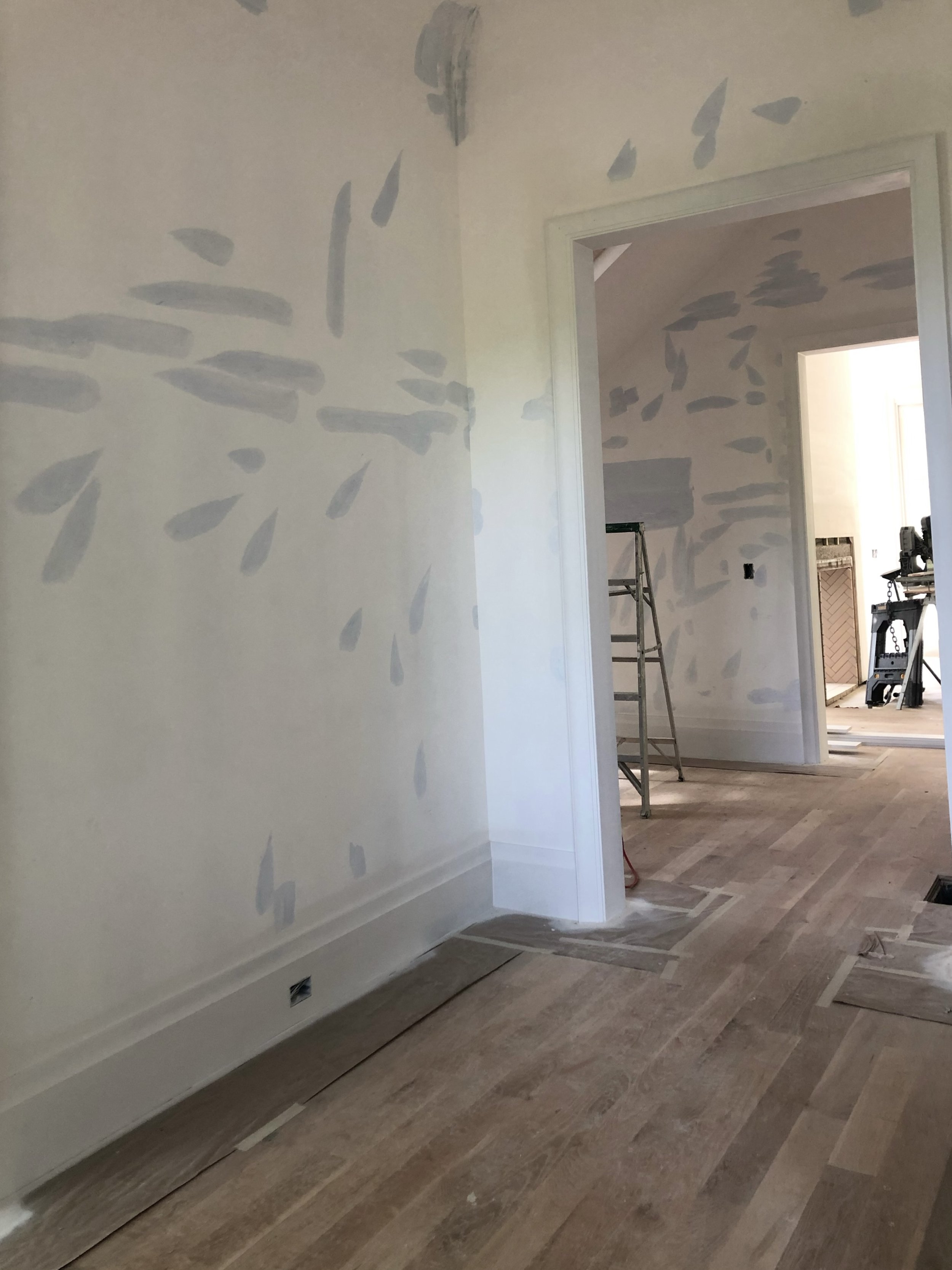
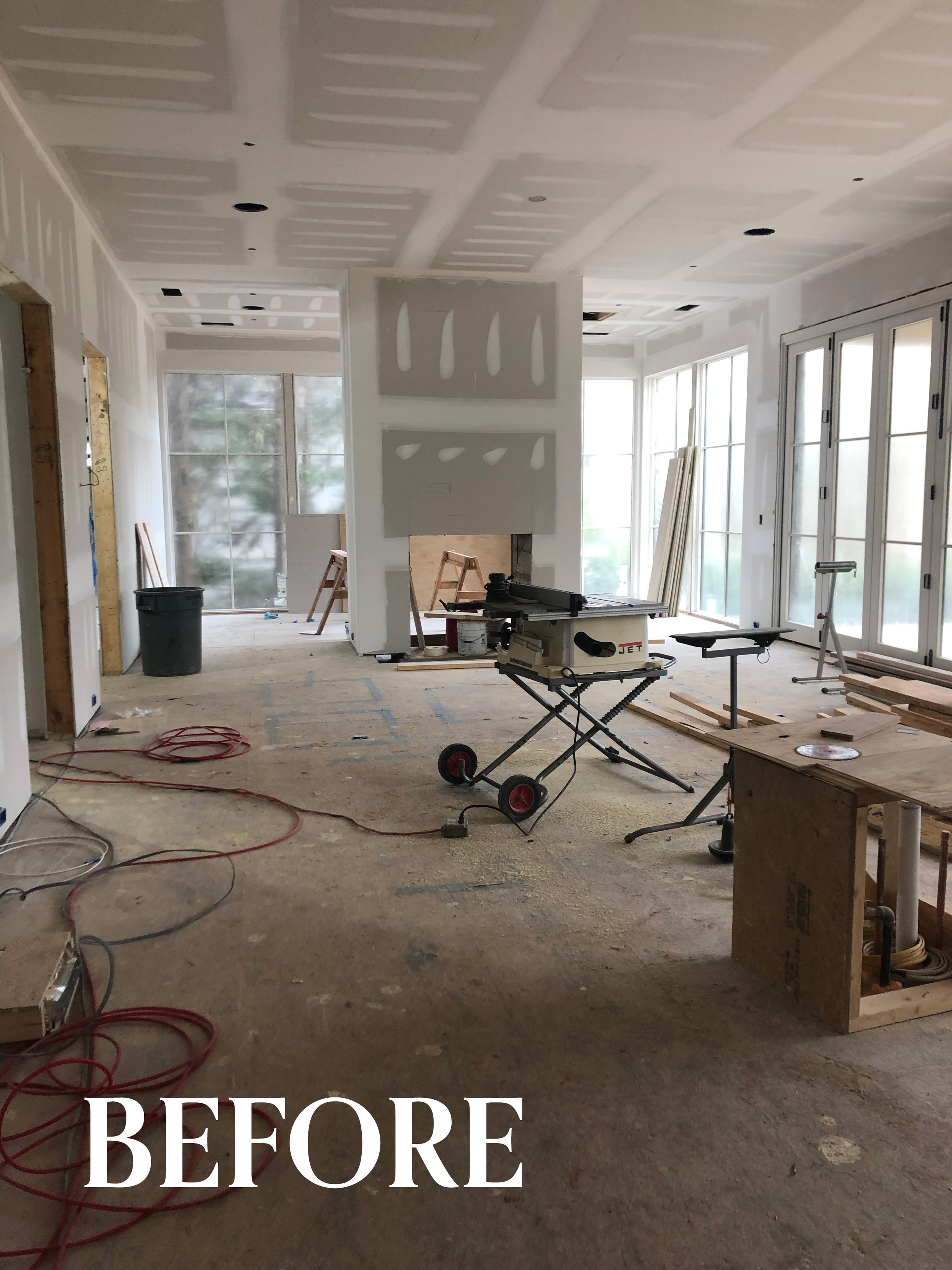
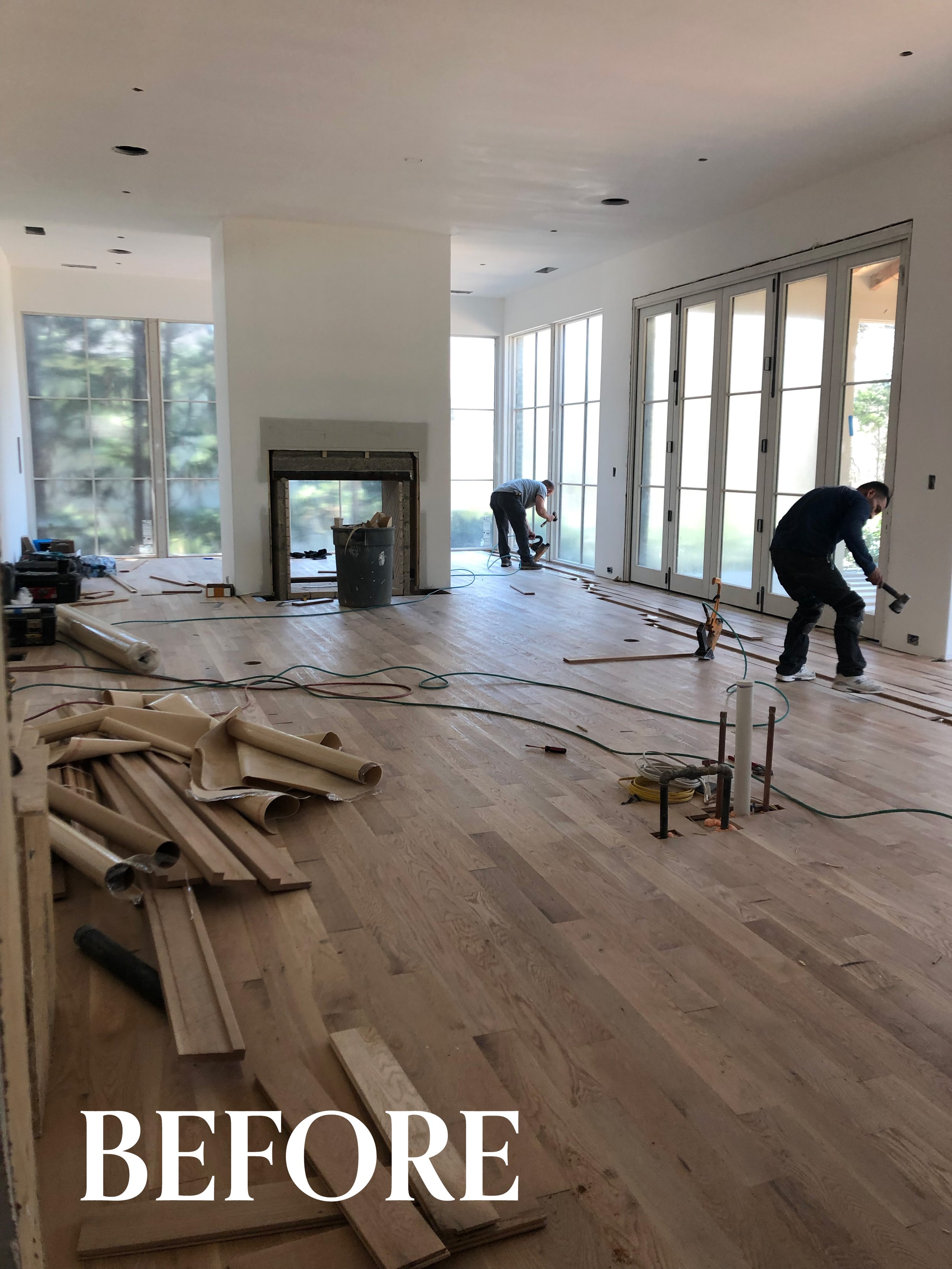
We won’t bore you with photos from the months of framing, insulation, and plumbing and electrical.. let’s jump right to the good stuff! The walls are sheet rocked and primed and ready to be painted, the hardwood floors are installed, the door and window casing and baseboards are in… and then comes all of the fun stuff — the lighting, the furniture, the textures, and the vibe. The interior finishes are so scrumptious and the best part. It’s why I was never drawn to going to architecture school — I am not as interested in all of the black and white lines and drawings and hardness .. I want texture and coziness and patina.
In the photo below we are looking from the stair hallway to the front door. Such a small space but so many decisions to make including: lighting — (statement, recessed, or wall sconces?), flooring (do we run the hardwood or tile it?), wall texture or color (wallpaper, paint, venetian plaster?) ceiling detail (barrel, cove or flat…add contrast with paint?), What does the crown molding look like, Do we need a door to the study for privacy? What are the details of the front door? Glass? Wood? Steel?
And this is just the entryway, folks. If you know me, you know I have a lot of questions in life, in general. I was born that way. We slowly bake in the answers...sometimes it’s three steps forward and one step back .. a jog of sorts until it’s all complete. It is a process… a long and very exciting one that I love shepherding.
The materials below shows the final color scheme of the main floor in paint colors, upholstery, wallpaper, rugs, millwork, and stone. The palette evolves and more interesting with every layer. Here we were keeping it neutral with interesting textures and rich blacks. As an interior designer, this is my favorite part of the process, envisioning how the materials will play together and look in the finished space.
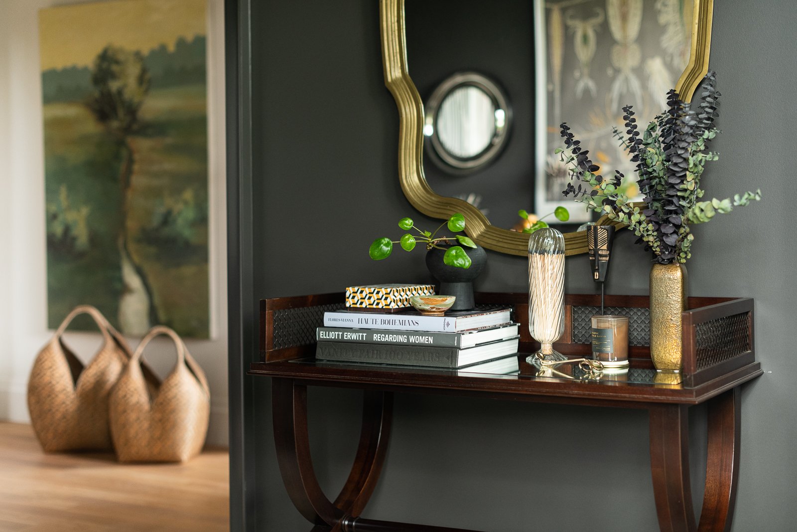
In the finished entry below the art is hung and oversized cuatro tetas decorative baskets from Columbia add some texture.
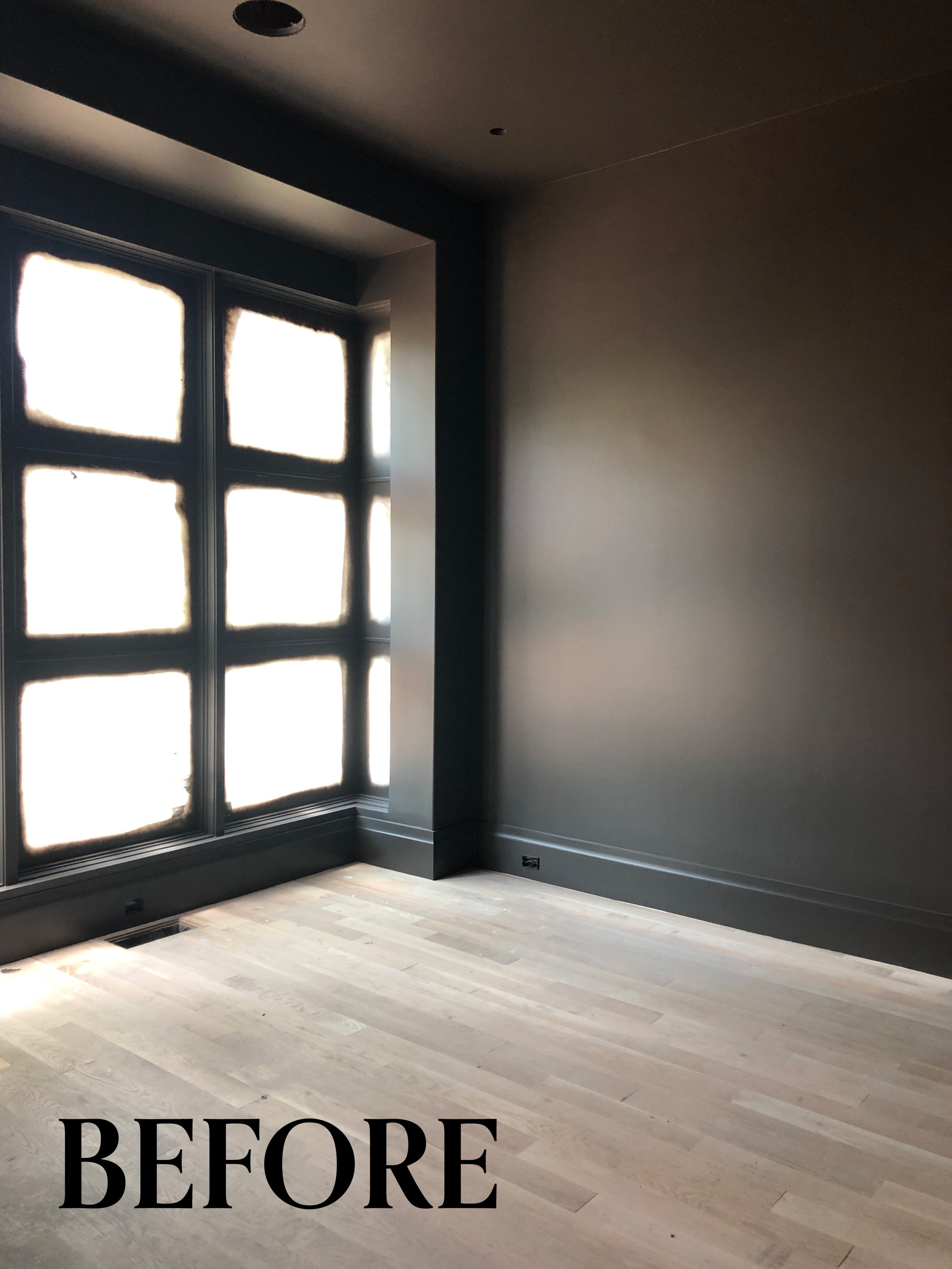
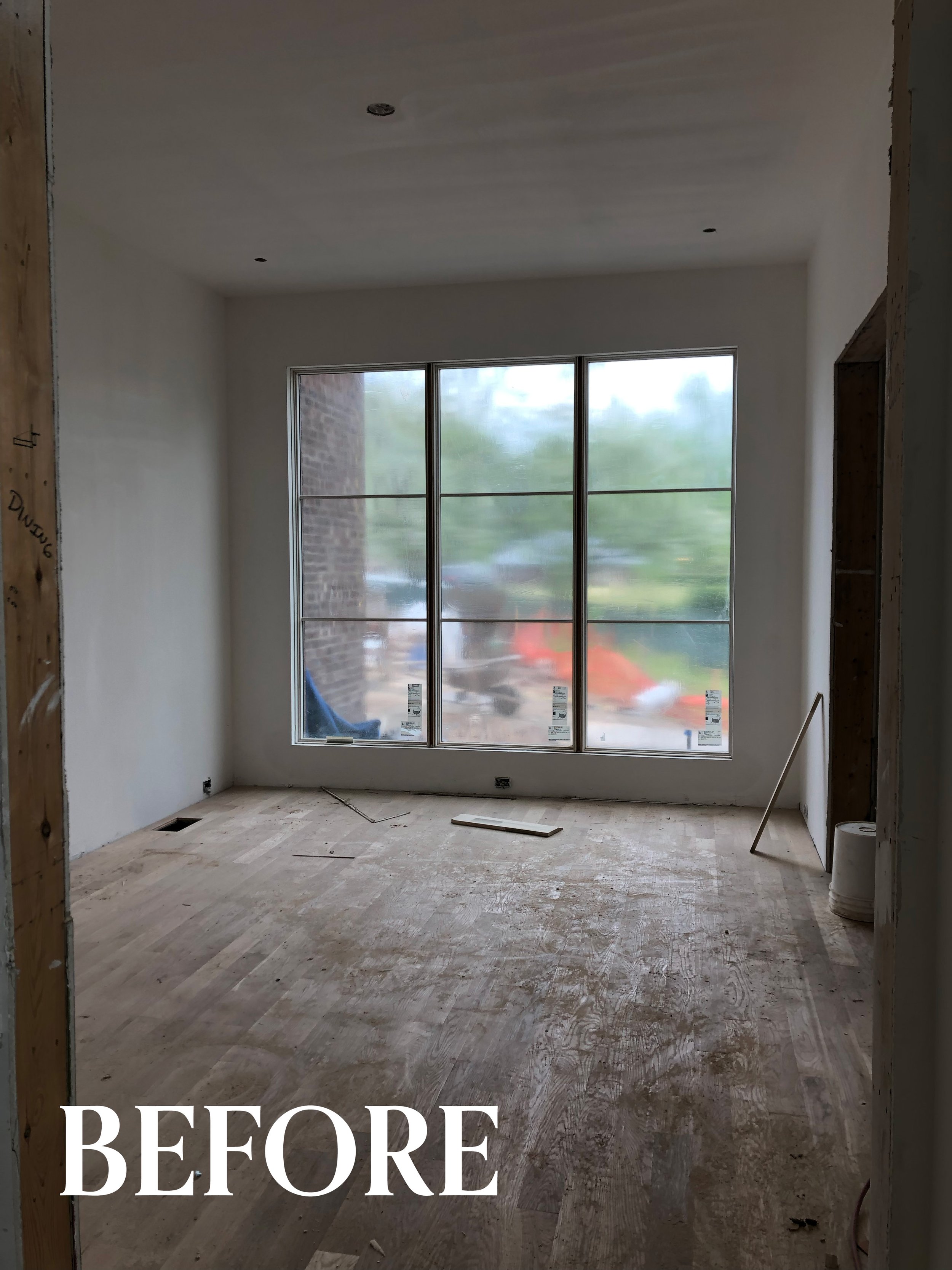
In the room below, called the study, the window wraps around to create a window box. It’s an interesting architectural detail. After the walls were primed they were painted a dark warm black called Black Fox by Sherwin Williams. I love painting the walls, the trim, and the window mullions all the same color. It creates serious mood.
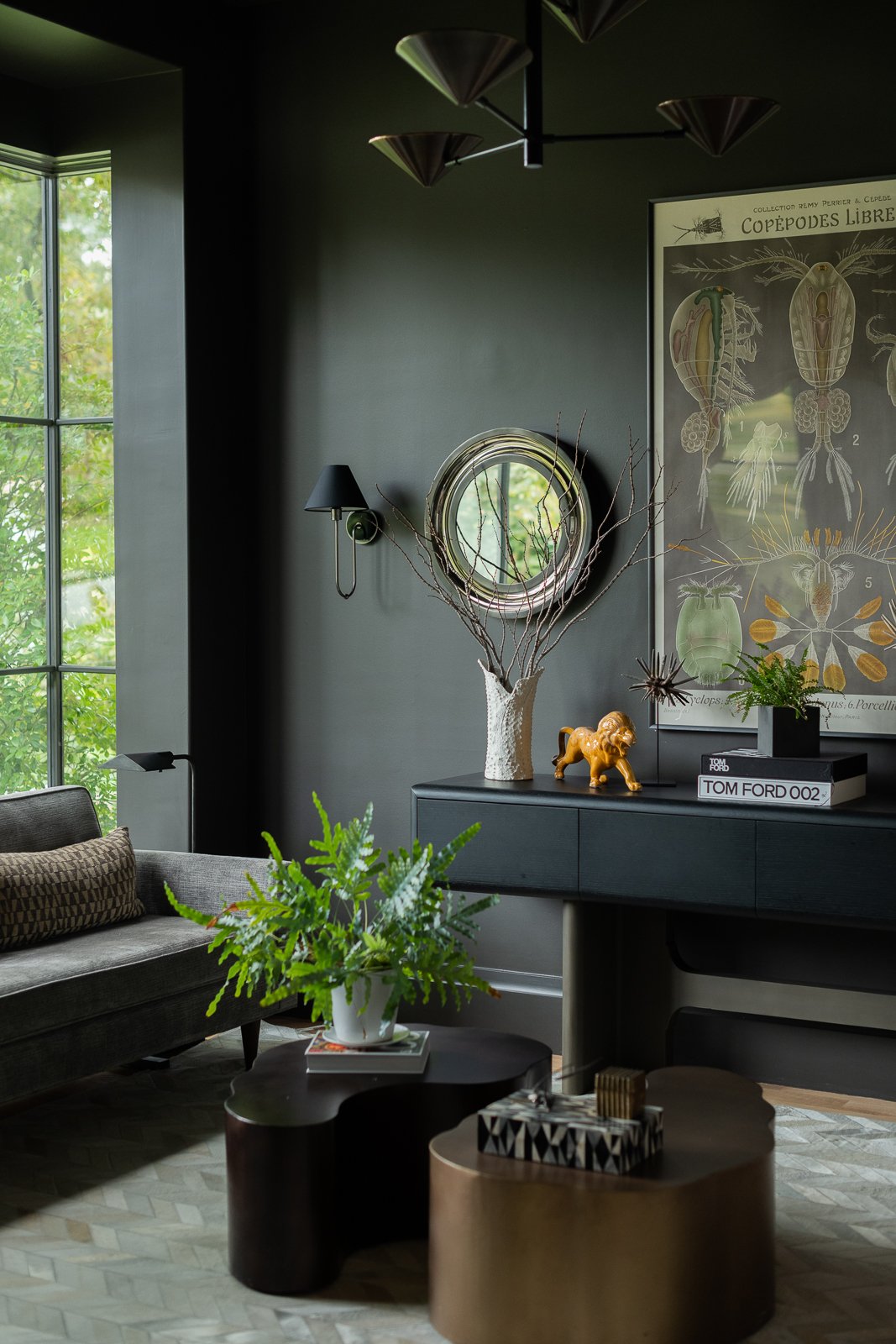
The room may feel a little dark when just the one layer is complete but as seen in the finished photo below, it’s made dimensional when the other layers are added and it’s a great contrast from the other lighter rooms.
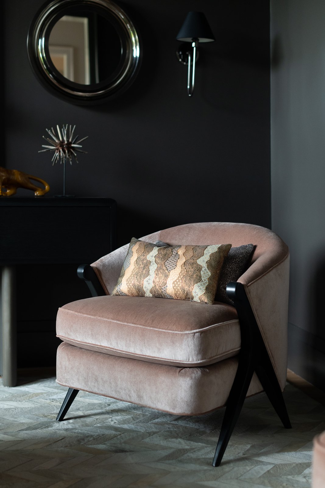
I love the brass and silver accents. We went with blush velvet chairs to pull in the blush color of the dining room across the hall.
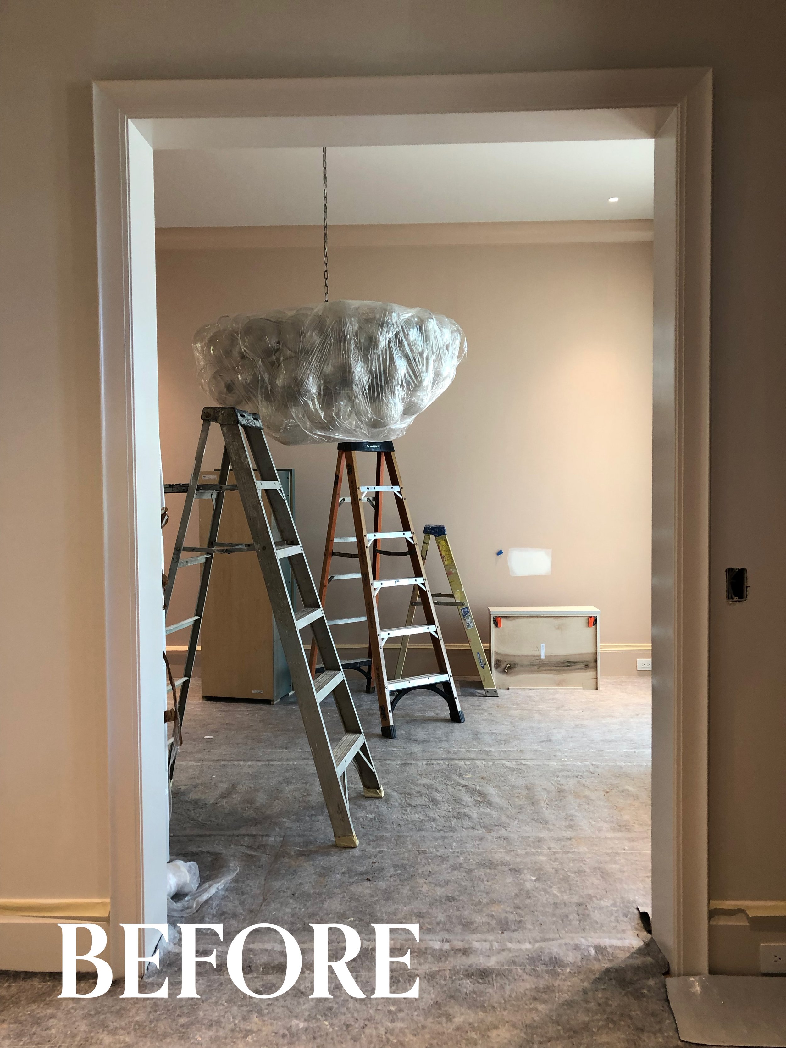
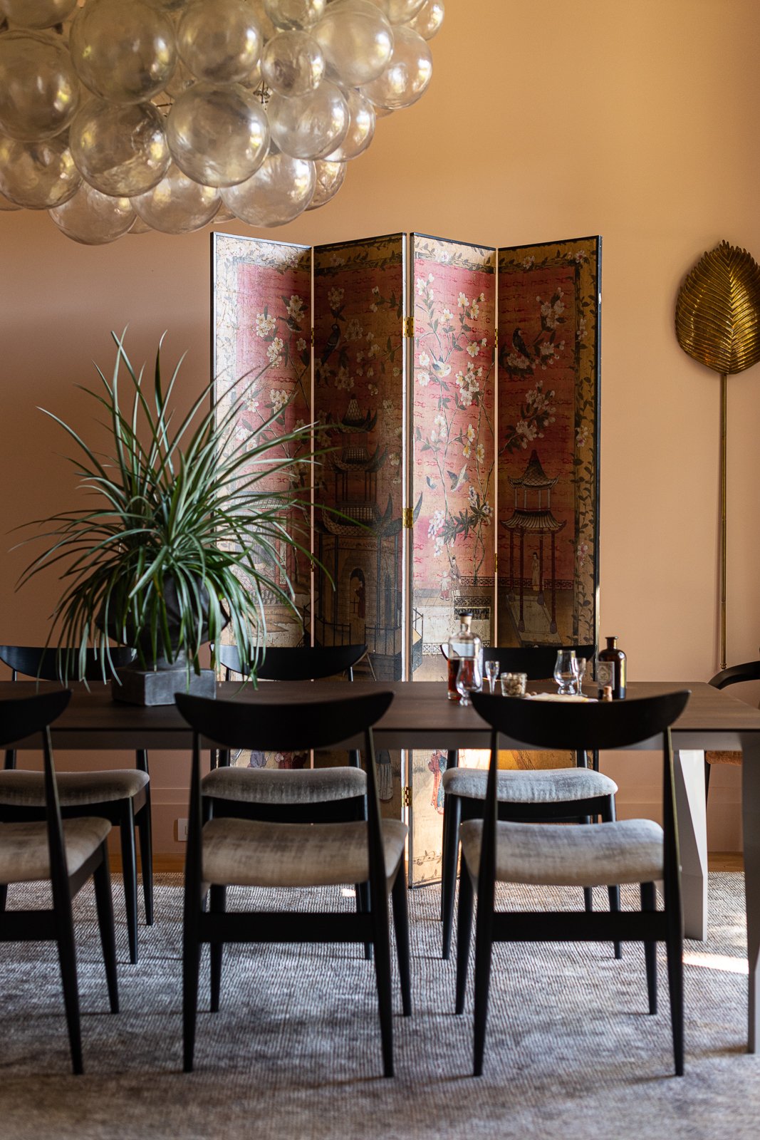
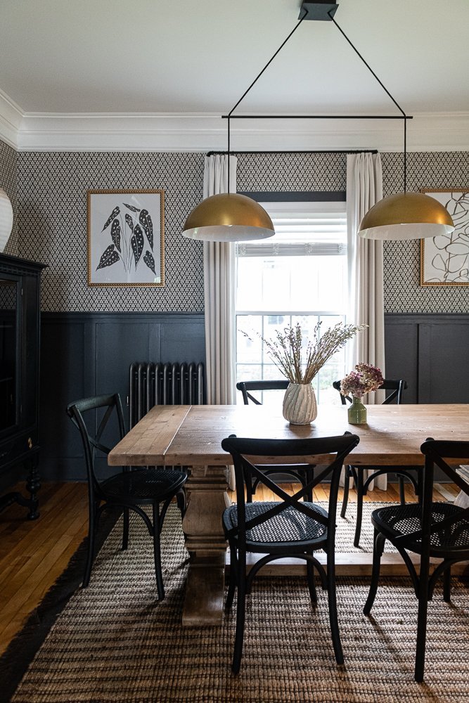
In the dining room the window is less dramatic but still oversized. We added a simple cove molding to add a bit of formality to this room. The paint color is Farrow & Ball Setting Plaster and the oversized chandelier was the first item we sourced. The piece looks like an oversized glass sculpture… it’s stunning.
In the photos below you can see the dining room styled two different ways. Which do you like better? This antique screen was purchased at Interiors Market in Atlanta and the flamingo painting is from Morning Glory at Scott’s Antique Market.
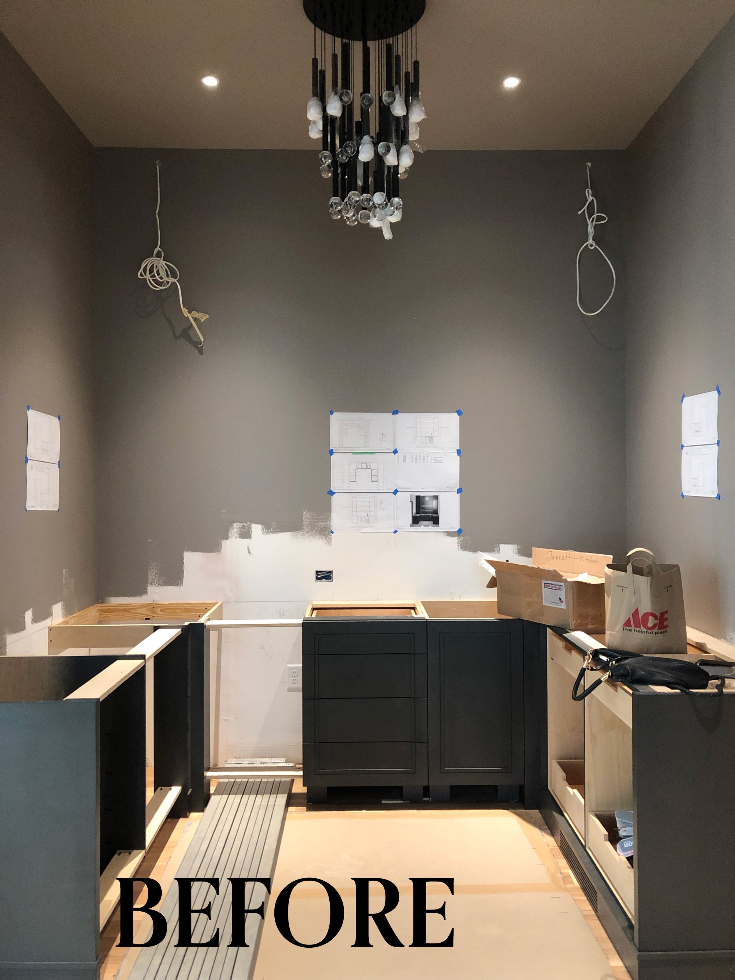
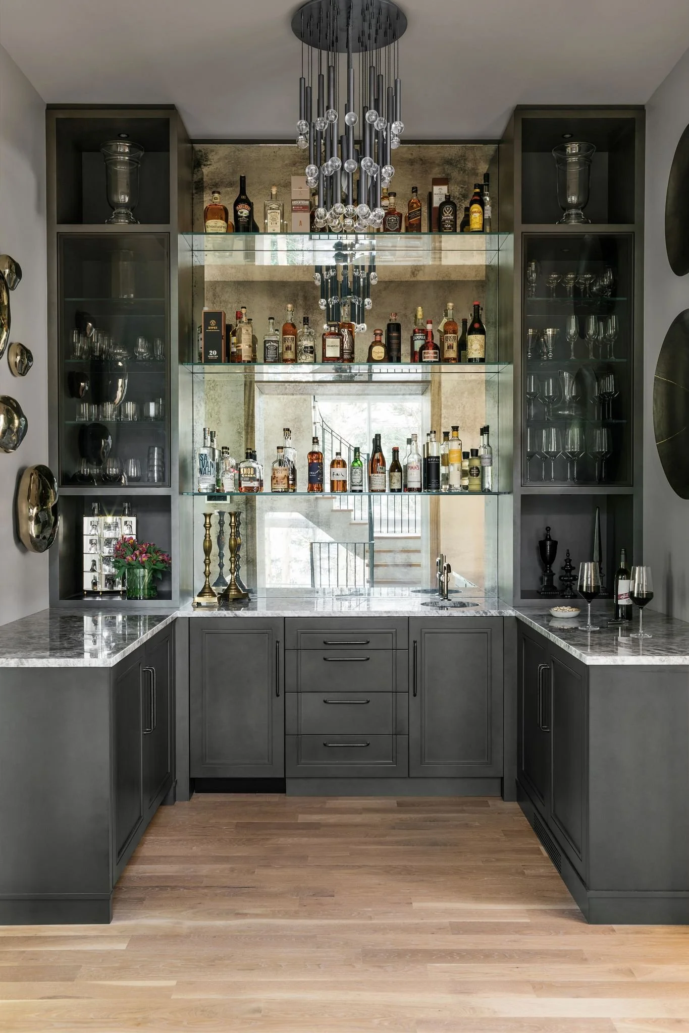
Connecting the dining room to the kitchen is an oversized butler’s pantry or bar. We outfitted this area with custom cabinetry, floating shelves, an ice machine, and two wine fridges. On the right side is storage for serving pieces conveniently located near the dining room.
Look at that beautiful antique mirror. It brings energy and life to this wall and reflects the light in interesting ways. We added two hidden closets for coats, extra storage and the vacuum which is plugged in to charge on one side. The pendant light is from Jonathan Adler.
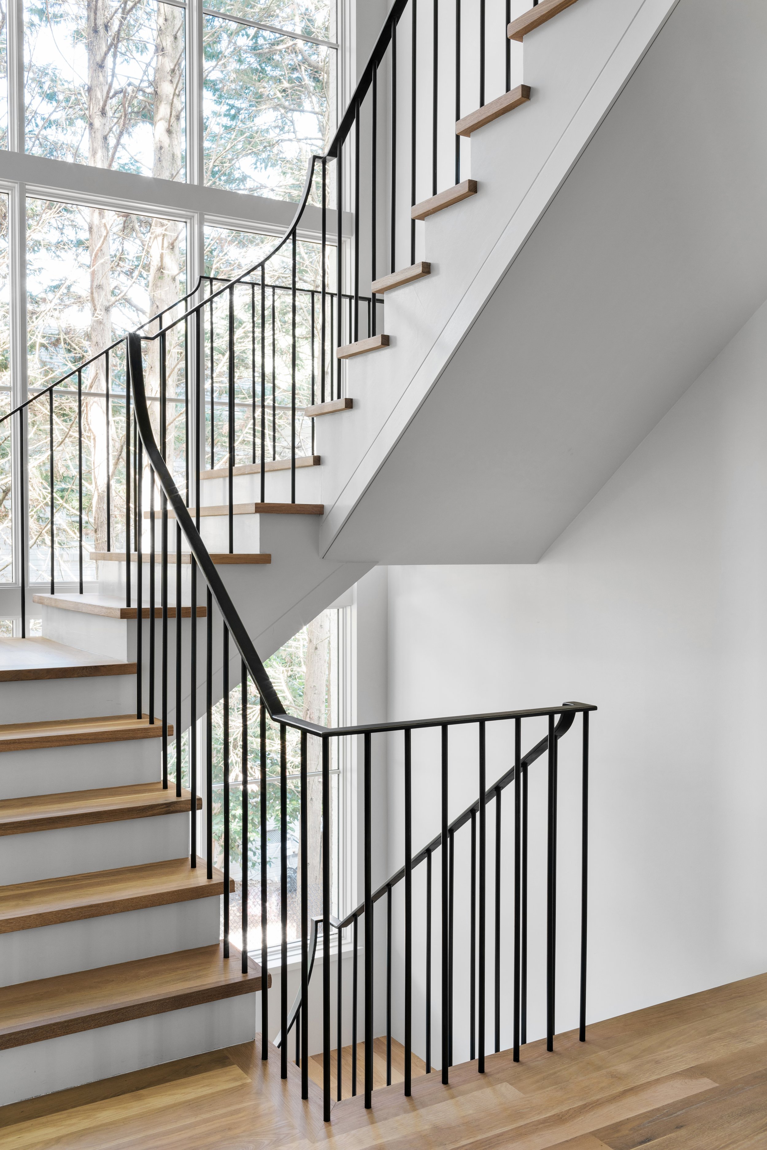
Across from the bar is the floating staircase which leads up to the bedroom level and down to the terrace level of the home. The powder room is the opening on the left, central to the main level.
We wanted the stair rail to be very modern and clean. The balusters are drilled directly into the oak stair treads and the hand rails are made of the same iron material. We added a couple of wall sconces to add some dimension and light to the hall.
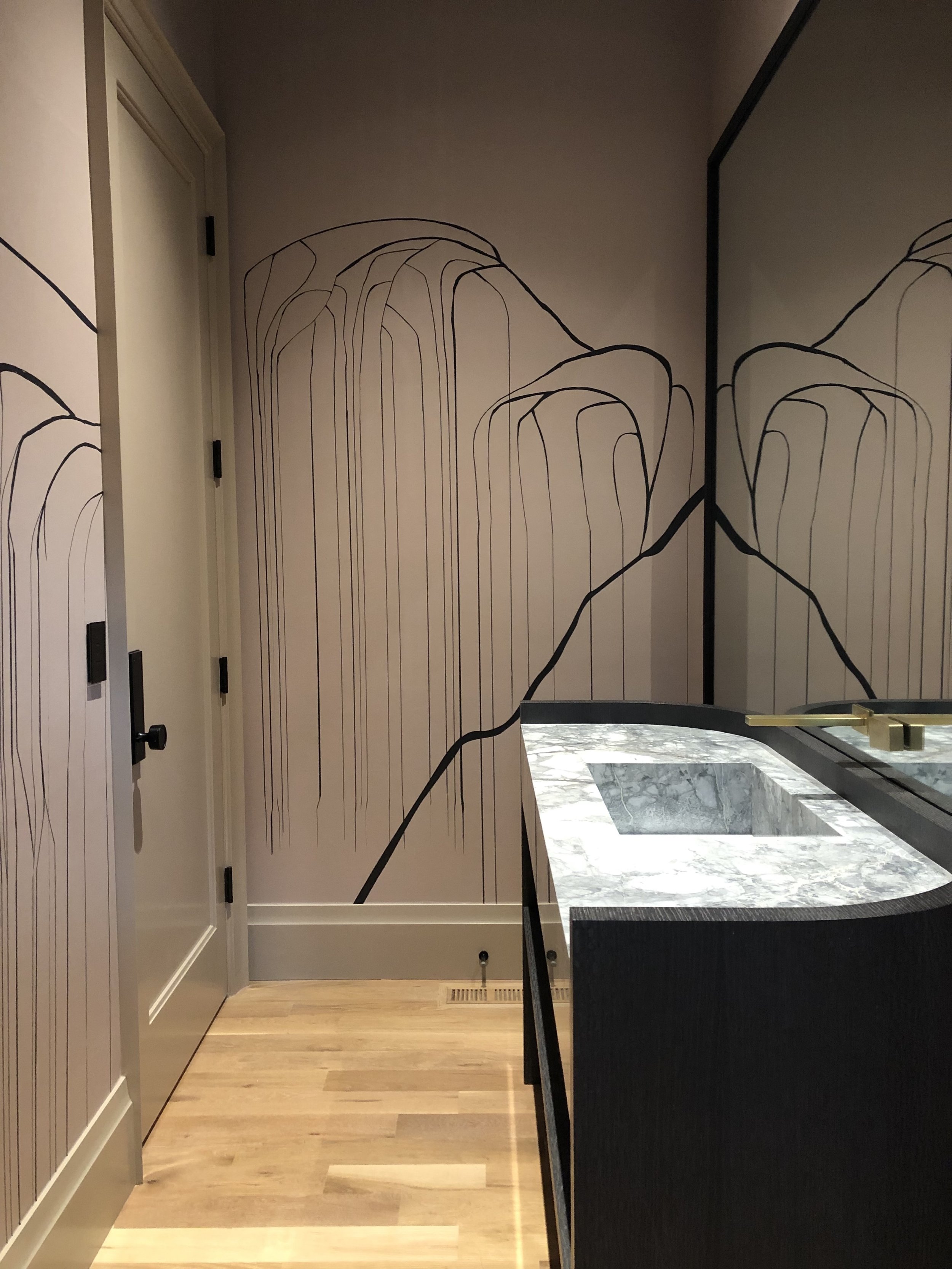
In the powder room we created a custom sized and curved sink vanity with an integrated mirror and shelf for a little open storage. The stone is a quartzite with a lot of movement and we loved it so much that we built the sink out of it. To keep it sleek, we added a floating toilet and wall mounted faucet in brass.
In the final image below you can see the beautiful cluster pendant which was purposely placed off to one side. The custom mural was designed to be wrapped around the walls.
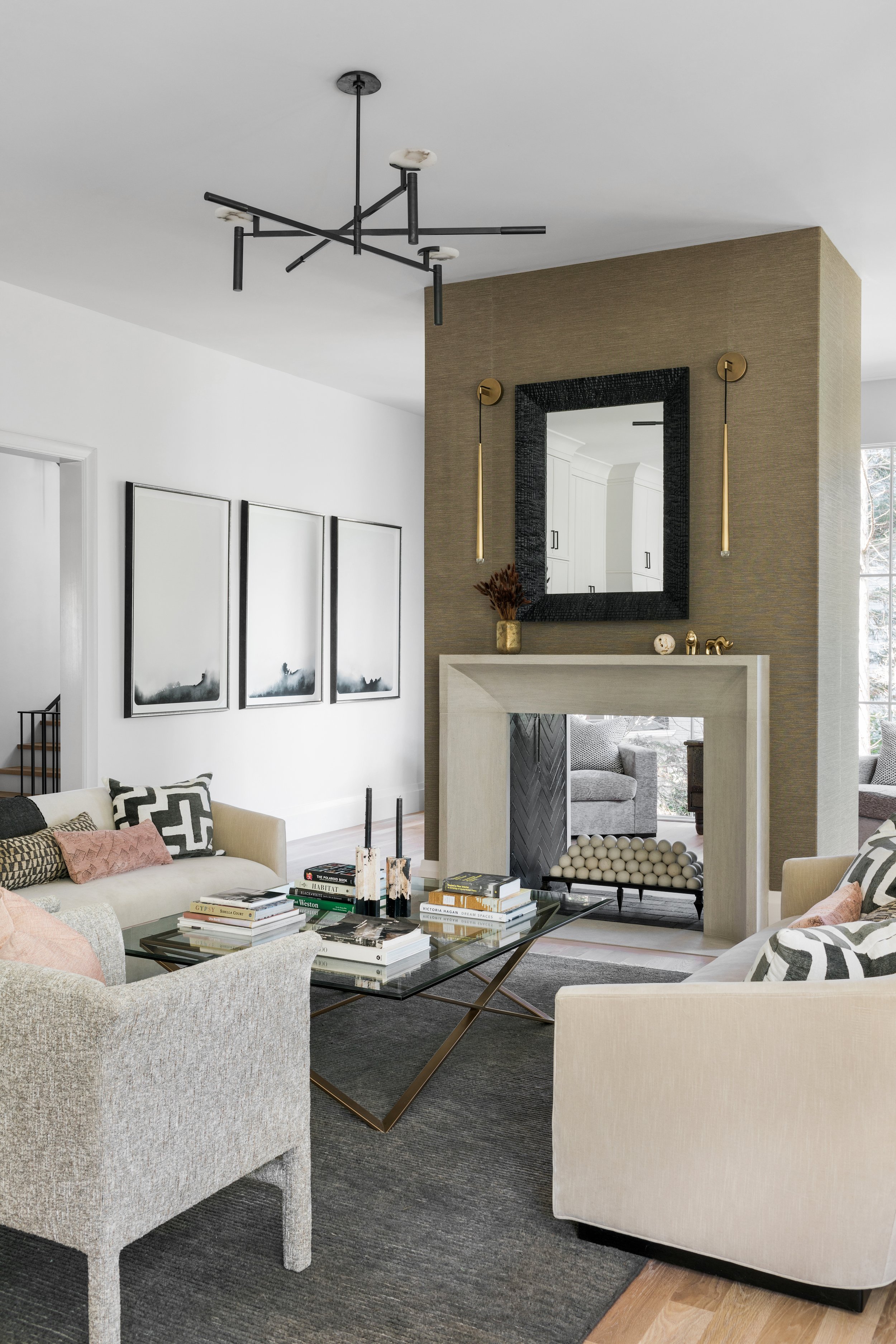
In the main living area as we move to the back of the house, you can see the windows remain large and in charge. Let that natural light in!! The fireplace is dual sided with the back of it facing the sun room and the front facing the living area and kitchen.
The hardwood floors are white oak and stained with Rubio Monocoat. The light fixtures are sculptural and the doors that lead out to the porch are accordion style so they open up all the way to the left to bring the outside in. It’s so magnificent on a Spring or Fall day.
On the fireplace below we wrapped it with a Phillip Jeffries vinyl grasscloth which won’t fade with the sun and adds some texture and interest.
The mud room is one of the hardest working rooms in the house and joins the kitchen to the garage. We did custom wood paneling which is to die for, hooks and added lots of storage for each member of the family.
On the floor you will notice the black tile goes all of the way under the bench so it’s super easy to vacuum and keep clean. The built in drawers help contain miscellaneous smaller items that we always seem to collect.
The screened in porch is a dream. The screening opens and closes with a touch of a button and we used the oversized haiku fan. The outdoor sofas are very plush and comfortable from Serena & Lily.
Stay tuned to see the principal suite and other areas of this beautiful new build in Atlanta. You can also see some of the press here.
The end.
Join the Party.
We promise not to bother you too much, but if you’d like to be alerted to new before & after blog content, please submit your details below.

