Colorful Modernism in Morningside
It is not every day that you get a new client and they say “MORE COLOR!” and “MORE PATTERN!” So fun!!
The client purchased this home in Morningside and fell in love with the modern architecture, the large windows and natural light and the en suite courtyard pool. When we first walked through together he said that it reminded him of Greece.
There is nothing better than a client who has a design point of view and a beautiful home that simply needs to be converted from a neutral real estate listing that appeals to every and any one, to his own special place.
The entryway before has great natural light and a beautiful oversized wood door but it’s a wee bit bland.
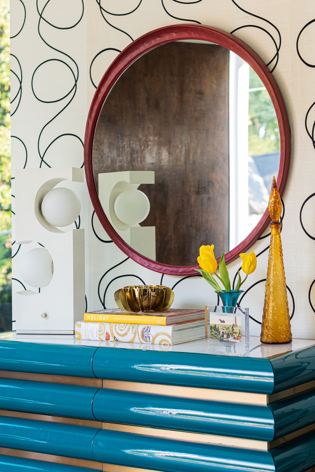
It’s not bland any more! I have had my eyes on this turquoise and brass chest from Jonathan Adler and thought it was the perfect piece for this entryway. It offers lots of storage and a great horizontal surface to add a few personal items. The mirror is an heirloom piece from Julian Chichester and has a hand made molded feel that sort of looks like paper mache. The wallpaper is such a great scale for this space and is neutral while being super interesting. The scribbles are actually dimensional and pop out from the white grasscloth background.
I found the white vintage lamp and a few of these accessories around town at a few of my favorite antique shops. Thank you, Atlanta, for all of the fun shops.
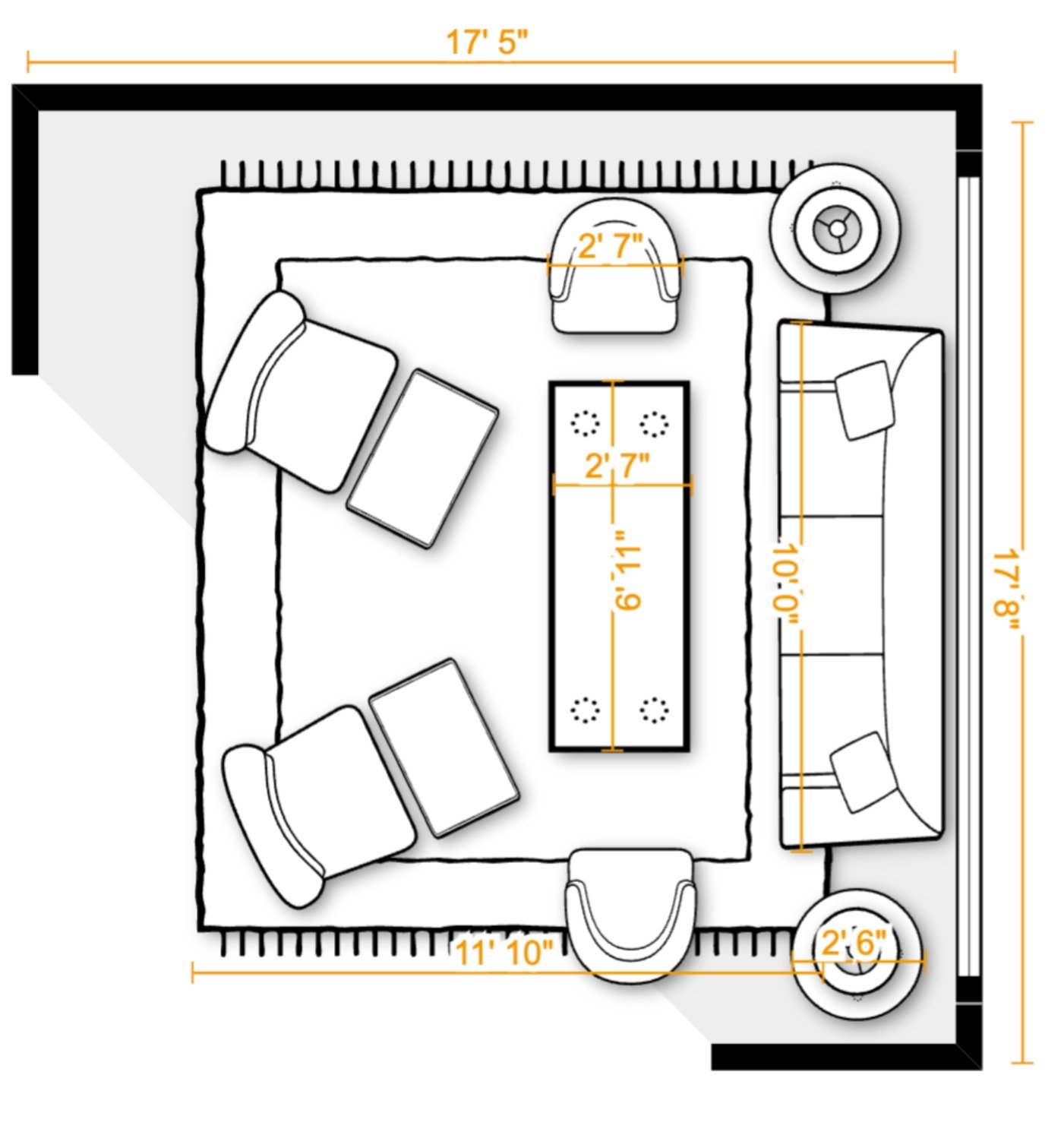
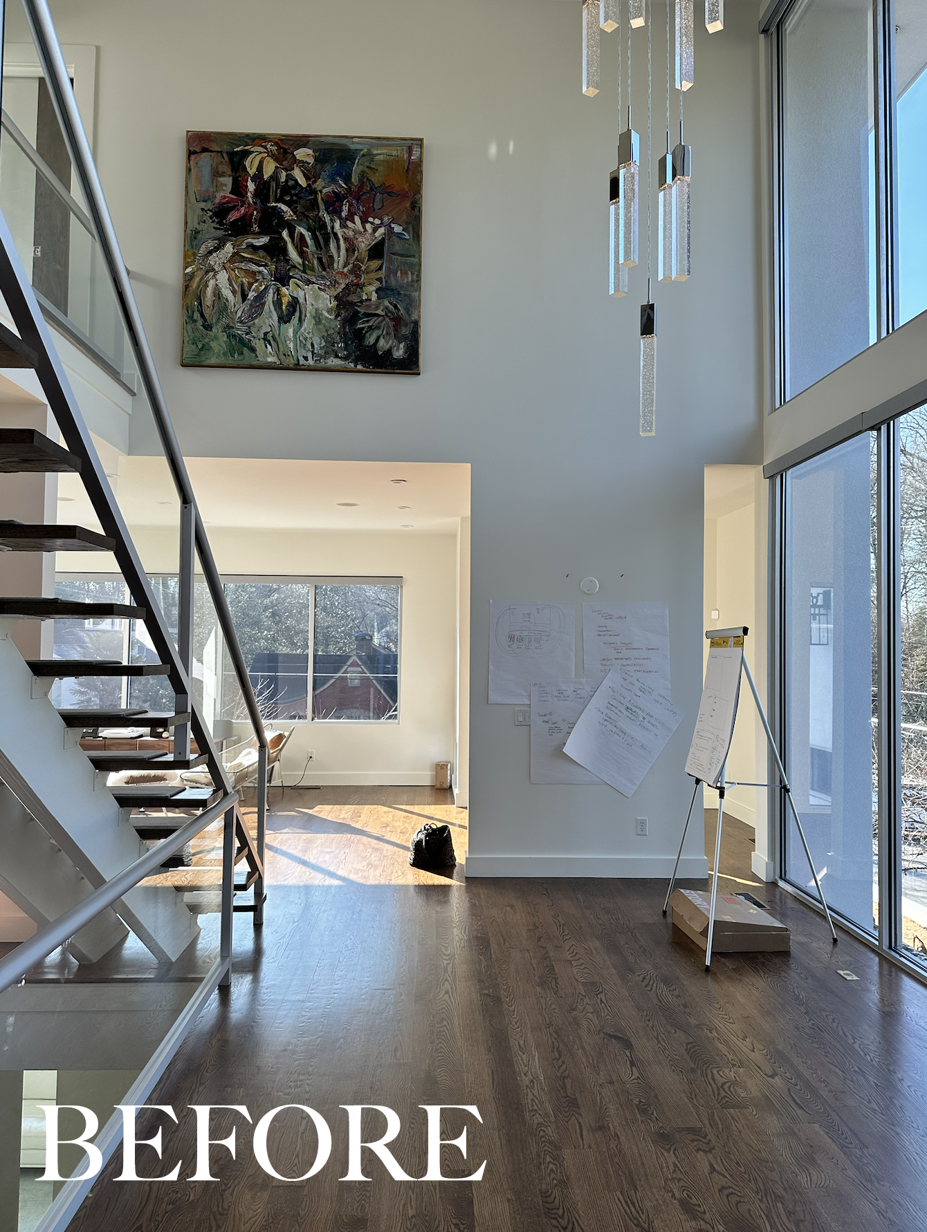
Windows and natural light for days here in this living room. We did some furniture planning as a first step to dial in the sizes and the pieces we need. In the new orientation the large sofa faces in to the rest of the house — toward the kitchen, family room and pool courtyard. I always consider the view when doing the space planning. What do we want to be looking at? In this orientation it helps to organize the space by connecting the experience in one room to the other rooms. He wanted to be able to accommodate 8-10 people socializing.
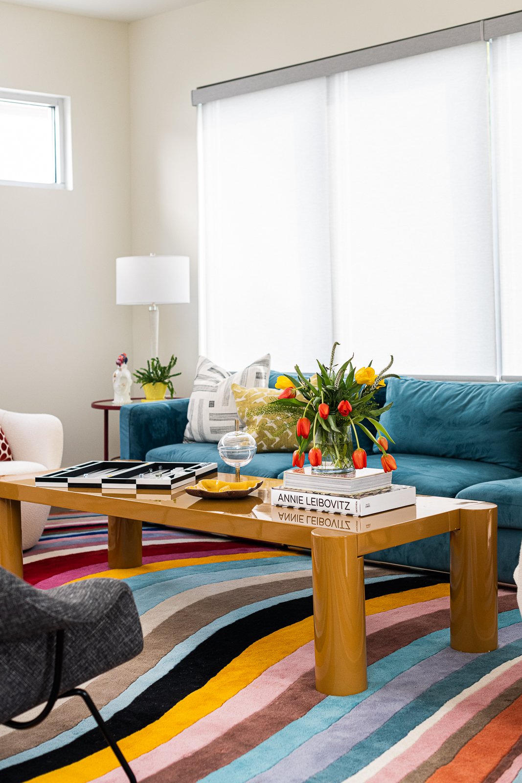
It’s always so much better in real life when we’ve sourced all of the materials. Another thing to note is that the client wanted to re-use his existing sofas since he recently purchased them. Instead of keeping them in their original locations, however, we swapped them. I moved the colorful teal sofa to the living room and the more neutral gray sofa to the family room.
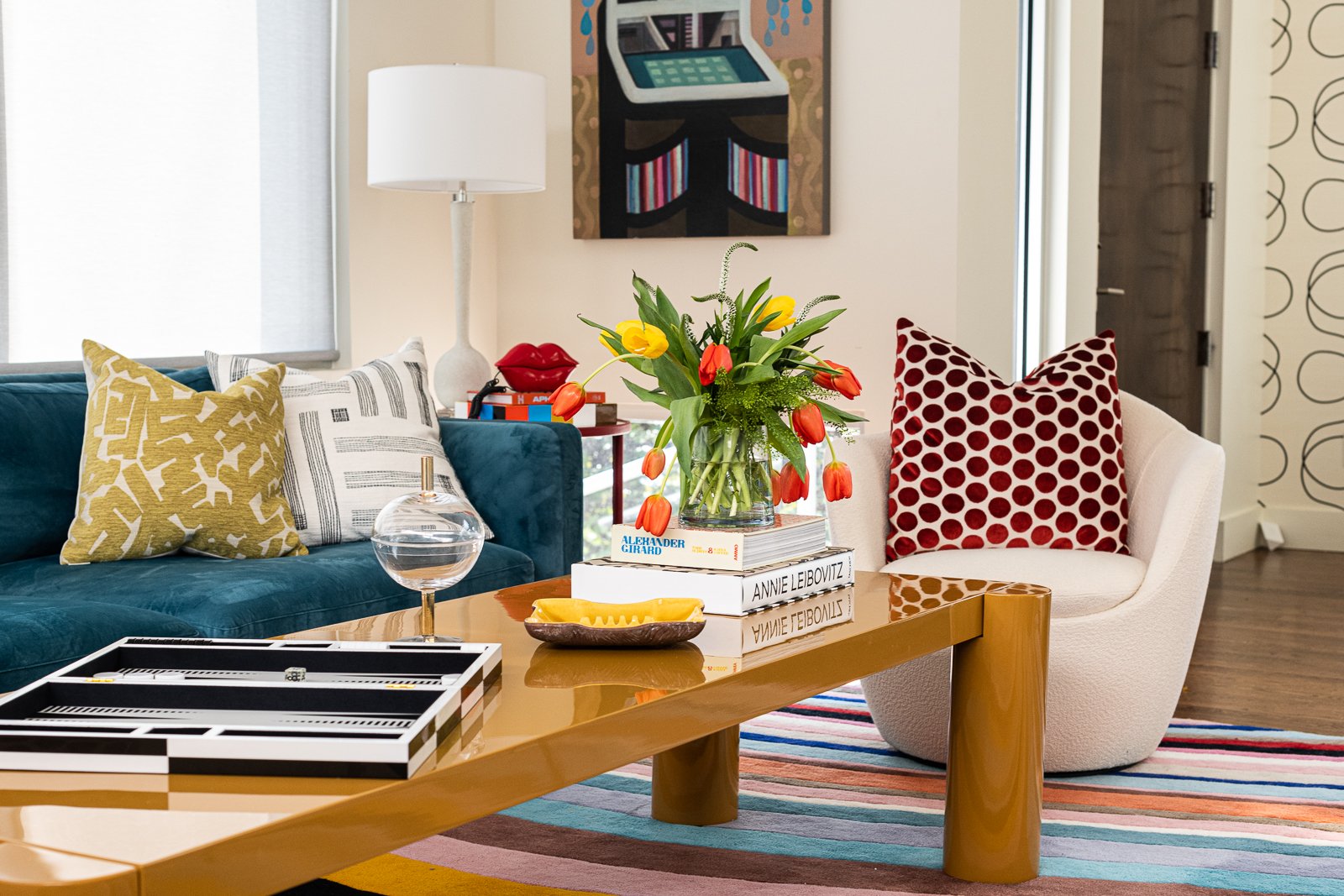
We started with this rug as the foundation of the room. The client fell in love with this colorful rug and we filled in from here. We kept the seating neutral with black and white fabrics on the four DWR chairs and designed this amazing yellow lacquer coffee table to stretch down the length of the sofa. I love the colors together. It’s so cheerful. These red side tables are wrapped in leather and are so dreamy and I found these MCM vintage lamps at one of my favorite local lamp shops— Lamp Arts. And see how nicely that scribbles wallpaper looks popping in from the entry on the right?
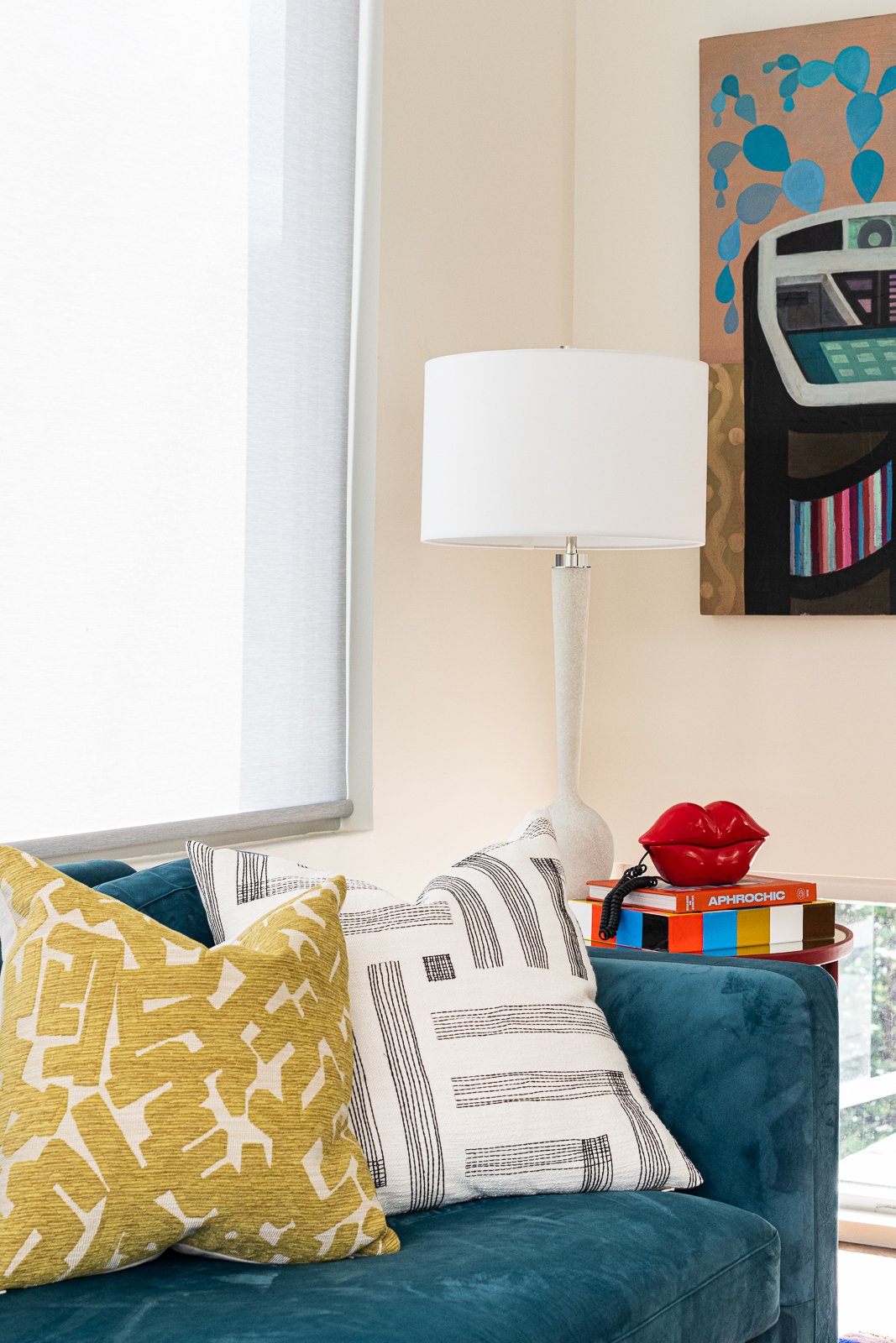
I am loving the chunky round legs of this custom coffee table and the gorgeous yellow color. The red dot pillows were custom made and the other two yellow pillows were sourced from a few of my favorite semi custom pillow vendors. I have many tricks and vendors up my sleeve, folks. That is my job! I am loving the pattern play here.
I didn’t get a great photo of the Jeni Stallings encaustic art, but I sourced this from Thomas Dean Fine Arts. She usually paints women swimming so this jukebox is a unique subject for her.
I need that lipstick phone in my life. And by the way, playing backgammon is kind of fun. I have recently picked it up.
Sharing the digital design board below of all the selections dialed in. The colors are even more saturated in real life.
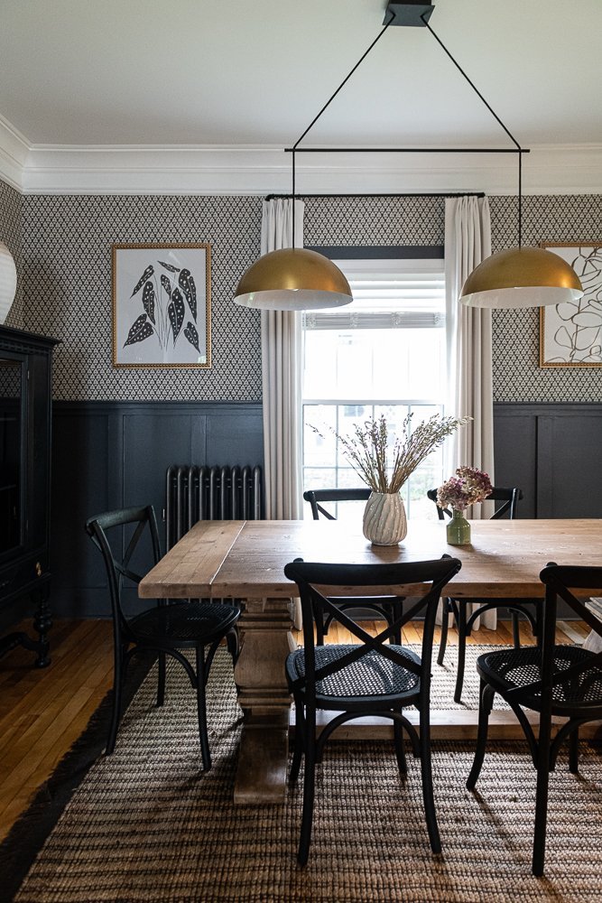
As we move into the house we find ourselves in the dining room. Again, the double story windows are dramatic and lovely. This room is really tall and really narrow so that makes finding a dining table tricky— they are all too short.
So…we designed and built our own dining table. We found this gorgeous polished nickel pedestal base and worked with a talented company to create an oval dining table that is 50” wide by 110” long. We are mimicking the proportions of the classic MCM tulip table. This table size completely fills the space and maximizes the seating capacity. On one end of the room we have a fireplace and on the end you can see below, we added a really tall cabinet. The cabinet is white but has a mirrored honeycomb pattern so it reflects the color on the opposite wall.
We added Panton style chairs in white linen and a custom sized white hair on hide rug. Texture and scale working together here.
The family room is connected to the kitchen and in the before image below you can see into the pool area. Is that blue sofa looking familiar? We removed the ottoman to use in the living room. Resourceful, right?
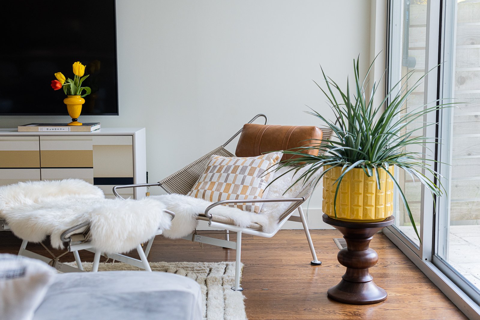
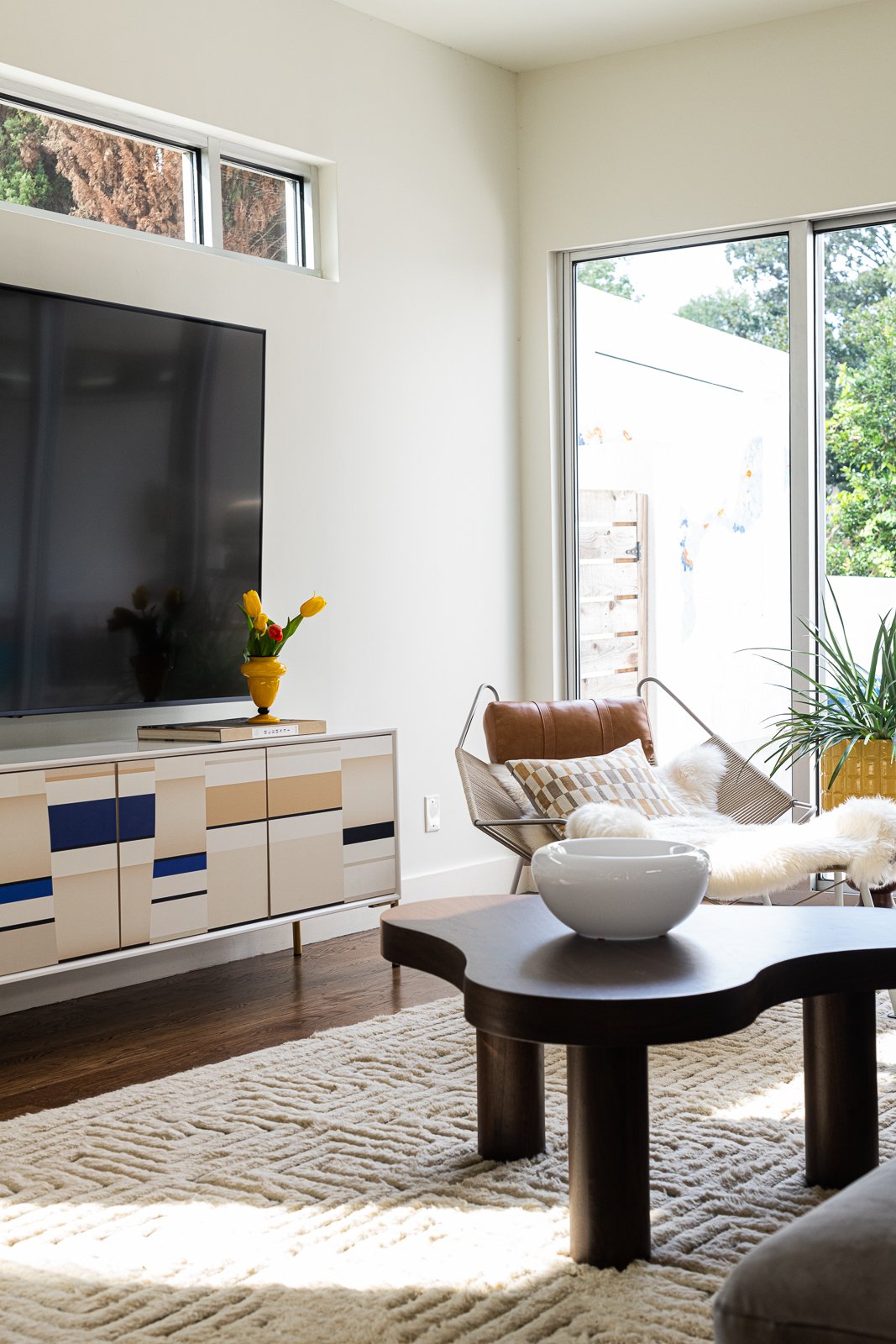
Since we dove into color in the living room, we pulled back in the family room. We started with a creamy textural rug, used the existing gray sofa (which is a smaller scale and fits better) and repurposed his existing lounge chair to this corner.
Since the TV is so giant we created a custom sized media console to ground it below. It has an interesting MCM pattern with a little bit of color.
The coffee table is from Bradley and is also a custom sized piece in classic walnut.
I love all of the lines and forms. The counter stools are a molded plastic sourced from DWR and the client had this art that I framed for him.
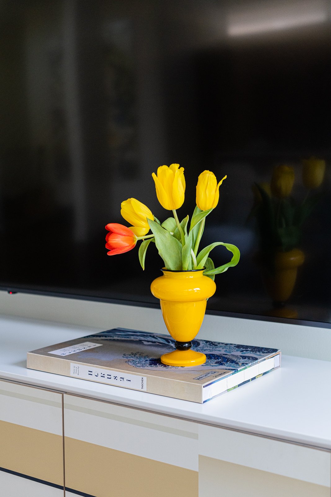
Nice detail with a few pops of yellow below. I always like pillows to add some color and contrast.
We could put art on the wall below but I love all of the white walls and negative space that allow the furniture and objects room to breathe.
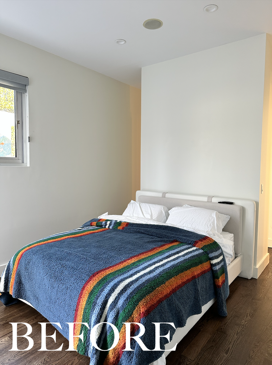
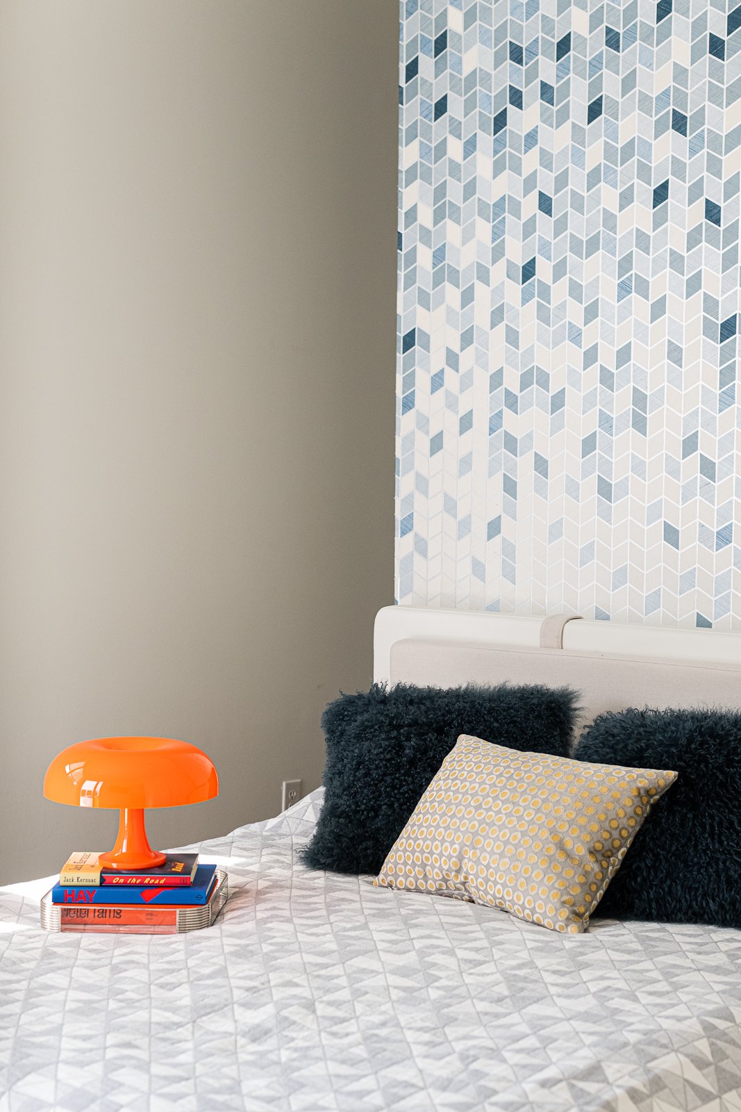
In the guest bedroom we wallpapered the floating closet and updated the bedding.
We are not afraid of pattern over here.
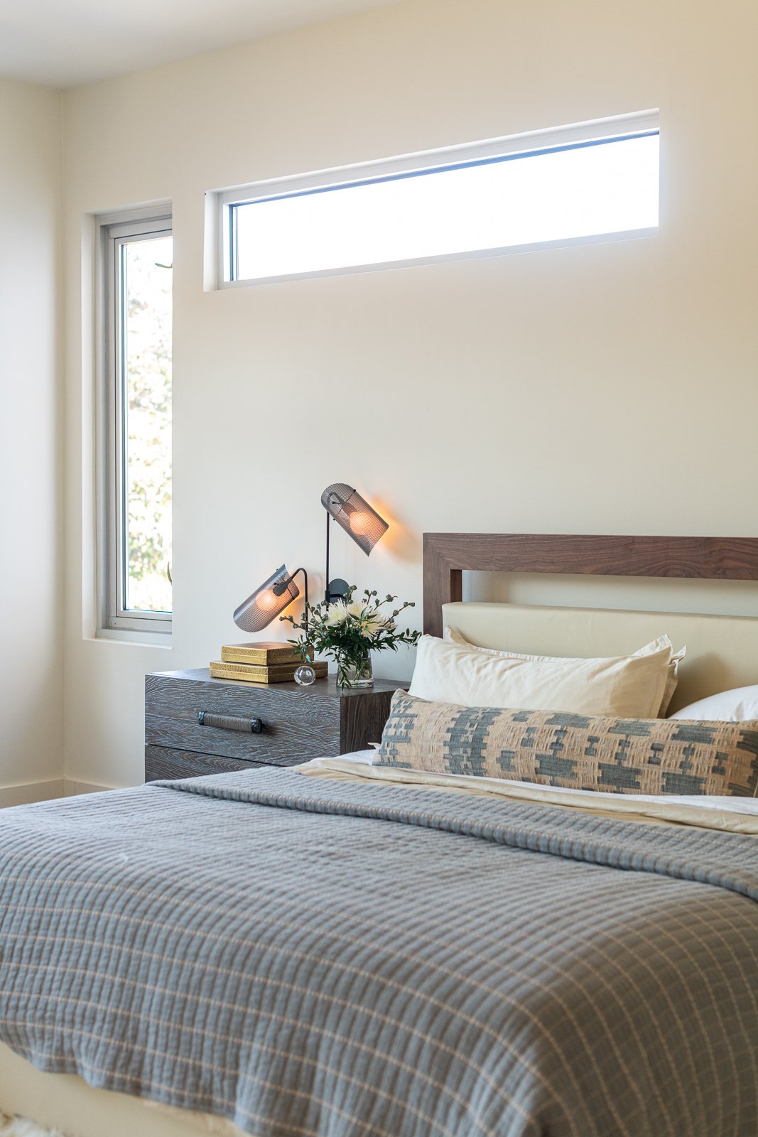
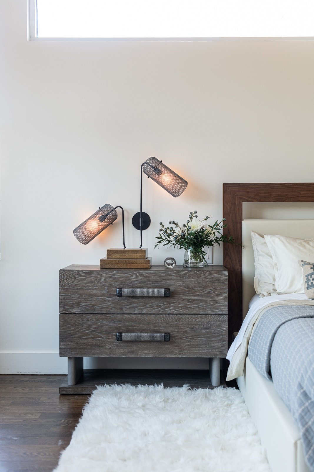
In the principal suite we added oversized nightstands, fabulous blue mesh wall lights, a super shaggy wool rug and organic bedding to complete the look of the bedroom. He had the bed so we built off of it. We kept the materials luxurious while still keeping it simple.
The end.
Interested in working together on your Atlanta interior design project? Book a discovery call to see if Violet Marsh Interiors is a fit. Please cruise around the site using the navigation links below and please do let me know how I can help.
Join the Party.
We promise not to bother you too much, but if you’d like to be alerted to new before & after blog content, please submit your details below.

