A Reimagined Atlanta Principal Suite
Oh, to have a refreshed bedroom and bathroom that is designed and customized to you! We started work on these two+ rooms a year ago and I am very happy to report that they are now complete after a few set backs. While we try our best to only work with vendors we have worked with before, sometimes we have to forge ahead with new relationships. In this case, we worked with a contractor and cabinet maker who were recommended by a client and another designer and had a few issues. We made it to the finish line eventually, and everyone involved maintained accountability which is so important, but it was not as smooth as I like the process to be.
These clients bought this home in Sandy Springs that was built in the 90’s and it was….well… stuck in the 90s. They lived here for a few years before deciding to renovate. I always think living in the space is such a great idea because you can really get a sense of what is working for you and what needs to be improved upon or added.
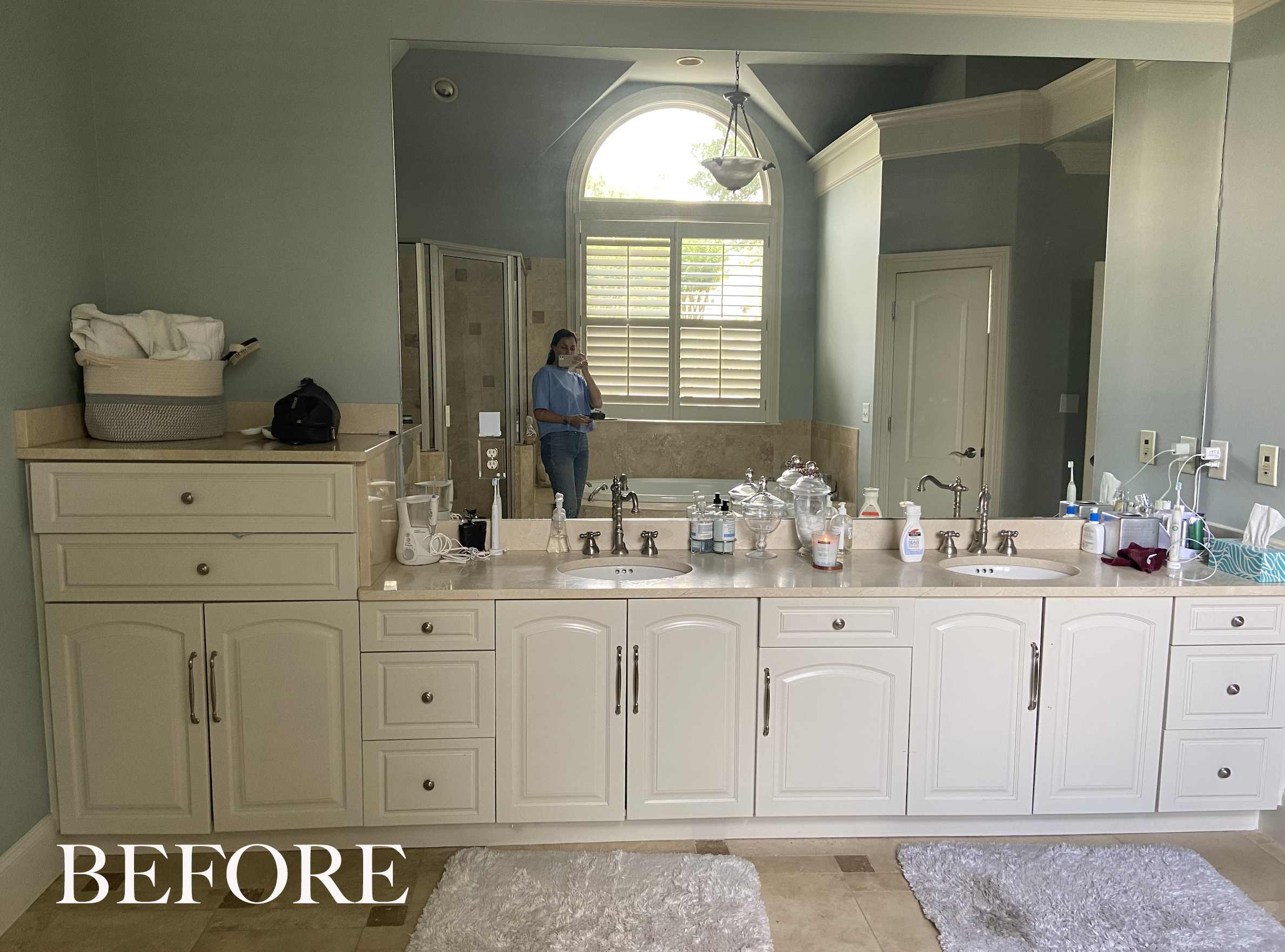
In the before photo of the vanity wall above there is a wall of white cabinetry with an odd (tall but not too tall) cabinet on the left and a makeup vanity all the way in the right corner which gets smacked by the door every time the door opens. These cabinets are original to the home and have served their time… you can see the wear with some of the hardware in disrepair.
It’s a very dramatic interior transformation and that is what we live for.
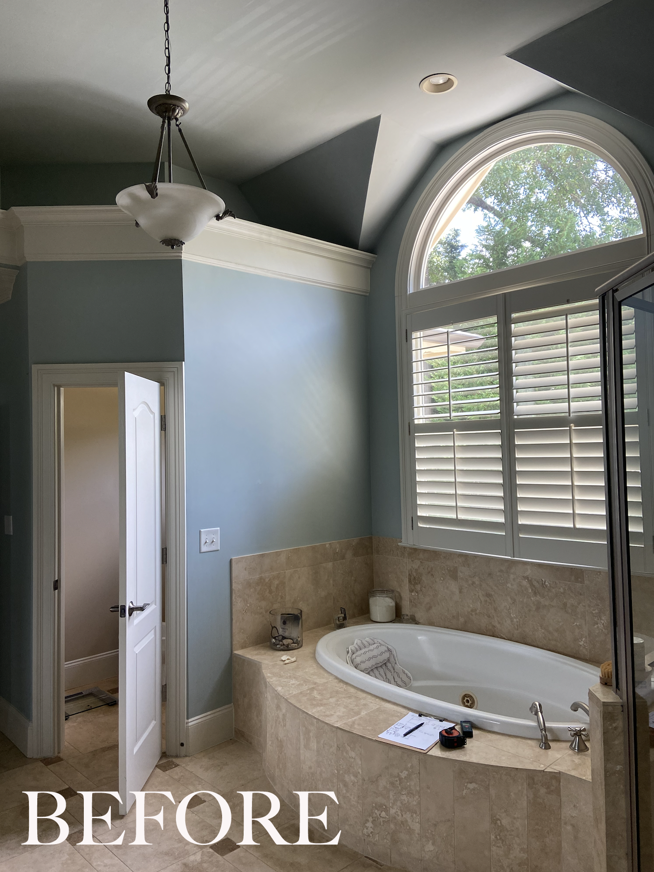
Across from the vanity wall was a built in tub with a massive demilune window shown below. There’s also a large shower with knee walls, one small light fixture which is lost in this large room, and so many angles everywhere you look. In the water closet view you can see how the wall ends short of the ceiling. This line carried through over the cabinet wall, and these things, my friends, I just don’t understand. I suppose it was to add some volume to the space but it had to go.
What is also noticeable is the odd cavity in the shower and what I would call, the random placement of wall tile. It the shower it ends abruptly and in the tub area they have only tiled one side of the window. These are all design decisions so someone was sleeping on the job. We also removed the eyeball lights and try never to install them on a sloped ceiling like this. It’s an eye sore.
I love seeing the before photos and then the updates side by side. It’s so easy to forget how far we have come.
There are a lot of traditional details in the curved lines of the doors and the extra thick millwork and even in the faucets. This style matches the style and facade of the home but the clients wanted something modern and earthy feeling. Their vision was to make this principal suite feel like a hotel and spa. They make regular trip to Mayakoba, Mexico and are very inspired by the Banyan Tree Resort. I stayed at the Andaz in the same area, a few years ago and love the vibe. It’s laid back, modern, earthy and luxurious at the same time. It’s inspired by Mexico while also having an Asian feel. I was all in!
In any new design, we start with the layout and the space planning— it’s the black and white outline of what will be and then we fill in the color and the texture. My first idea was to float the tub in the center of the room and relocate the shower in front of the window for added drama, but to cut costs, we landed on keeping the plumbing in the original locations. This bathroom is massive so there is plenty of room for everything but we had to plan around the large window and the two doors. One door is the entrance to the room and the other is to the walk in closet.
In the original design I also had the makeup vanity in the center which separated the two sink vanities. I love symmetry and always look for clean lines and balance when I am designing a room.
A few of my goals in this project were to remove all of the angles, add more statement lighting to fill in some of the volume with the soaring ceiling, and try to tidy up the slanted ceiling sections. Obviously new paint, tile, and plumbing, and trim were in order and we updated the doors and the door locations to make the space more functional.
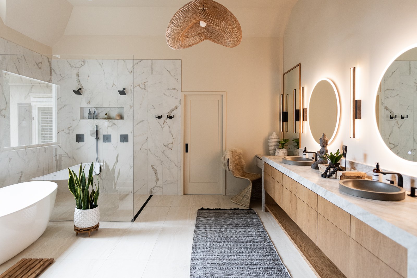
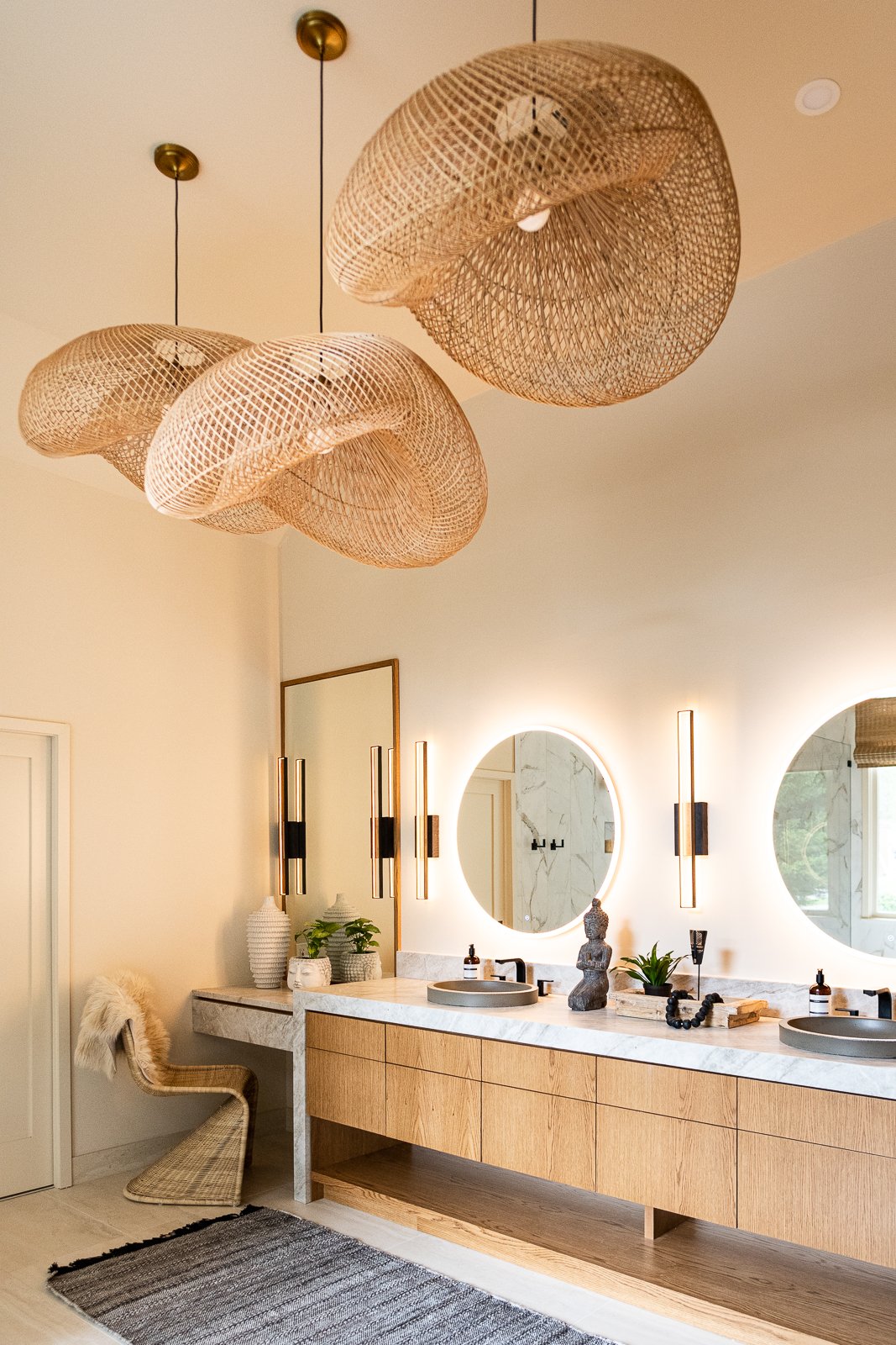
Once the space planning is locked in we start building the look and feel. We sourced LED circular mirrors, wall sconces, oversized woven pendant lights, and neutral and earthy tiles and then designed the custom vanity. In order to maintain symmetry on the long vanity wall, I added a framed mirror that is the same height as the linen closet on the right.
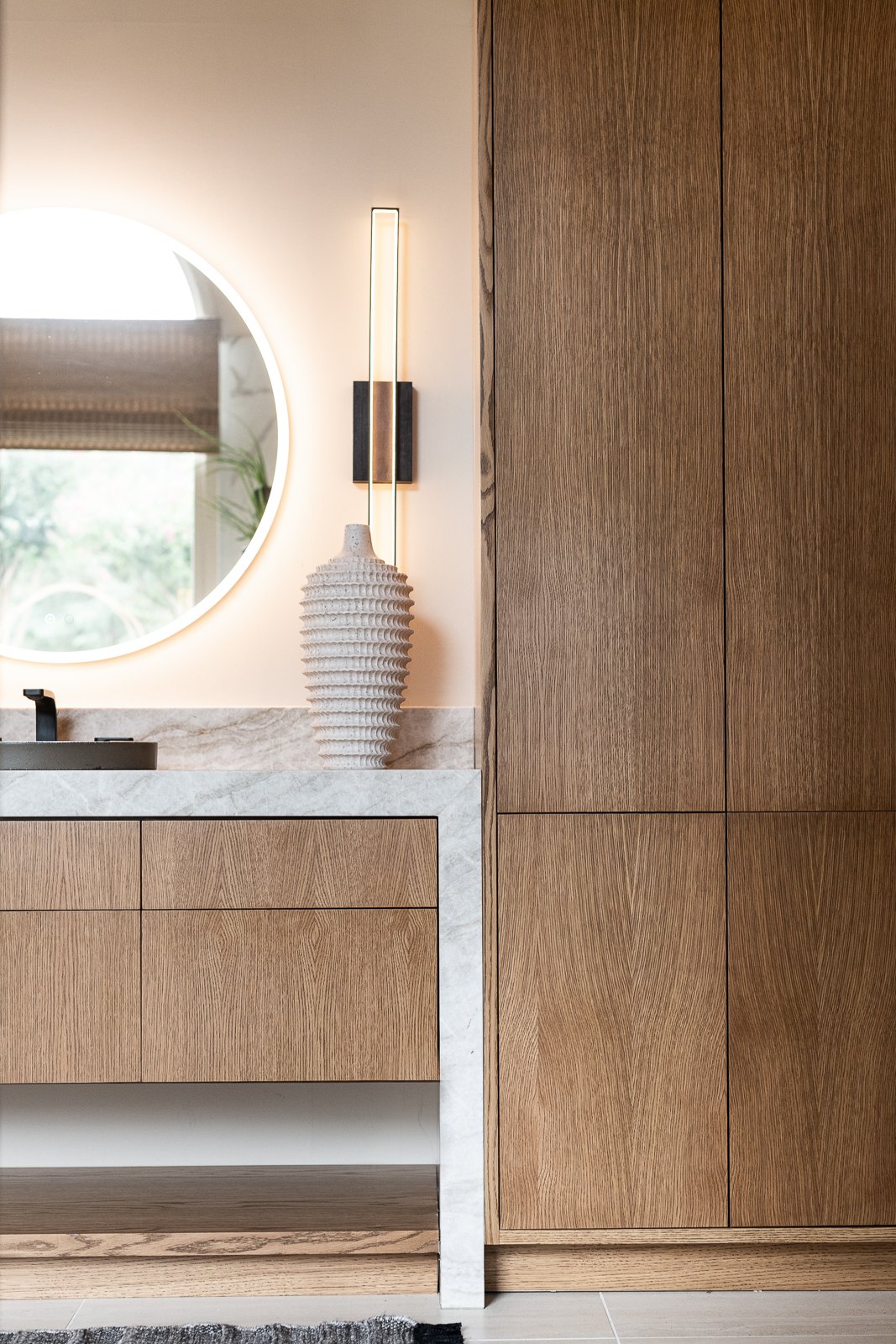
The clients really wanted a dramatic floating vanity which eats into the storage capacity (always trade offs!) so it was important to add a linen closet. In general, I find drawers much more spacious and accessible for storage, rather than cabinets. You always want to maximize storage.
The client fell in love with this tropical bird wallpaper which was one of the early design decisions. You can see how we built up the materials in this Instagram reel. The color palette is black, white, and brown and we layered in natural oak, woven rattan and green foliage to bring the tropics to Atlanta.
Below is a digital illustration and rendering of the final selections. We can see what it will look like before we build it down to the accessories. Isn’t that fun? For the paint color we went with a neutral, slightly creamy white. The final look is very airy to give breath to the oak cabinetry and is a great counterpoint to the deep brown hues in the adjoining bedroom. No surprises here.
Another design element that was important to the clients was having a curb-less shower. To achieve this we added a linear drain to one side so we do not have to have a door. It’s a walk in shower with a single stationary glass panel.
The renders are so fun, I had to share another one.
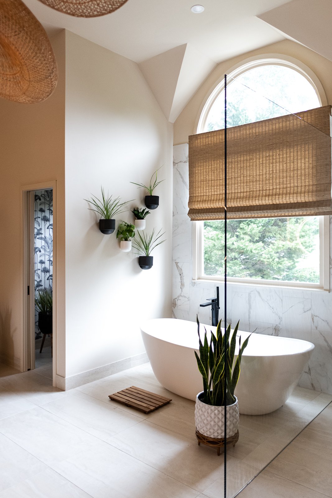
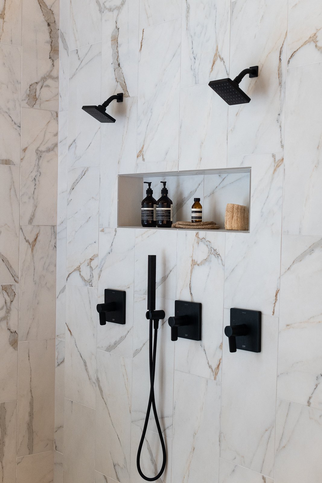
We mixed two tiles for the final look, both porcelains. On the floor we selected a larger sized 18x36” travertine looking tile and for the wet walls we did a 12 x 24” marble look alike with beautiful veining. In general, I am an advocate of more tile everywhere in wet rooms but as you add more tile, the price climbs up, so we try to be very intentional with the placement. We lined it up to where the window starts curving and followed that line across to the door.
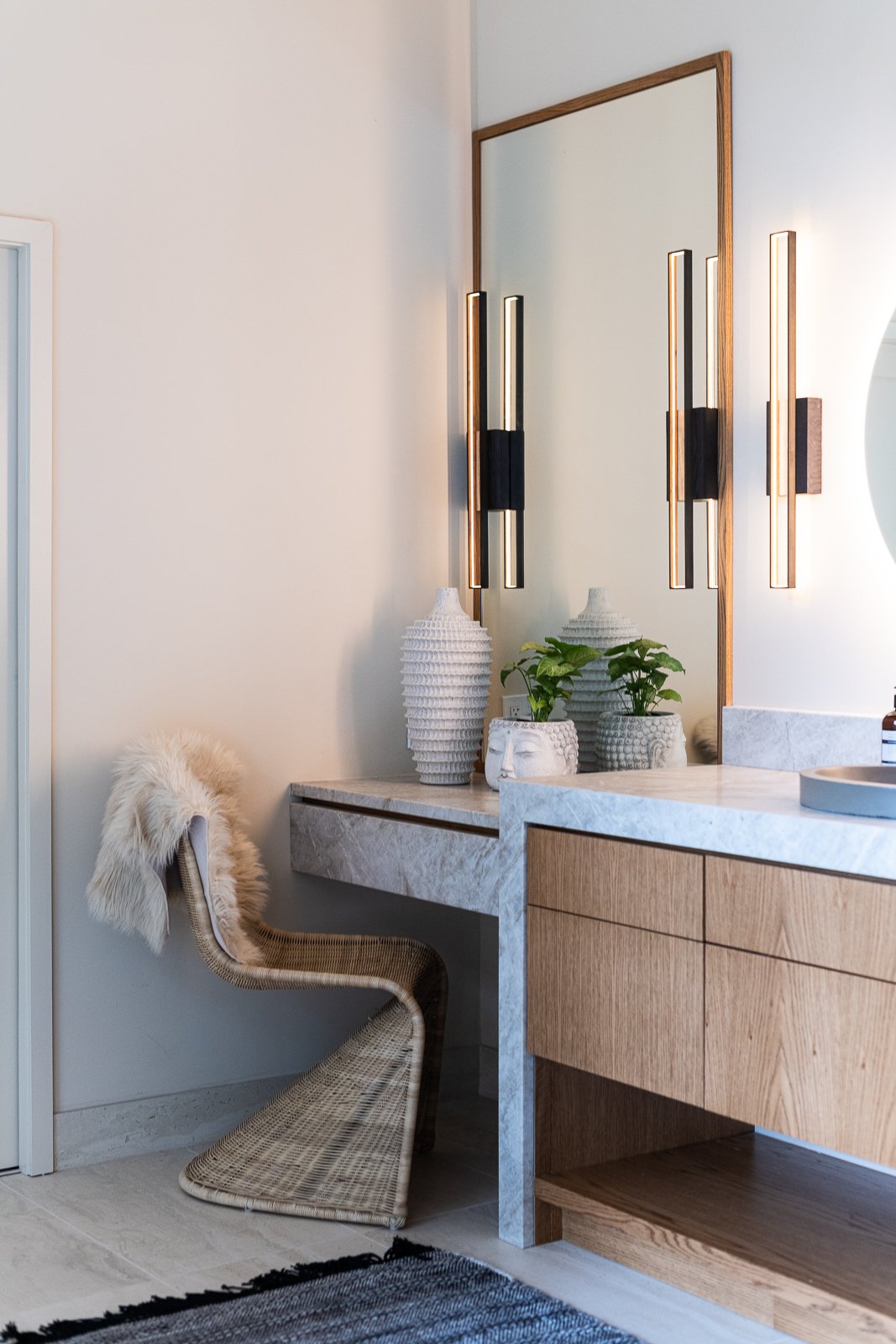
The vanity is made of white oak with a light stain and we used honed Taj Mahal quartzite on the counters which is a very classic, durable material. I built up the sides and the edges for drama and floated one piece of stone for the makeup vanity. We were also able to use the stone for the face of the drawer here which makes it look like one chunk which I love. For the sinks, I found these drop in sinks that look like they are handmade of concrete. They add a lot of texture. For the plumbing we went with a matte black line from Kohler. I love the woven Panton style chair for the makeup vanity and the black woven PET runner for the floor that adds contrast and more texture.
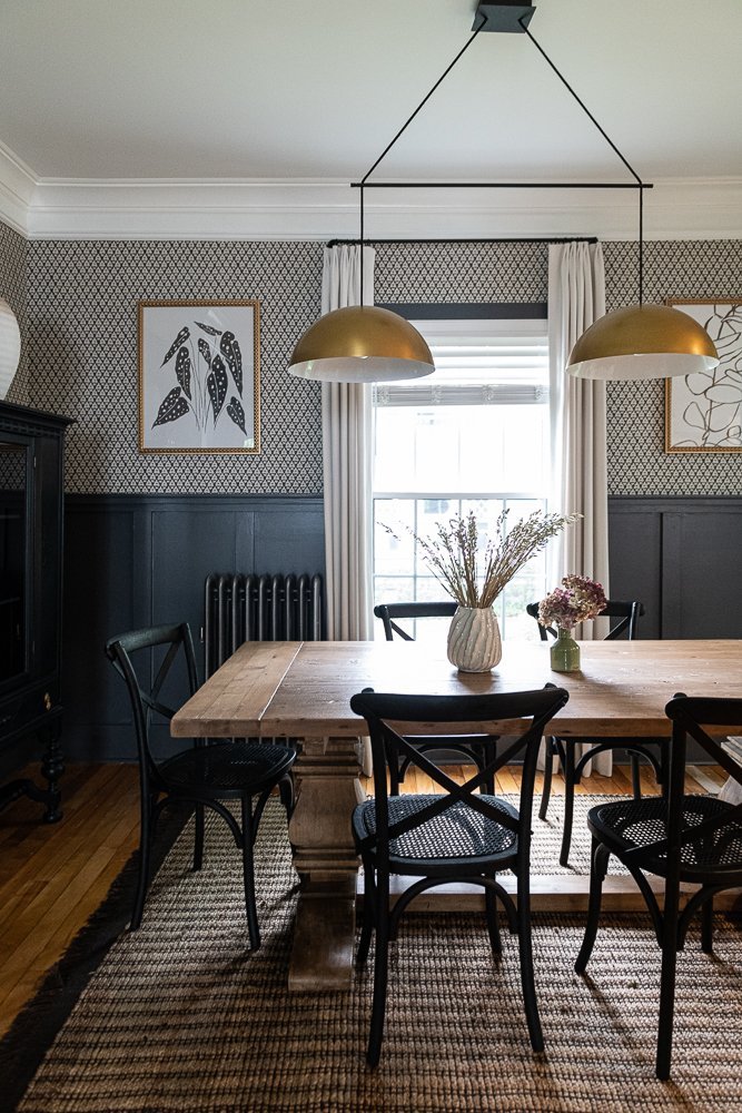
To connect this bathroom to the bedroom we created a moody vestibule with a lovely black and white small scale wallpaper from Thibaut.
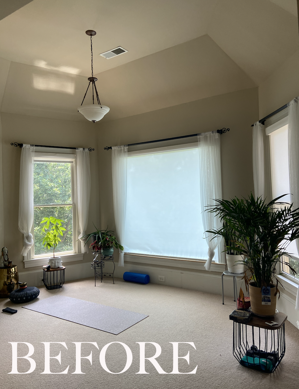
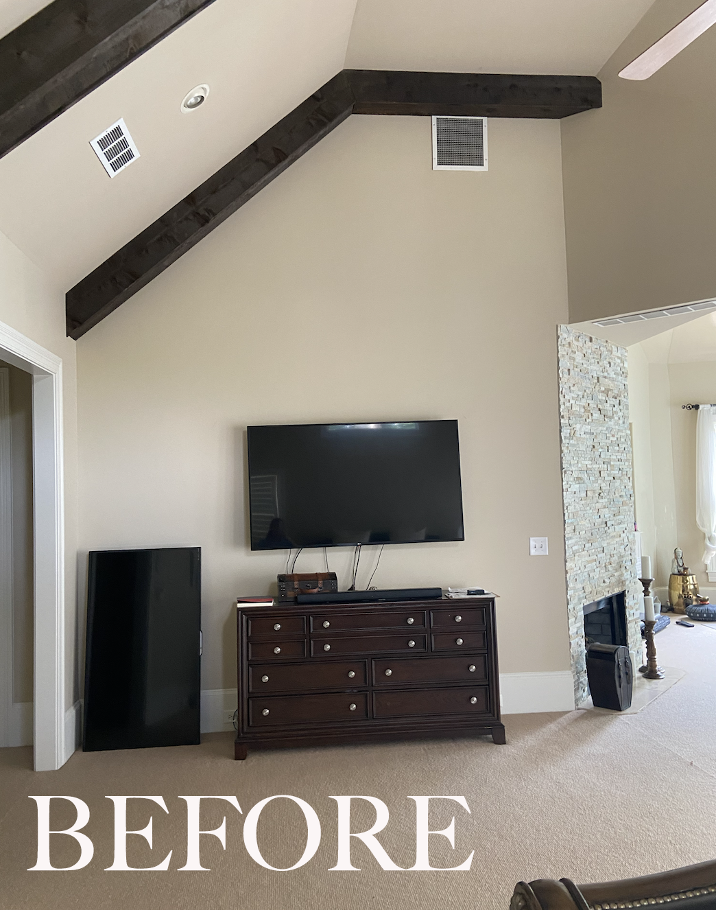
Moving into the bedroom, the first thing I noticed was the scale. This room is massive with really high ceilings, a fireplace, and an entire turret on one side. In the before photos you can see that even a California king bed looks too small for the room. We discussed the layout and decided to keep it as is because they wanted to keep a TV on the one wall and add some seating in front of the bed. The turret was designated as the yoga room where they would add a collection of tropical plants.
I offered up a very controversial and bold idea— cover up the windows behind the bed so we can create a paneled wall which will bring in serious mood. It would also help to push the furniture forward a foot or so which would be better spatially for TV viewing. I don’t usually take out windows but here it seemed to be a good option. They had plenty of windows on the other two walls for the natural light and we wanted this space to be rich and moody so a little less brightness is good.
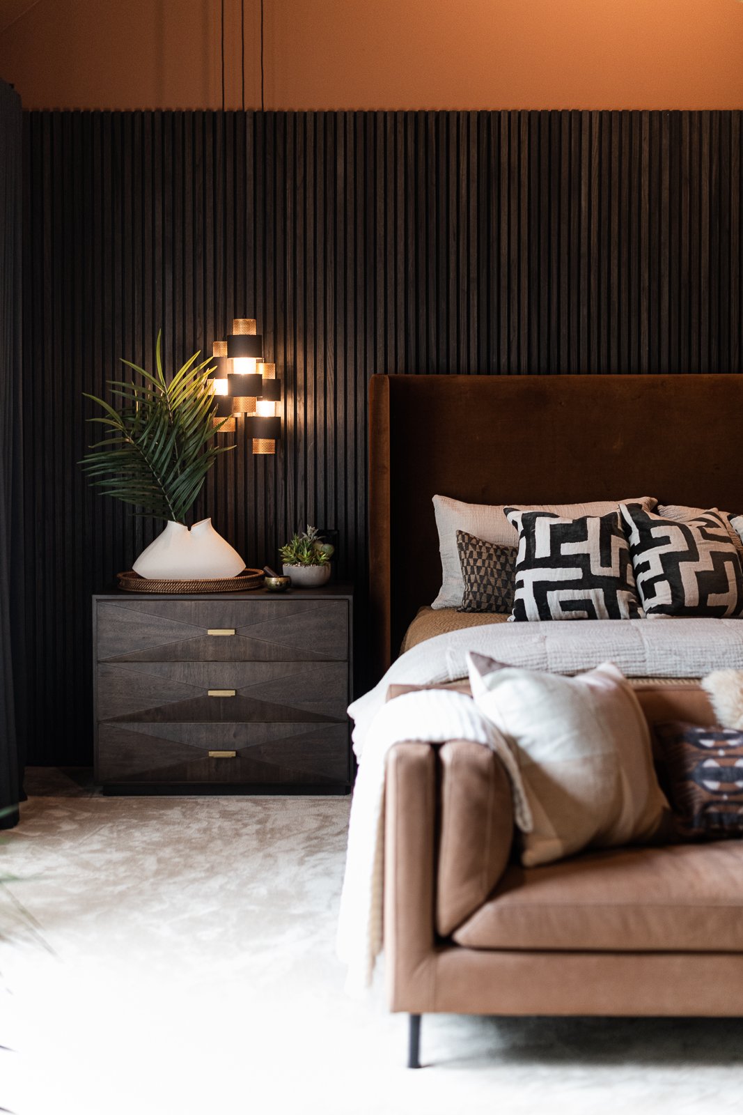
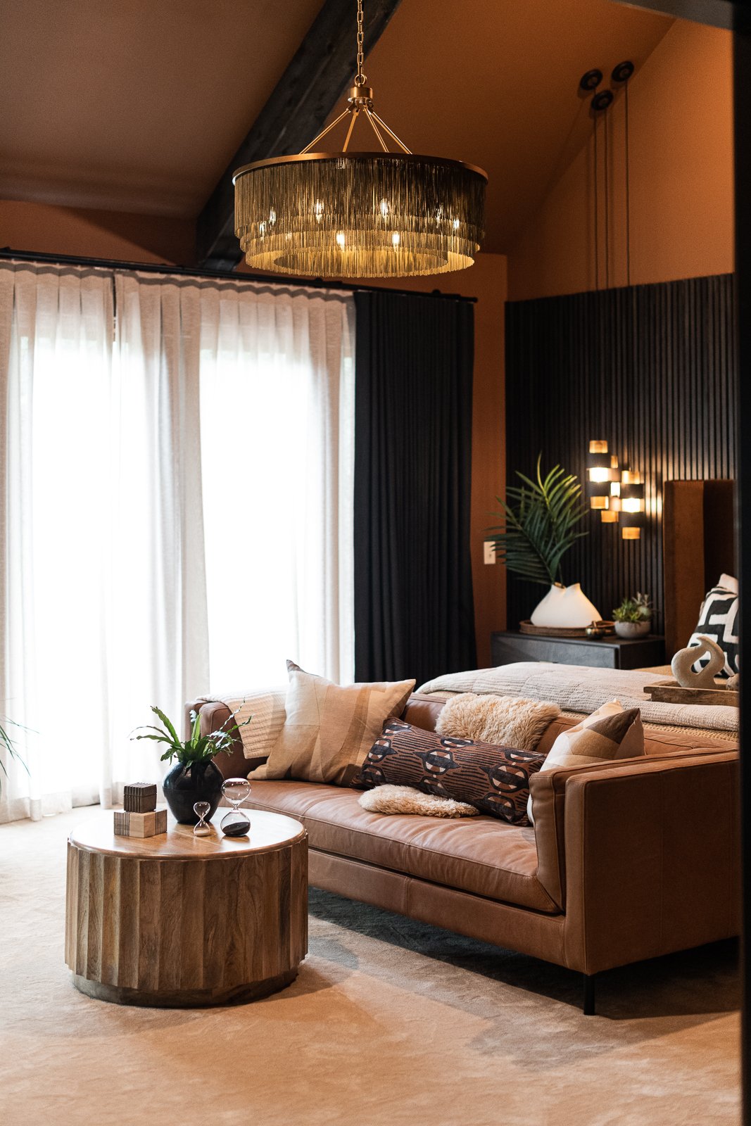
Below you can see our selections. I sourced a giant brass chandelier, an asymmetrical cluster of black and brass pendant lights, larger nightstands, a tall upholstered bed, and a leather sofa to complete the look.
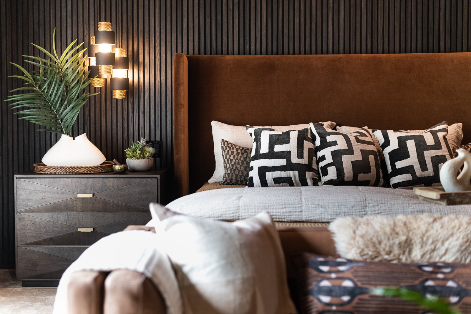
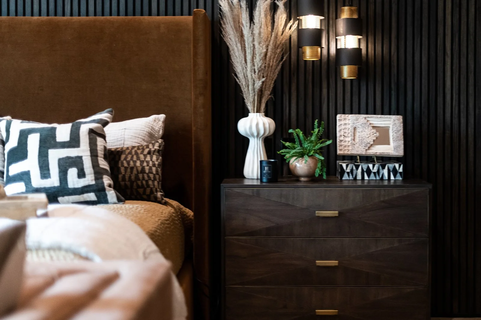
The digital presentation is how the client signs off on the overall direction but then I add a lot of layers, as seen below. The real thing is always so much better than the presentation. The fabrics and the materials are so lovely. I love how the light dances around from the pendants.
This slat wall is really the main feature. Opposite we have one wall mounted sideboard so the TV has some grounding, oversized art on the large wall to break up the brown paint color and add some energy, and custom drapery for the windows in a textural cream sheer and black linen for the blackout drapes. We’ve layered in lots of great texture with the bedding, pillows, throws, organic decorative items and greenery.
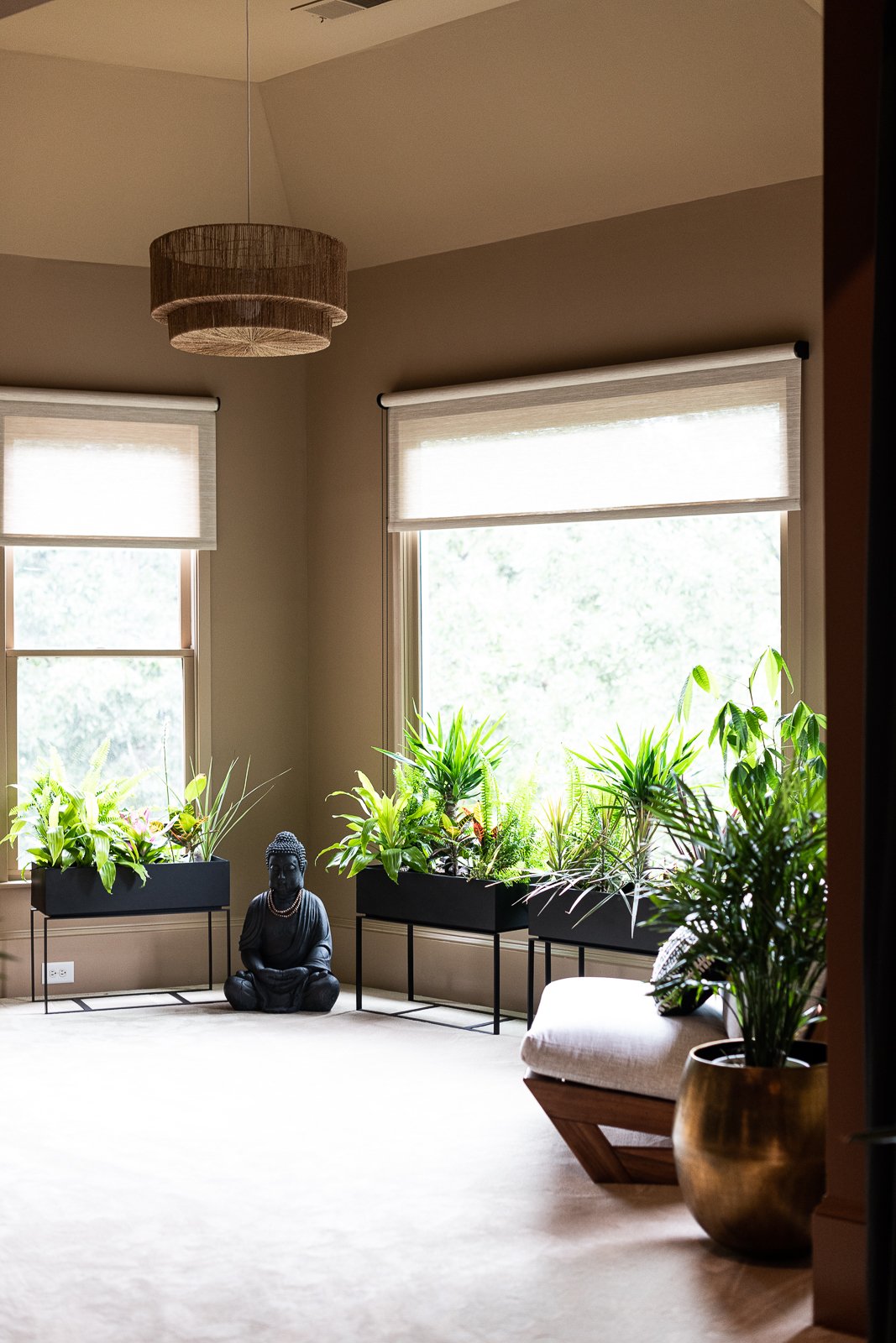
In the before photos below you can see the faux beams and the awkward angles they create. Because we were bringing dark wood into the design we kept the beams as is but painted the walls a darker tone so that the beams feel less stripy. We’ve intentionally toned down the contrast. We also relocated as many of the vents as we could and got rid of the eyeball lights. We found a more permanent way to install lots of tropical plants and we kept the window treatments very streamlined in this nook with roller shades.
We also selected a lighter paint color for the yoga area to break it up a bit. I love all of these warm tones together. We selected a super plush wall to wall carpet for the entire space which is so soft and cozy on your bare feet.
So many great angles to share of this upscale organic primary suite.
In a bedroom, everything should be soft and the light should come from a few places and not only the ceiling.
Just one more before image of the bedroom to sear it in.
Serious mood, right? It feels better in the space than the pictures can describe.
Great lines and great texture and look at how lovely all of the browns and blacks play together. We’ve adding a few creamy tones and some flax color as well. We do not want to be boring.
The end.
Interested in working together on your Atlanta interior design project? Book a discovery call to see if Violet Marsh Interiors is a fit. Please cruise around the site using the navigation links below and please do let me know how I can help.
Join the Party.
We promise not to bother you too much, but if you’d like to be alerted to new before & after blog content, please submit your details below.

