The Ultimate Morningside Kitchen
We started this project in 2017 and worked on the entire 6000 square foot home for two years before it finally came to life. We spent a year working with an architect on the perfect flow of all four levels, and just over a year building and selecting the finishes and furnishings. The kitchen is after all the heart of the home, so I wanted to share this project starting here. This new build kitchen in the Morningside neighborhood of Atlanta encompasses what all kitchen dreams are made of and is a testament to intentional planning and having a vision.
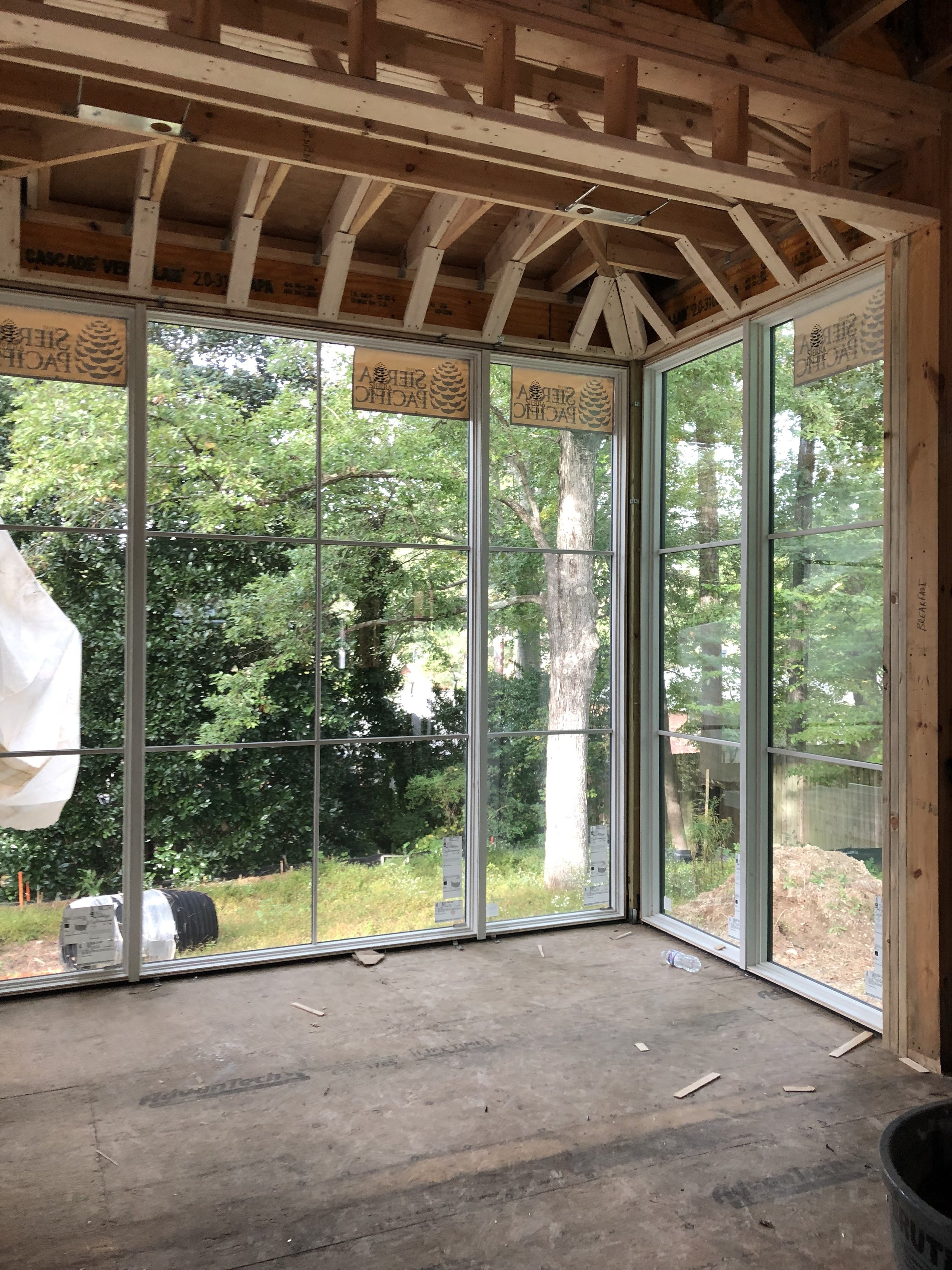
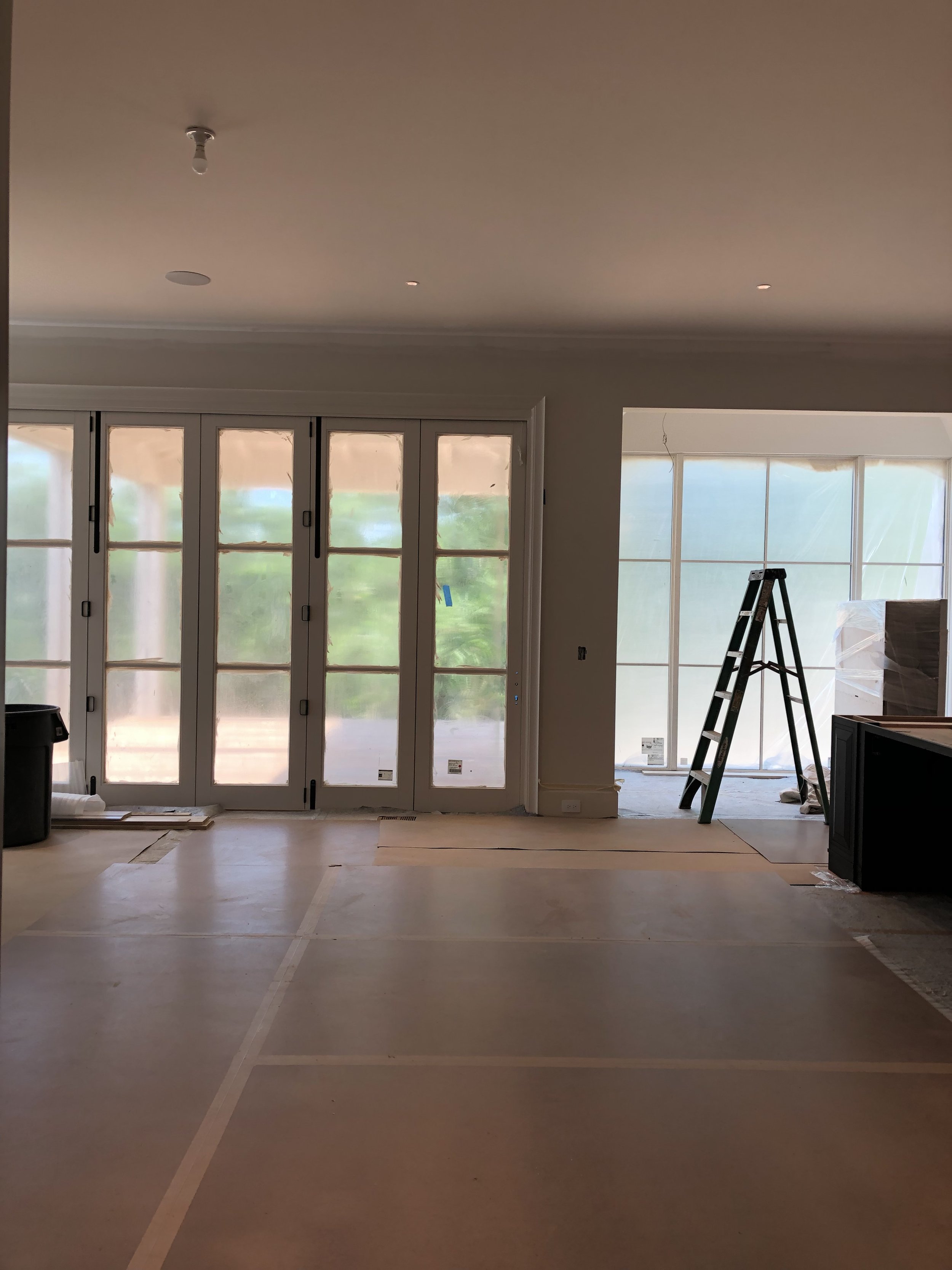
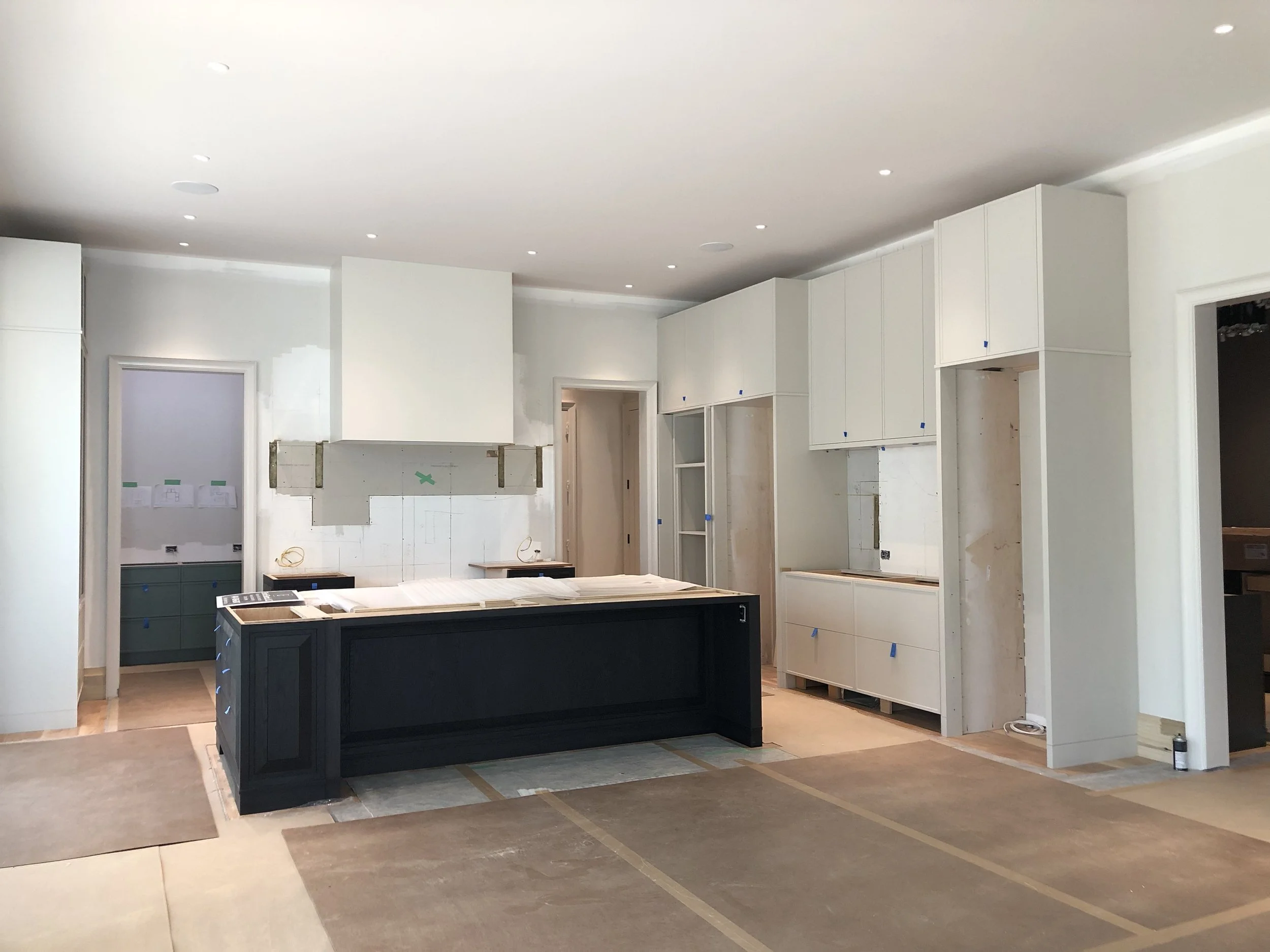
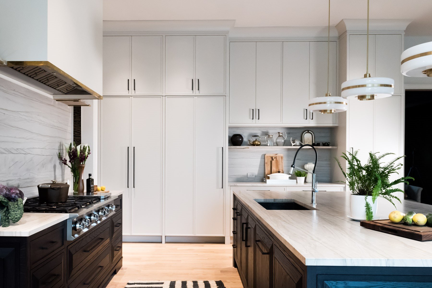
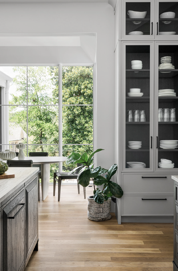
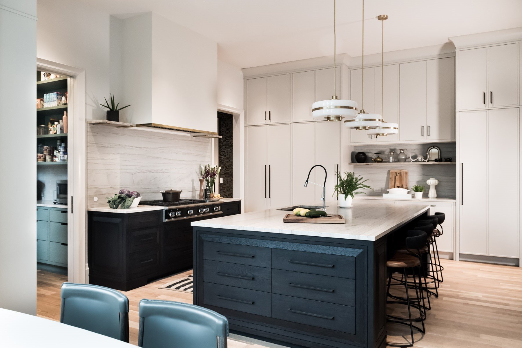
In the view above we are standing in the adjoining living room looking into the kitchen. You can see the layout and the connection of the rooms below. We added a breakfast nook with floor to ceiling windows which provides a convenient and casual place for the family of four to enjoy day to day meals. Along the three kitchen walls we added a tall glass dish cabinet, an oversized range and hood; and on the right, a wall of cabinets with cabinet panels that hide the wall ovens, fridge and freezer.
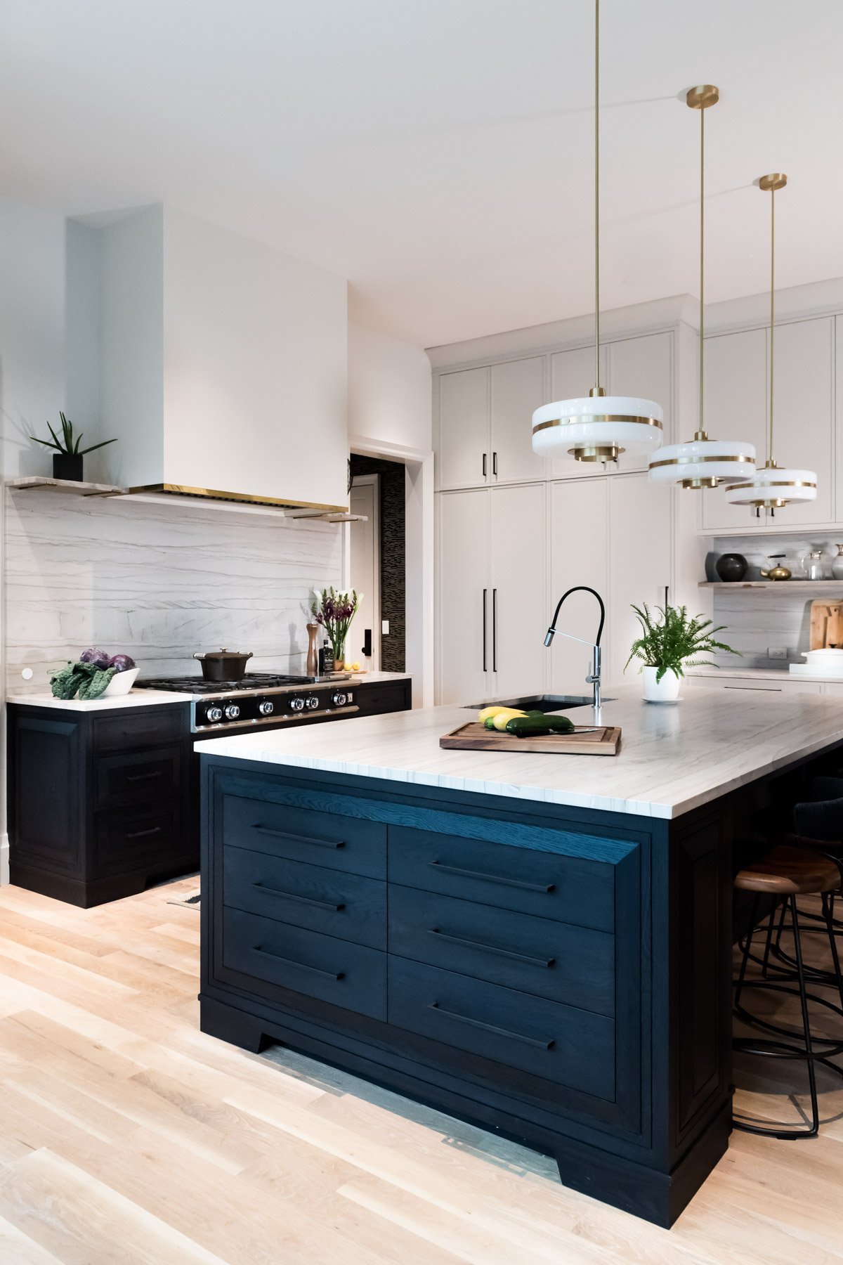
The island is oversized and houses the sink, dishwasher, roll out trash, and a bank of drawers for utensils that faces the breakfast nook for the ultimate table setting convenience.
In the original design, the pantry was located between the kitchen and the dining room (not pictured) which just seemed inconvenient and out of place. Who wants to walk into another room to use the pantry? In the current pantry space, they had a small office drawn in instead.
We scrapped the office and made it a walk in pantry also known as a dirty kitchen or scullery kitchen. There is a pocket door that can hide any mess created before a dinner party. Brilliant! I really wanted it to be a swing door like a real kitchen, but it didn’t work in the space. In the pantry we’ve stored all of the appliances— microwave, blender, toaster, coffee machine, along with a large sink and a second dishwasher, open shelves and more drawers to store kitchen gadgets.
Smart? I think so, and yes that is the point. Every kitchen is custom designed to optimize the space and make every square inch work for you and your family.
When your ideas go from a piece of paper and become a built three-dimensional space it is…. magical! Once the walls start going up and you can walk through the space you can continue to dial in more and more detail. It’s funny how having the framing up can feel like so much progress… but let me just say, there are so many more steps from this point forward. Renovating and building a home takes time and let’s not forget, lots and lots of patience. Even though it can feel like a long time, you’ll be so happy enjoying your space when it is done correctly and beautifully that you will barely remember those challenging months… eh hem years, in some cases.
I have said this many times but natural light is my very favorite design element. It makes everything sing. That said, we added windows, windows, and windows everywhere… and these are all facing the backyard so there is still a lot of privacy. Make note of the existing conditions of the back yard pictured above. The transformation back there will blow your mind. People get a little choked up about the cost of furnishing a home but have you ever priced landscaping? It makes interior design services look quaint.
It’s also a great analogy for interior design. When you hire a landscape designer you collaborate with them to design the outdoor space that will work for you. It includes hardscaping, walkways, trees and flowers. There are many, many layers and many conditions that have to be met (sun exposure, rainfall, color, materials) to bring the design to life. And when it is done by a professional, you can tell.
Interior design is the same way, there is a lot of collaboration to tailor the design to the client’s lifestyle, but ultimately, the interior designer knows which materials will work best and all of the layers needed to create the intended final look. Allow the designer to do their job… they will have ideas and resources beyond what you can conceive.
Imagine getting a landscape plan and then DIY’ing all of the plantings? It would take forever to get done, be a janky and frustrating process and in the end, not look as good. It’s the same with interior design. Clients can easily get in their own way when they start shopping and adding things to a design. Hire a designer, like Violet Marsh Interiors, who you trust and who’s work is inspiring to you and let them work their magic.
(Moving on from my PSA…)
Below we can see the oak floors were added and the sheetrock has been painted. The ceilings are 11 feet which feels grand. I love tone on tone so in this room I painted the walls, the ceiling and all of the trim the same color. And because light is always moving throughout the space and changing, you would never know that. The ceiling always looks like a different color than the walls. In the photo below the ceiling is taking on a bit of a pink tone because of the reflection of the wood floor.
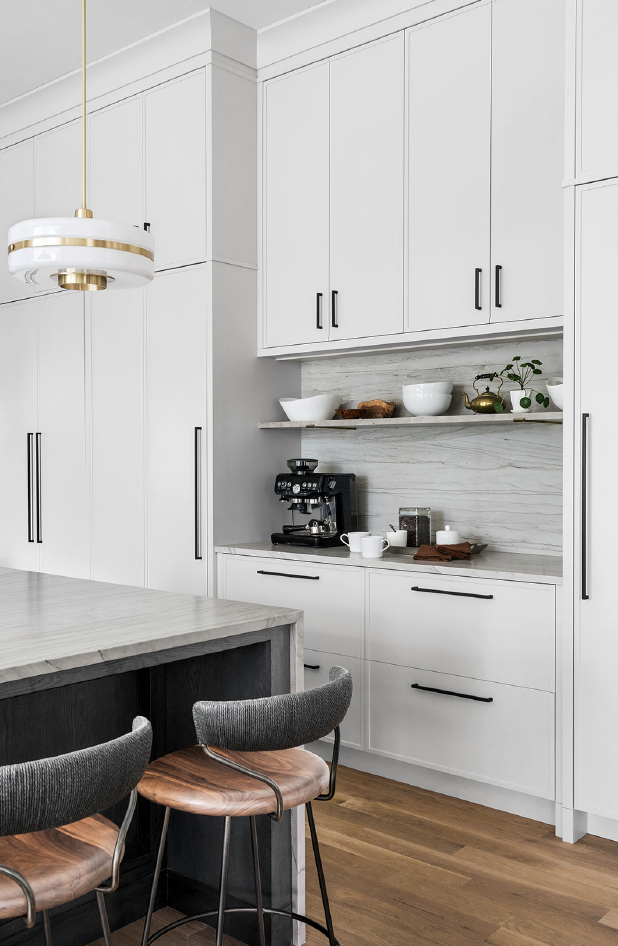
The elevation below shows the cabinet wall which houses the fridge and the freezer along with a closet for the two wall ovens. We’ve added a counter between them for function (loading/unloading groceries) and to add some airiness and movement to this large wall of cabinets.
On the stove wall elevation we can see the proportions of the range hood with the stove below and how it fills the wall between the two doors. That is custom for you.
In this 3D line rendering we can see how the island pairs with the range wall and the large bank of cabinets. It’s dynamic and the space is filled in nicely.
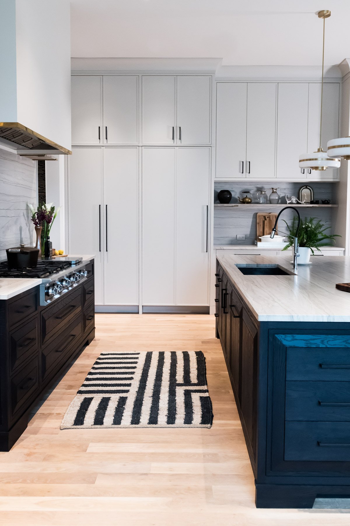
Taking it a step further and adding color we really start to see the kitchen come to life. These are the actual pendant lights we selected and check out the detail of the brass band wrapping around the range hood. It’s too cute. We went with a different (ah hem, better) stone material but it still conveys the look and feel.
Hello green pantry peeking out on the left. You are cute! And Bert Frank pendants, I love you! You have a MCM feel, but way more sophisticated.
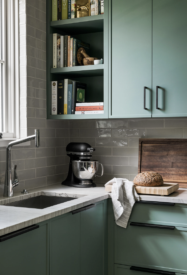
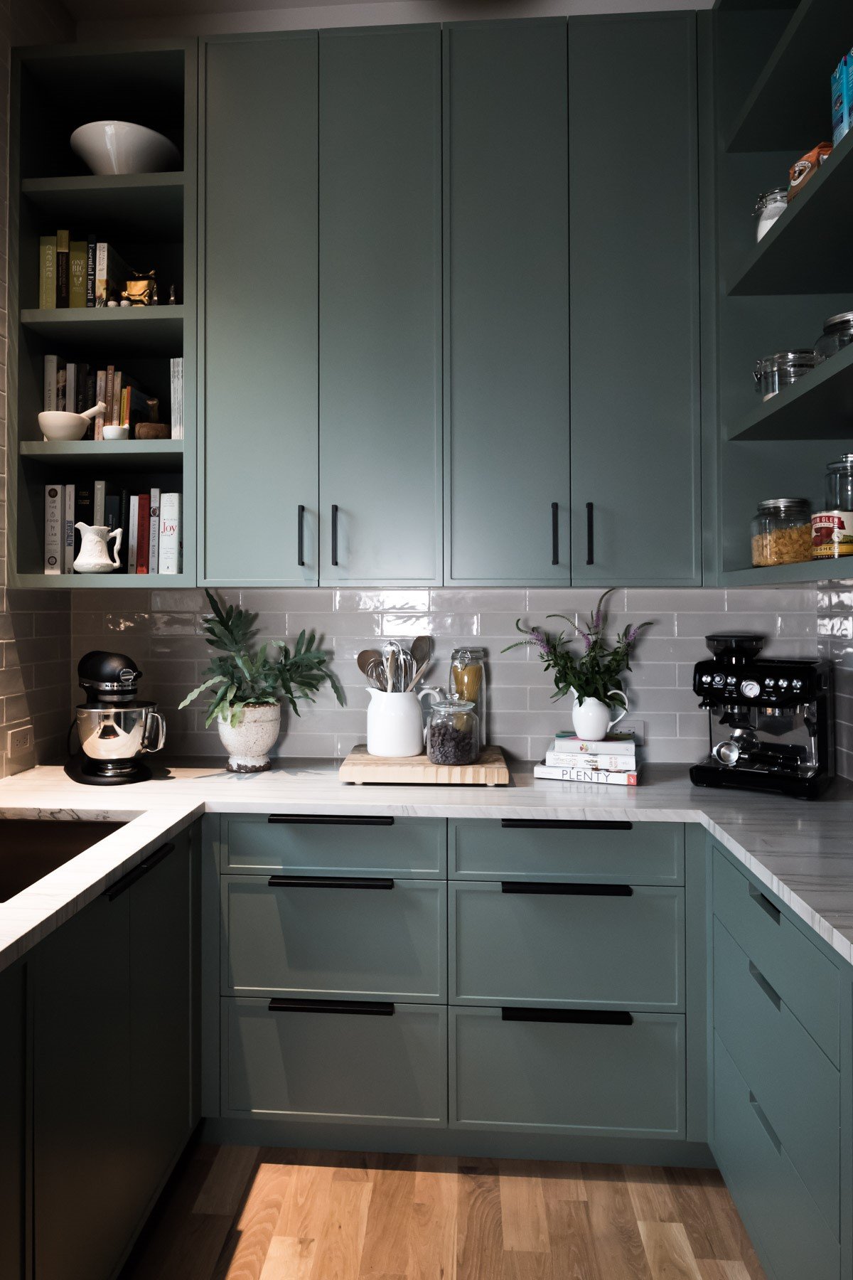
In the pantry we added a large sink and a second dishwasher for those times when you have a party and there is a lot to clean up. We also incorporated lots of closed storage for spices, miscellaneous kitchen gadgets and glasses. The entire right side of the pantry is open shelving and drawers for food storage. Since the room size is fairly small, we didn’t bring the cabinets up to the ceiling. If we left them full height in such a small room it may feel like the walls are closing in on you. We want to enjoy being in the space.
It took about two months for all of the cabinetry to be installed in this home. And your patience has to be strong because as they are installing things, they then cover them up. No one wants to damage the newly stained hardwood floors, for example. And the same happens with the counter material and sometimes lighting.
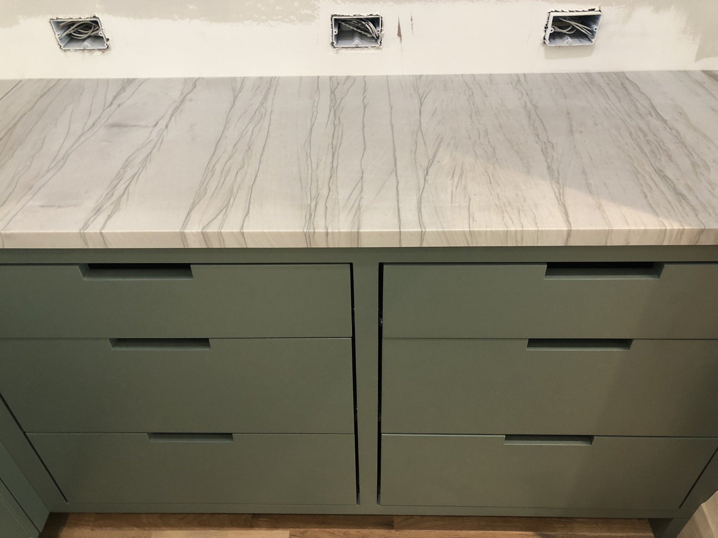
Once the cabinets and hardware goes in, the counters are installed. We selected a honed (matte) vein cut Quartzite in pale gray. It’s earthy and stunning at the same time. In the kitchen we used this same stone up the backsplash to create a modern seamless look. (And yes, we specify exactly where the stone movement will be.) In the pantry we went more classical with subway tile. Stone is always sold by the slab so it’s good to think through all the ways the material can be used — window sills, door thresholds, integrated shelves… there are lots of ways to incorporate the material.
In the pantry photo below you can see the numerous electrical outlets we installed. We wanted ample plugs for all of the appliances that line the counters with dedicated circuits where needed.
We selected a pale gray modeled subway tile. It adds a bit of sheen and softness to the space.
We’ll just skip right over move-in day when the room is covered in cardboard boxes and packing materials.
We went with a painted creamy cabinet and a black stained oak island and range wall and we mixed hardware colors. We used black for the cabinet pulls, brass touches in the lights and around the range hood, and stainless steel for the faucet and the range.
Don’t be afraid to mix materials but do it wisely!
This kitchen has great flow and lots of beautiful natural light. For the dish cabinet below we added a black oak interior to tie in the island. All of the white dishes pop.
Pictures taken at different days show a couple of different ways to style the shelves.
The green pantry is gorgeous. The goal with any kitchen design is to blend utility with beauty, function with form, and to make it timeless. This kitchen will serve for decades to come and age gracefully.
The end.
Interested in working together on your Atlanta interior design project? Book a discovery call to see if Violet Marsh Interiors is a fit. Please cruise around the site using the navigation links below and please do let me know how I can help.
Join the Party.
We promise not to bother you too much, but if you’d like to be alerted to new before & after blog content, please submit your details below.

