A Colorful Buckhead Condo Transformation
It’s not everyday that a client reaches out and has a beautifully built, high quality space that just needs personalization and intrigue. There are so many different aesthetic styles in the world and as you can see from the before photos, the client simply wanted a different look and feel. She loves the color purple, has an incredible growing art collection and generally wanted a more youthful vibe than the previous condo owner.
In the before photo below, the style is what I would describe as Southern Glam Classical. Is that really a thing? Not really, but the description works. There are watery blues and lots of white and gray and touches of silver and gold. The lines are clean and scroll-y at the same time.
While Atlanta has a rich history of classical interior design, the art scene is still very much up and coming. What you find around town are a lot of what I will call “decorator” pieces that are easy on the eyes, don’t have a point of view, and simply match the color scheme. The art below is a perfect example of this. Is anyone looking at this entry piece and feeling moved? Not likely. Atlanta has some amazing galleries and some incredible artists but you really have to seek them out. Stay tuned for a post about my favorite in town galleries and artists.
The nook you see below on the right is a perfect place for built ins, so that is what we did. It adds so much more functionality and interest to the long meandering hallway. We removed this great textural wall covering only because it was the wrong color. The client wanted brighter whites so her art could really pop, but I love the texture and softness that a woven wallpaper provides. It really steps up a space and makes it feel luxurious.
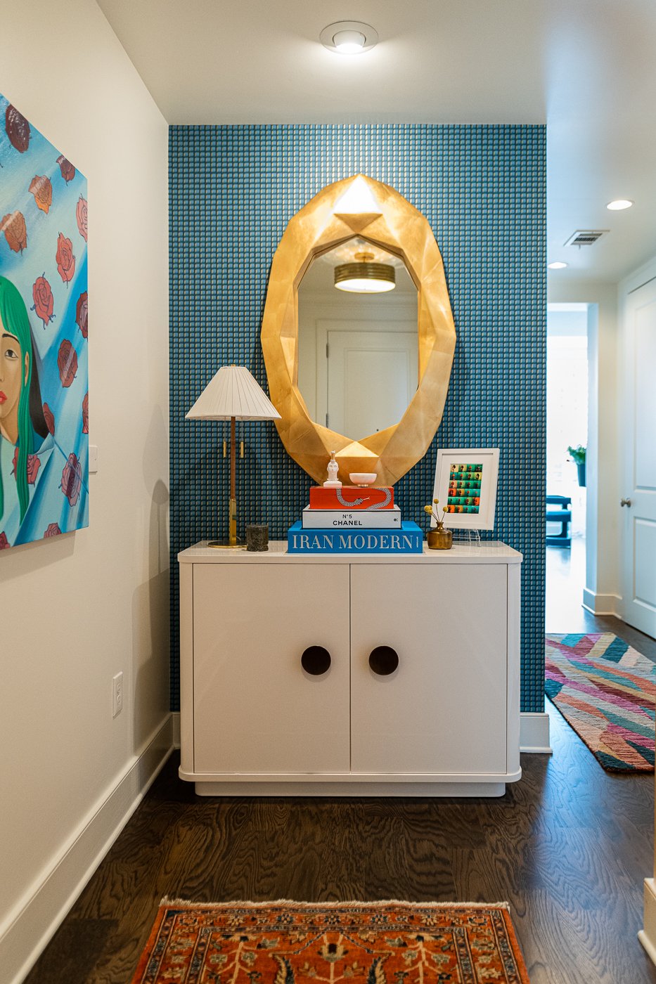
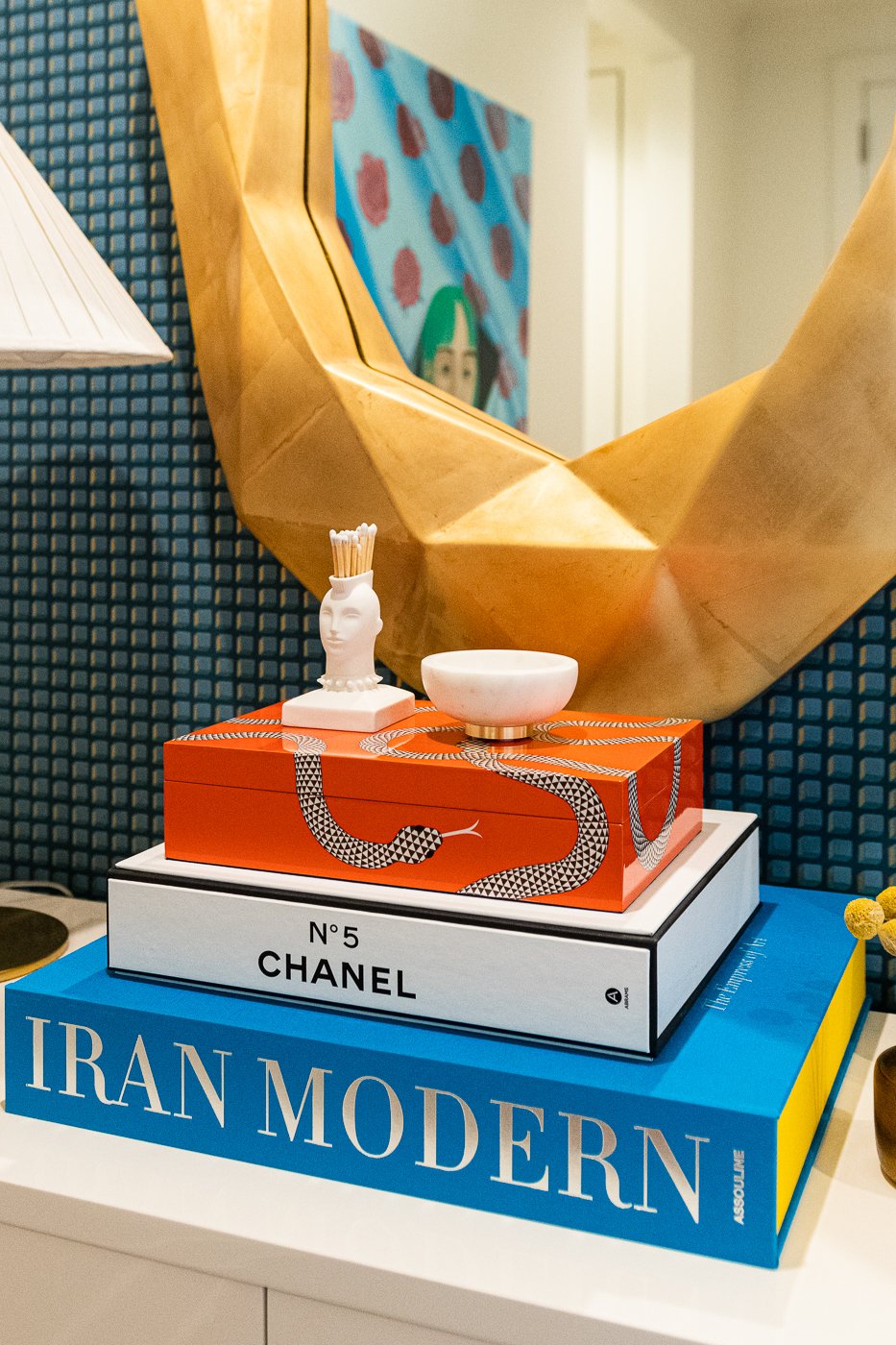
Well, that’s dramatic! We added an entry console and a giant gold chunky mirror to reflect light back into the hallway. The wallpaper behind the furniture creates a strong focal point and this furniture piece provides a ton of storage with shelf space and drawers that roll out. I can’t get enough of interesting art books and interesting boxes and I love the mohawk matches holder from Jonathan Adler. It’s so clever.
This is the view looking down the entry hall into the kitchen area before. These are also the real estate listing images which by nature are generic and depersonalized.
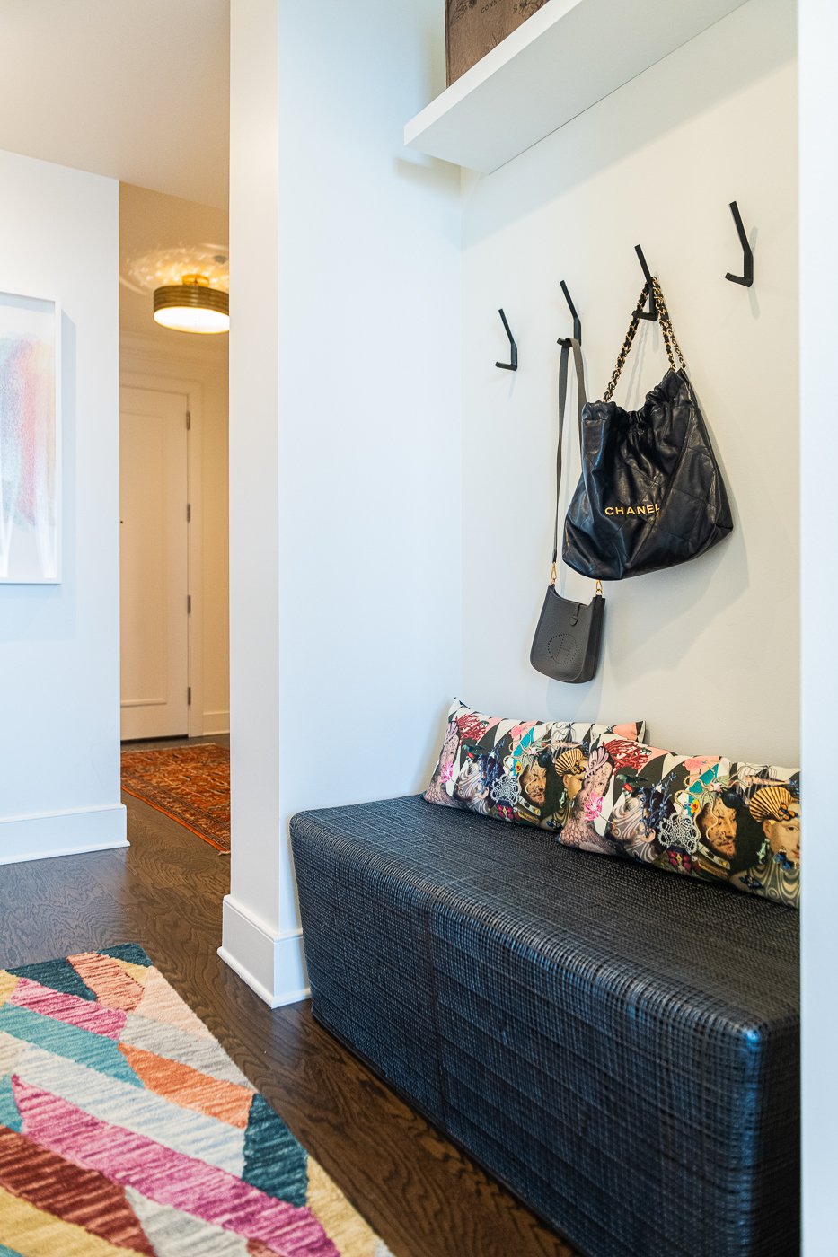
Rather than add another piece of storage furniture, we used this nook for an entryway bench and hooks. She does have a coat closet for storage so this area is more for everyday, come and go items. She had these white floating shelves from her previous home so we added one above the hooks where we display a few of her art sculptures.
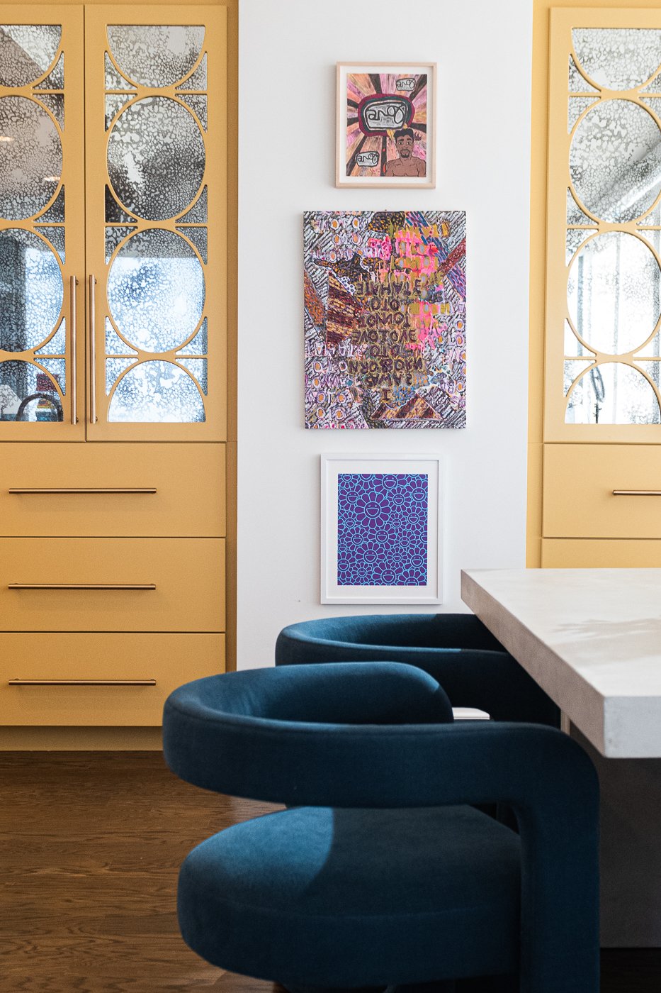
For the built in shelves, we kept it very simple and just matched the color of the walls so all of the objects pop. She has a lot of NFTs so we added wall outlets so they can charge. We got a number her smaller art pieces framed and added some more art books and a few objects for interest in a variety of textures and shapes.
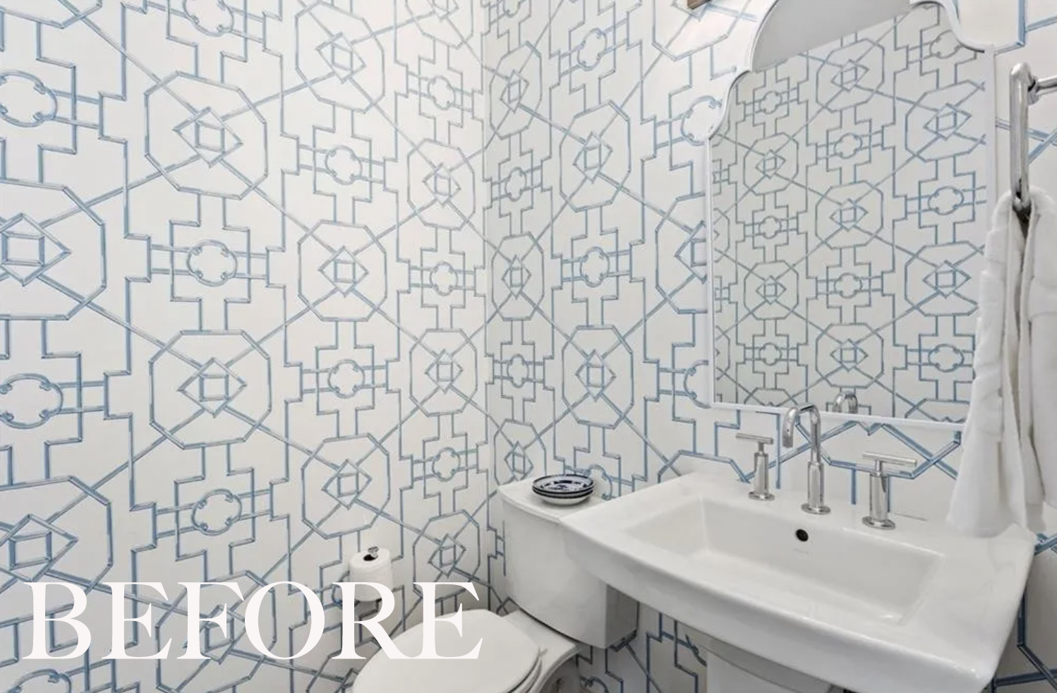
The powder room is located off of this hallway and in the before image below, we can see how traditional and surprisingly cold it looked before. The plumbing is all chrome from the Purist collection. I typically love Thibaut wallpaper and fabrics but not here.
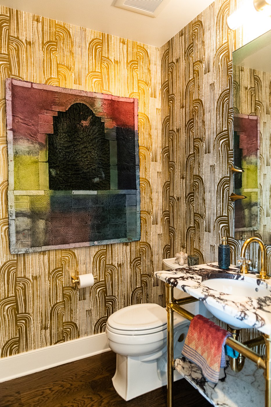
We added a lot of color saturation, drama and warmth. I love being surprised by color saturation and interesting things when I walk into a small room. We swapped out the pedestal sink for a marble console with brass legs. This one is from Waterworks and I have had a crush on it for ages. The marble top is absolutely stunning and is probably my favorite marble ever, if I had to choose just one. It’s called Calcatta Viola.
The wallpaper is by Kelly Wearstler who is an American design icon. We updated the plumbing (also Waterworks) and added a gorgeous wall sconce from Ralph Lauren and a super sassy wall mirror with brass talons from Arteriors.
The hand towels are Missoni which are so fun and the art is from the client’s personal collection. Talk about a vibe! Dim the lights, light a candle and you won’t want to leave.
Heading into the main living space, we have an open concept kitchen, living, dining, and in the this case, office area.
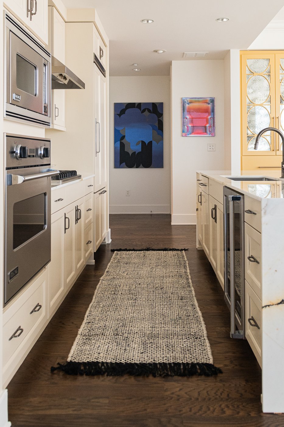
The original kitchen was in great shape as you can see but we wanted to infuse more life into the space.
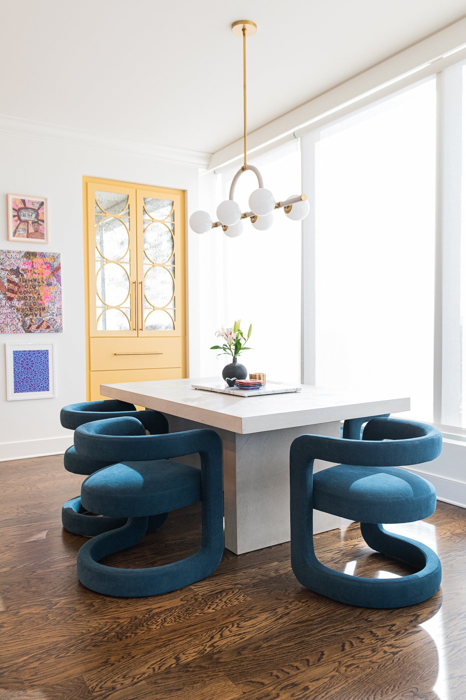
We updated all of the colors— yellow on the built ins and cream on the cabinets. We replaced the granite counters with dramatic marble and made the island square with two waterfall edges. It was curved before and the client did not want any seating here. We also swapped out the faucet. Look at this dark nickel beauty.
We switched out the lighting with something more interesting and added the most comfortable gorgeous blue dining chairs. We had to wait 6 or 7 months for these chairs but I think they were worth the wait. I love them and they are super comfortable.
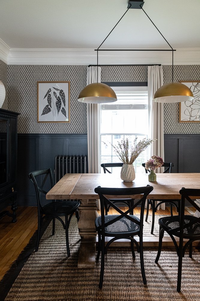
I love how clean and bright this dining room has become. The personal artwork makes all of the difference and is so vibrant. Also, I love a hardwood floor under a table and chairs because it’s so easy to keep clean. Instead of adding a textile on the floor, we are adding that softness and warmth with the chairs.
In the living room below you can see that there isn’t much wiggle room to reposition the layout of the furniture. Having only one wall dictates where the TV lives and naturally the sofas and chairs must orient to it. But, you can also see that the two chairs against that back window wall take up a lot of space and only providing seating for two.
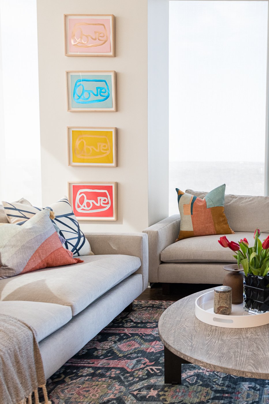
The client really wanted to maximize the seating so we did just that. We added two sofas which fit perfectly around the giant pillar in the corner where the Love art is hanging. Now she can fit up to 4 people on each sofa. I added the two small polkadot poofs as well in case she needed a couple more seats. Adding the small poofs adds a lot of texture and energy without taking up much space.
The scale of the media cabinet is bigger now which also provides more storage and she had a Samsung Frame TV which turns into a colorful piece of art rather than a hulking black box.
Look at that ceiling light in the living room! It’s perfect. Every detail has to be aesthetically pleasing.. it’s my strict policy.
Speaking of details, since I am obsessed with each and every one, did you notice I updated that black accordion lamp with a more interesting shade? I love the balance of the round lamp base with the tapered conical shade. And another detail that you may or may not have missed is the paint color on the soffit around the kitchen cabinets. In order to make the cabinets look more custom, I used the same paint color here giving this wall a more seamless feel.
Color coordinate our books? Yes, I have been doing that for almost twenty years now.
It’s cheerful, comfortable and so inviting and it’s all about the layers. We have seven different fabrics working together in this small space.
Also, with any new sofa, I always remove the extra pillows they come with. It’s too boring to have toss pillows made with the same fabric as the sofa.
We updated all the pulls in the kitchen and in all of the bathroom vanities. Again, design is in the details and this is such a simple, cost effective way to update the look and feel.
In the primary suite before image below, we see more of the same— cold, washed out and bland.
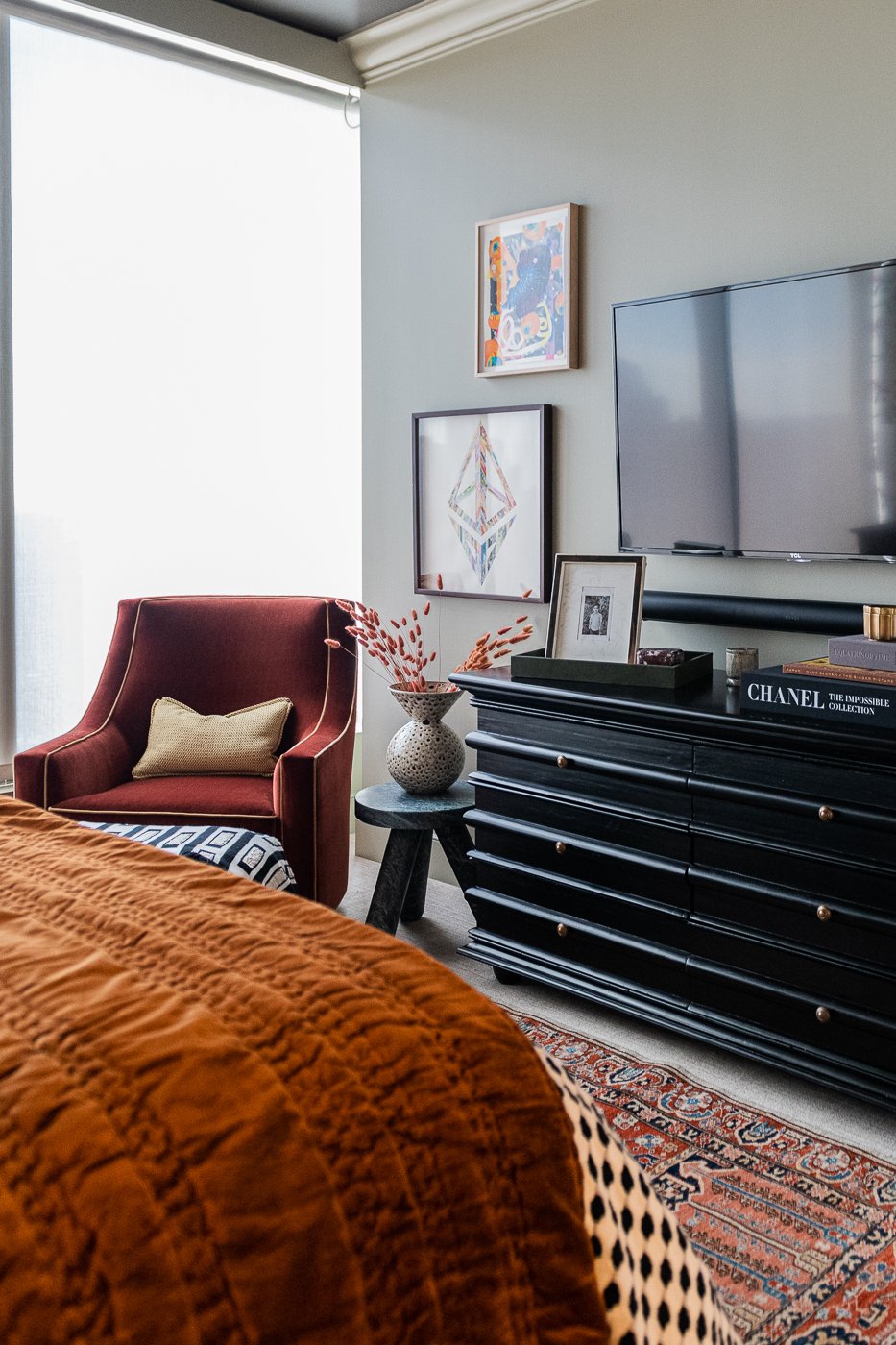
Try as I might to capture the same angles, it doesn’t always work out. In the transformed version below we have so much texture and gorgeous materials. The nightstands are wrapped in leather and brass and the bed is custom made in a soft olive green flannel.
We painted the entire room a pale, earthy green and the ceiling a soft warm black which you can’t really see in these photos. The furniture is black and the we added various orange elements that pick up the color of the flower stamens in the wallpaper.
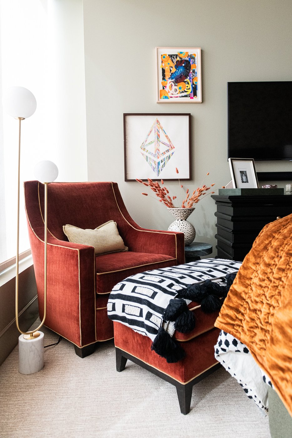
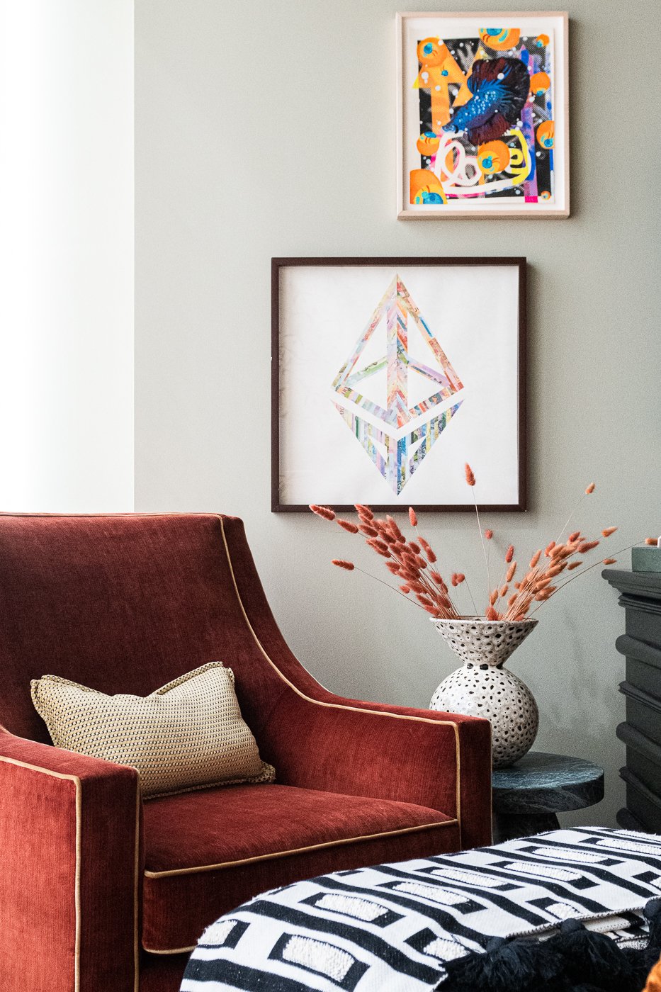
We curated her art collection and added the pieces that work best in this room and we have lots of small brass details throughout. Again with the layers .. we are using eight different fabrics in this space.
The client wanted a cozy chair with an ottoman to work from and it fits nicely in this corner with that edgy green marble side table.
We left all of the floors because once we layer in the interesting things, the floors recede into the background.
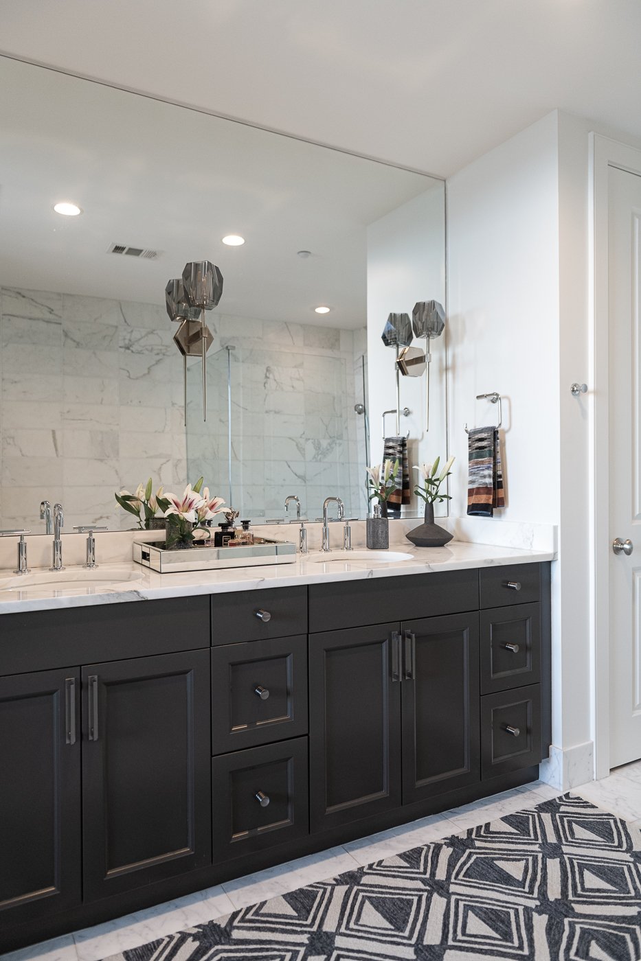
Initially the client wanted to gut this primary bathroom and add a freestanding tub. We decided to spend the budget elsewhere because this bathroom is all marble and it is really classic and in great shape.
Instead, we painted the cabinets, updated the lighting, and added a textural runner. In the water closet, we added wallpaper too which brings a lot of depth.
We kept the faucets but look at the upgrade on the cabinet hardware. These knobs and pulls are gorgeous. Swapping the sconces for something heavier grounds the space and plays well with the new cabinet color. We repurposed these sconces to the other guest bedroom bathroom.
I haven’t designed many guest rooms to date. Most people want to spend their budget on the main areas of their home and guest rooms tend to be an afterthought. But in this case, since the space is fairly compact and she often hosts family from out of town we went for it.
Before image below. We started with a white box with gorgeous views. Again, not a lot of creative freedom to change the furniture layout. The bed has to be positioned on the back wall.
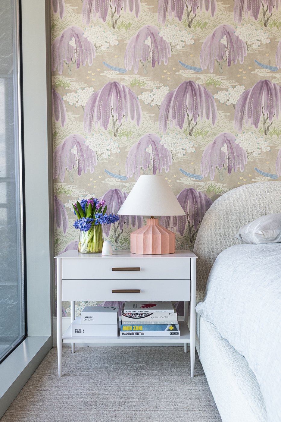
We went all in on purple, pink, gray, white and blue. Not pictured is the amazing purple grass cloth on the ceiling. It matches this colorful wall oh so perfectly. We also added the most amazing oversized metal drum shade which you can see in the Pinterest board below.
We painted the bathroom vanity purple too and you can see our inspiration below.
The client had this gorgeous oversized art that fit so nicely on the wall and we added some plush seating and a couple of custom pillows opposite the bed.
Would you love to be a guest in here? I know that I would.
The end.
Interested in working with Violet Marsh Interiors on your Atlanta interior design project? Book a discovery call to see if we are a fit. Please cruise around the site using the navigation links below and please do let me know how I can help.
Join the Party.
We promise not to bother you too much, but if you’d like to be alerted to new before & after blog content, please submit your details below.

